SurvOmics: a multi-omics database for cancer survival analysis
About SurvOmics
What is SurvOmics?
SurvOmics is a multi-omics database, which incorporates somatic mutation, RNA expression, DNA methylation, copy number variation, and clinical variables into multiple survival analyses in 33 cancer types from the TCGA dataset. The database provides two main functions, ‘Cancer’ and ‘Gene’ to help researchers visualize the relationships between cancer survival and genes among multi-omics layers.
The 'Cancer' function summarizes the calculated results of prognostic genes in multi-omics levels by using published bioinformatics algorithms or tools for a specific cancer type or dataset. The important molecular pathway related to survival is also presented.
The 'Gene' function provides the multi-omics and multiple survival analyses of a user-selected gene within cancer types or datasets. Selected integrative multi-omics analyses are also presented.
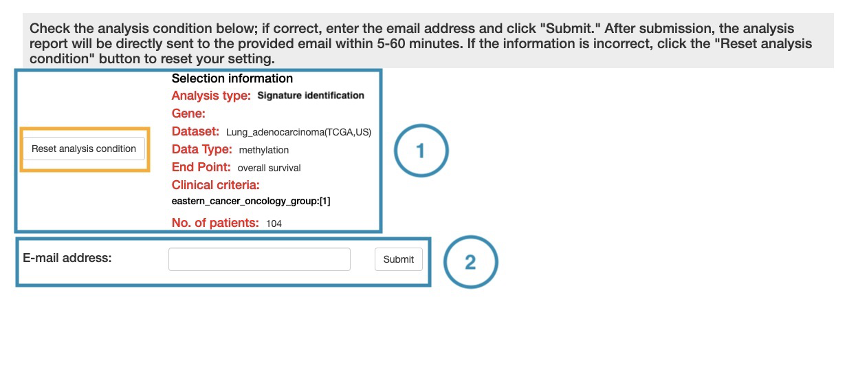
The 'Customized analysis' function allows users to construct their gene-based signature or multivariate regression model by uploading the specific candidate gene list or clinical factors they are interested in.
The TCGA RNA sequencing data and mutation data were collected from the GDC data portal [1], and processed with in-house script [2]. Level 3 copy number variation data were downloaded by applying the TCGA2BED tool [3]. Level 3 methylation data were collected from firehose [4]. TCGA clinical data were downloaded by using an R package, ‘TCGAbiolinks’ [5]. Survival endpoints were retrieved from TCGA-Clinical Data Resource (CDR) Outcome [6].
Reference
[1] “GDC data portal.”https://portal.gdc.cancer.gov/
[2] Liu, S.H., Shen, P.C., Chen, C.Y., Hsu, A.N., Cho, Y.C., Lai, Y.L., Chen, F.H., Li, C.Y., Wang, S.C., Chen, M. et al. (2020) DriverDBv3: a multi-omics database for cancer driver gene research. Nucleic Acids Res, 48, D863-D870.
[3] Cumbo F, Fiscon G, Ceri S, Masseroli M, Weitschek E. TCGA2BED: extracting, extending, integrating, and querying The Cancer Genome Atlas. BMC bioinformatics. 2017;18(1):6
[4] “Broad GDAC firehose.” https://gdac.broadinstitute.org/
[5] Colaprico A, Silva TC, Olsen C, Garofano L, Cava C, Garolini D, et al. TCGAbiolinks: an R/Bioconductor package for integrative analysis of TCGA data. Nucleic acids research. 2015;44(8):e71-e
[6] Liu J, Lichtenberg T, Hoadley KA, Poisson LM, Lazar AJ, Cherniack AD, Kovatich AJ, Benz CC, Levine DA, Lee AV, Omberg L, Wolf DM, Shriver CD, Thorsson V; Cancer Genome Atlas Research Network, Hu H. An Integrated TCGA Pan-Cancer Clinical Data Resource to Drive High-Quality Survival Outcome Analytics. Cell. 2018 Apr 5;173(2):400-416.e11
Cancer
The 'Cancer' function summarizes the calculated results of prognostic genes in multi-omics levels by using published bioinformatics algorithms or tools for a specific cancer type or dataset. The important molecular pathway related to survival is also presented.
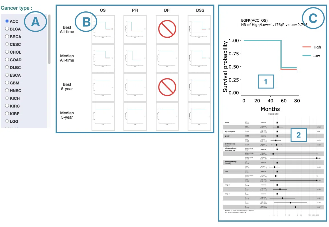
In the following sections, you will figure out how to access each section on the Cancer page. Each section, represented by a number in the screenshot below, has a corresponding page on the sidebar. You can access the desired tutorials by simply switching the sidebar.
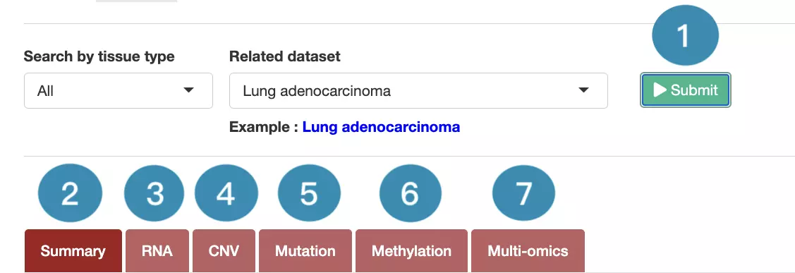
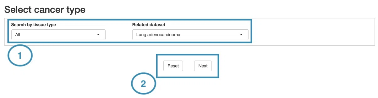
1.Data source and dataset
As you begin the analysis, the first step is inputting your data.
We have divided the process into three steps, marked in the below screenshot.

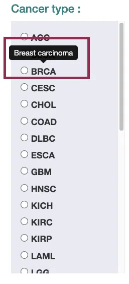
- Select a tissue type of dataset.
- Select a dataset according to the previous selected tissue type.
- Press ‘Submit’ button to view prognostic gene information of multiple features in a specific cancer type.
2. Summary
The Summary section provides the most significant survival-related genes (2.1) identified from the multi-omics levels in a specific cancer type, the multi-omics integrative network (2.2), and the functional annotation (2.3) of these survival genes.
The screenshot below provides an overview of the entire section, with numbers assigned to each subsection. You can easily navigate through the corresponding tutorials in the following content.
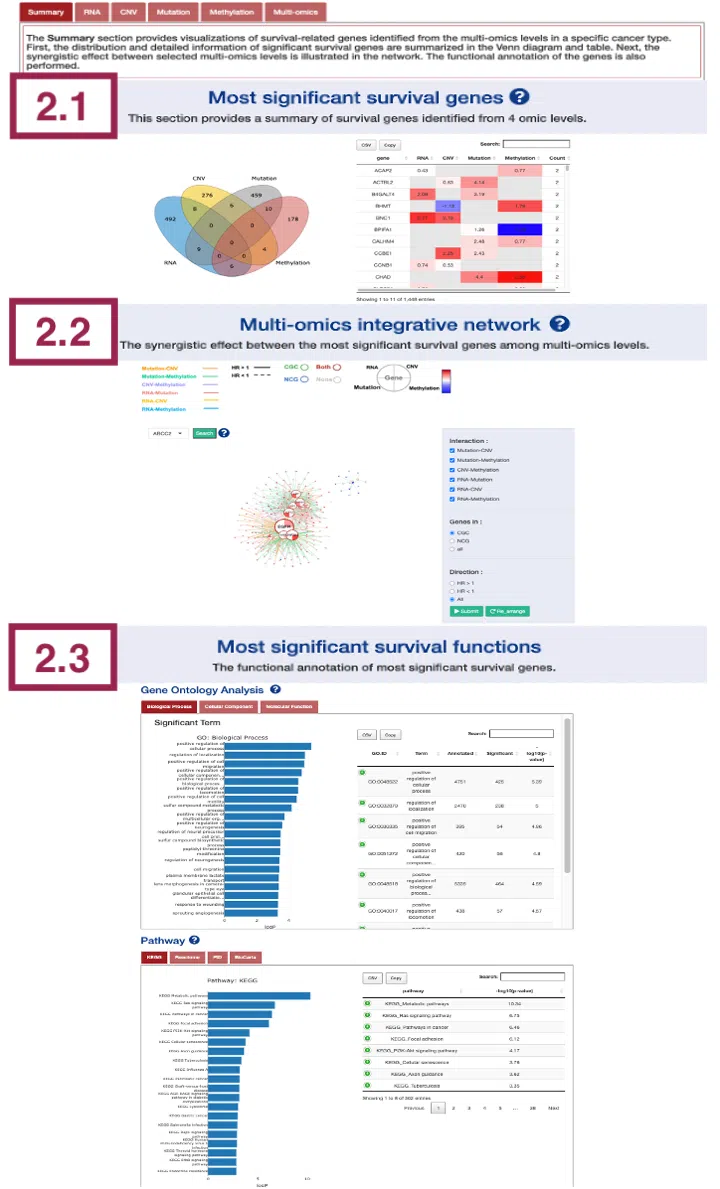
2.1 Most significant survival genes
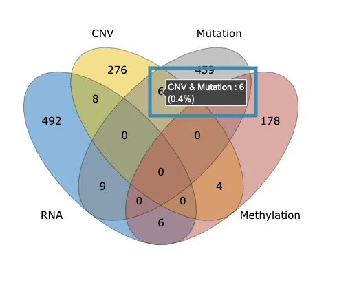
This section provides the most significant survival genes in 4-omics levels. The distribution and detailed information of significant survival genes are summarized in the Venn diagram and table.
Upon accessing this section, you will find a Venn diagram and a table, as depicted in the screenshot. The Venn diagram on the left-hand side will be described in section 2.1.1, while the table will be explained in section 2.1.2.
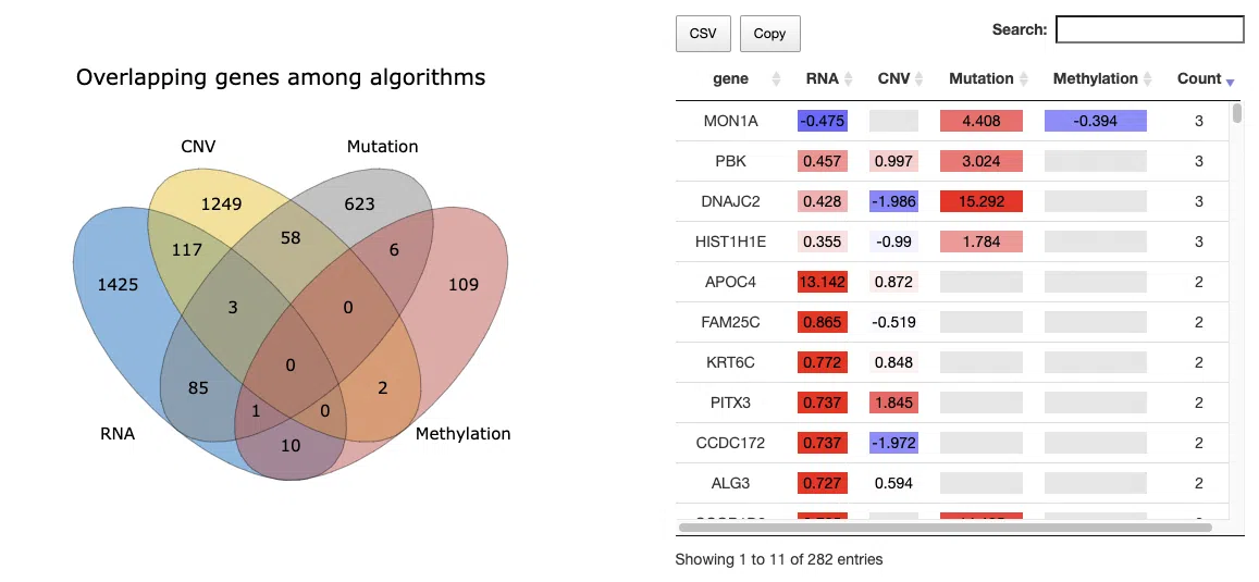
2.1.1 The distribution of most significant survival genes
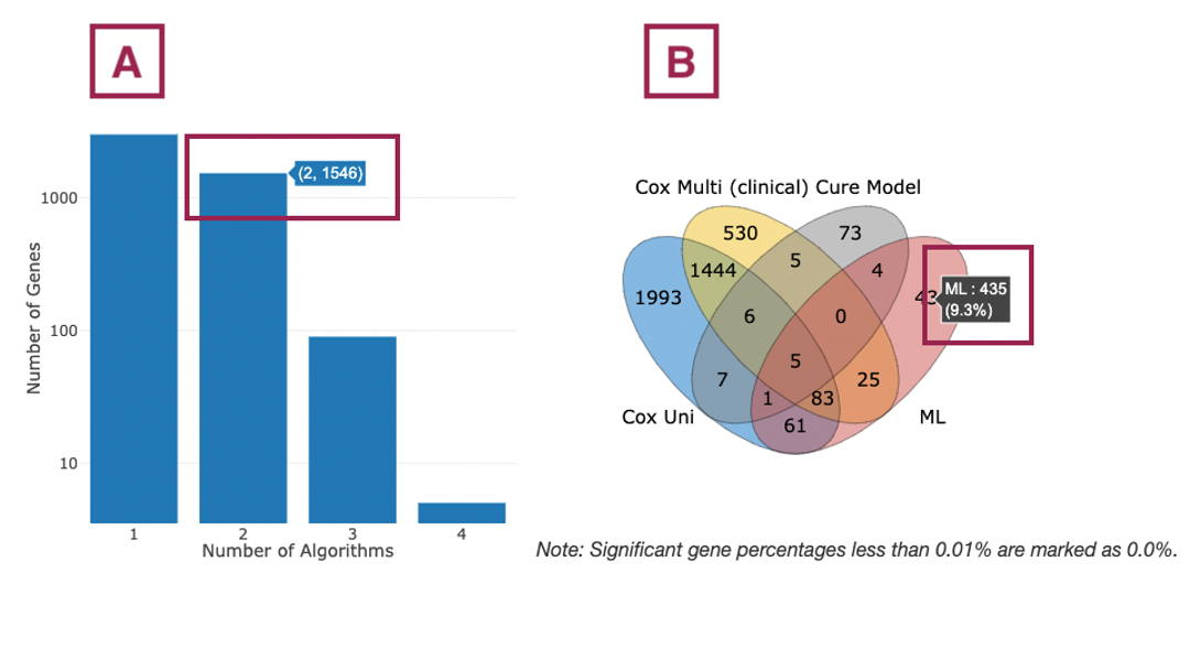
The Venn diagram illustrates the number of most significant survival-related genes in 4-omics levels: RNA expression, copy number variation (CNV), somatic mutation, and DNA methylation. The most significant gene must be identified by at least three survival algorithms concurrently. Users can move the mouse to the number in each colored area to view the numbers and percentage (number of genes in an area/total genes) of significant genes.
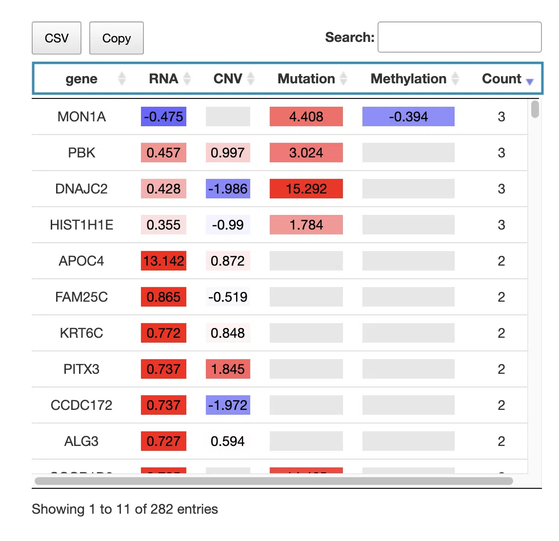
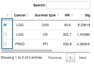
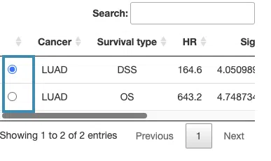
2.1.2 Hazard ratio of most significant survival genes
The table displays the symbol of the most significant survival-related genes, their log2 hazard ratios, and significance (red for positive values; blue for negative values) in the 4-omics level. The log2 hazard ratios are calculated by univariate regression (cox uni) and multivariate regression with clinical variables (cox multi (clinical)), and the more significant value will be listed in the table. The count column summarizes the number of omics levels the prognostic gene is identified.
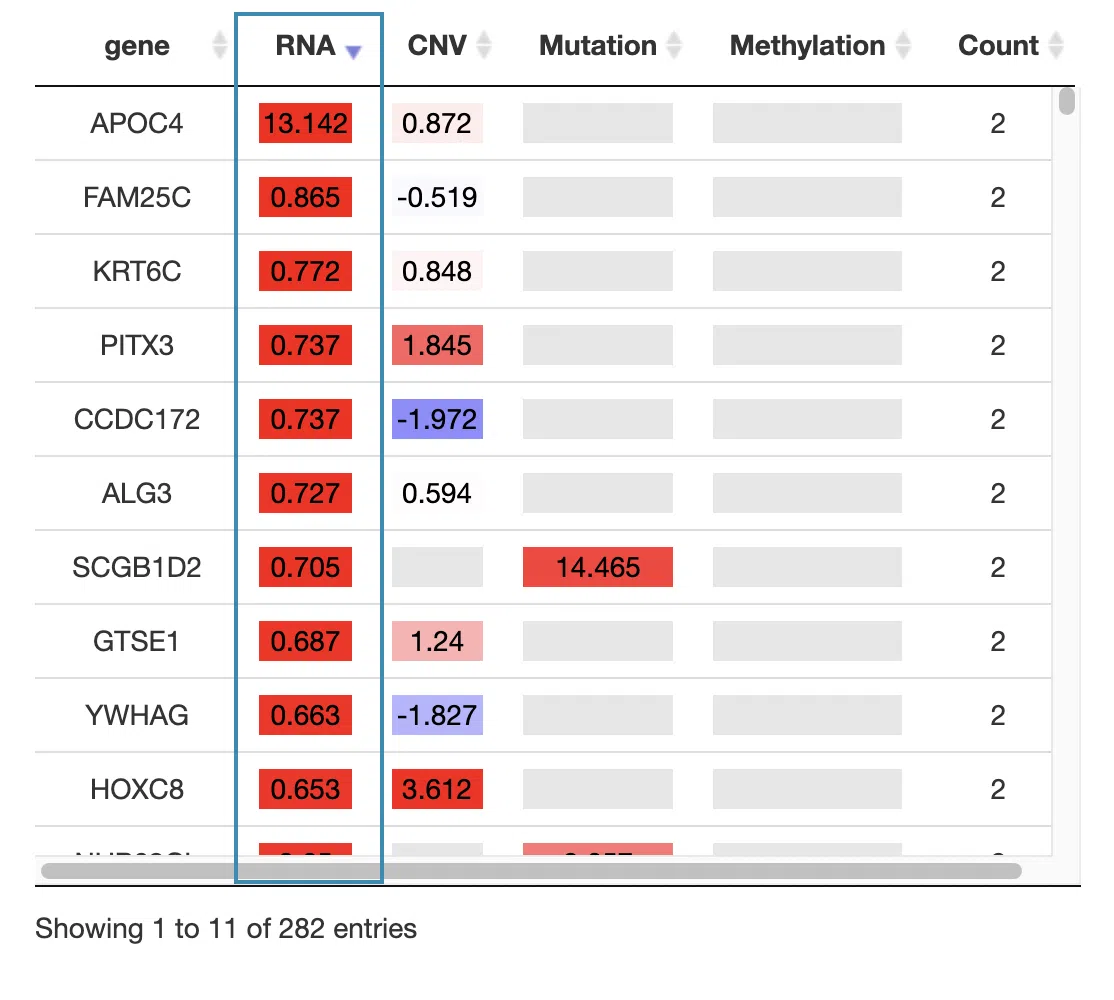
You can reorder each column in the table by clicking on the column name.
For example, after clicking on “RNA,” the log2 hazard ratios of RNA are displayed in decreasing order.
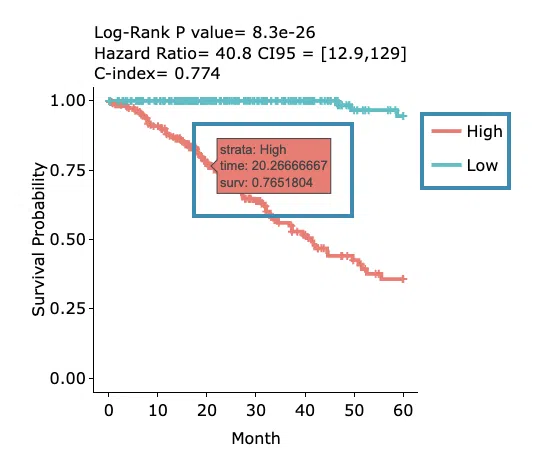
Click on a specific color cell in the table, and the corresponding KM plot will appear. The manipulation of the pop-up window is provided below, corresponding to the order in the screenshot.
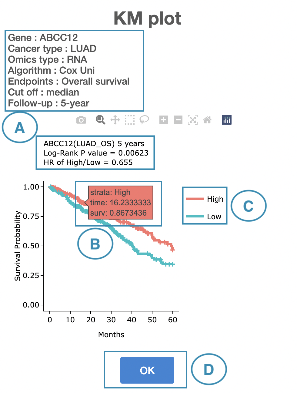
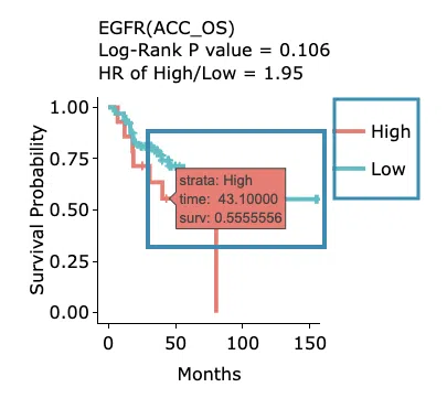
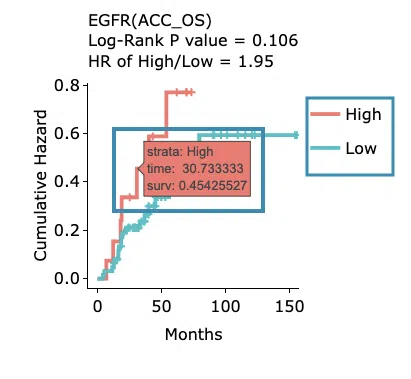
- The top of the window lists the condition of the KM plot, and the top of the Kaplan-Meier survival curves plot lists the values calculated by survival analysis.
- Hover the mouse on the curve to view the detailed information on strata, time, and survival probability. The plot's x-axis is the survival time starting from the initial cancer diagnosis, and the y-axis is the survival probability.
-
You can hide or show a particular curve by clicking on the corresponding legend. The explanation of the legend is below.
- In RNA, high/low in the legend refers to a higher/lower gene expression value.
- In CNV, gain/loss in the legend refers to copy number gain/loss, and none refers to none of copy number variation.
- In mutation, Mut on the legend refers to mutation, and WT refers to wild-type.
- In methylation, high or hypo in the legend refers to methylation, and low or none refers to none methylation.
- After viewing the plot, click the "OK" button to back to the table.
2.2 Multi-omics integrative network
The network presents the relationships between survival-related genes among multi-omics levels in a specific cancer type.
The network can be zoomed in/out by rolling up/down the mouse and be moved by clicking and dragging on it. Users are allowed to view the connection of a certain gene or line by clicking on the gene or line. Then, click the "Re_arrange" and "Submit" buttons, in turn, to back to the overview of the network. The manipulation is explained below as corresponding to the order in the screenshot.
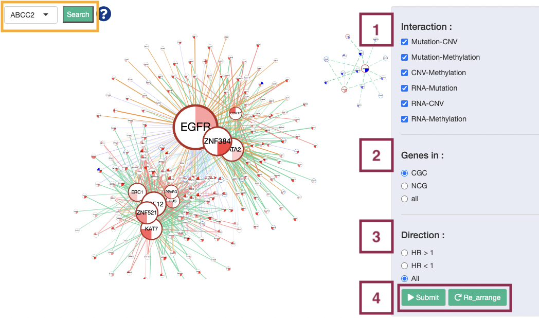
Note: Search. Users are allowed to view the synergistic effect of a specific gene by browsing gene symbol and press the “search” button. After searching, click the "Re_arrange" and "Submit" buttons, in turn, to back to the overview of the network.
Step 1. Select one or more interactions of synergistic effect to view.
- Mutation-CNV: synergistic effect between one gene in mutation level and another gene in CNV level.
- Mutation-Methylation: synergistic effect between one gene in mutation level and another gene in methylation level.
- CNV-Methylation: synergistic effect between one gene in CNV level and another gene in methylation level.
- RNA-Mutation: synergistic effect between the RNA expression of one gene and another gene in mutation level.
- RNA-CNV: synergistic effect between the RNA expression of one gene and another gene in CNV level.
- RNA-Methylation: synergistic effect between the RNA expression of one gene and another gene in methylation level.
Step 2. Toggle CGC/NCG6.0/all for selecting dataset.
- All: show all coding genes.
- NCG: show genes in the Network of Cancer Genes (NCG6.0) dataset and the genes that are connected to them.
- CGC: show genes in the Cancer Gene Census (CGC) dataset and the genes that are connected to them.
Step 3. Select the direction of hazard ratio to show in the plot.
- HR>1: show interaction with HR>1 only.
- HR<1: show interaction with HR<1 only.
- All: show all interaction.
Step 4. Click the “Submit” button after setting the conditions. If you want to reset the arrangement to the original state click the “Re_arrange” button.
Step 5. Click the 'Download JSON' and 'Download XML (Style)' button to download the network results. The downloaded network results can be used as input for Cytoscape. For the manipulation of Cytoscape, please refer to Help.
After all the setting processes, the synergistic network will appear as below. The explanation of each legend is in the following sections, and a simple example is provided in the last section.
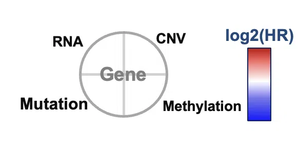
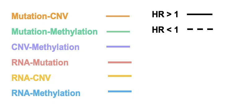
- Each node represents a survival-related gene. The size of the node depends on the connection with other nodes. The more connection it has, the larger it is. Each quarter of a circle represents an omic level, and the filling color is according to the log2HR value.
- The frame color presents the datasets these genes belong to. The resources of the gene dataset include the Cancer Gene Census (CGC) and the Network of Cancer Genes (NCG6.0).
- The line that connects two nodes, represent the synergistic effects between two different omics, defining by which hazard ratio (HR) of two genes is greater than 1.5 fold of each gene. The larger the |log2(HR)| value is, the heavier the line is. The color of lines represents the type of interaction between two genes, including synergistic effect between mutation-copy number variation (CNV), mutation-methylation, CNV-methylation, or PPI. The style of the line shows the direction of the hazard ratio.

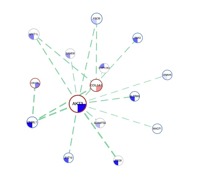
Example
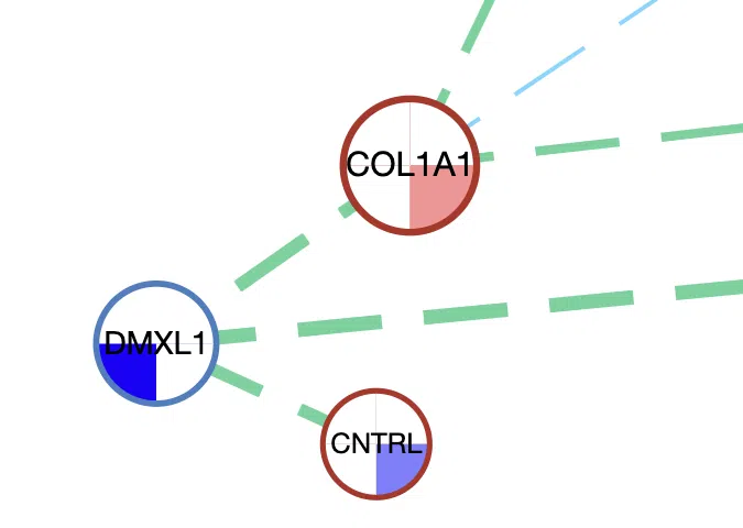
A simple example of the synergistic network of three genes, DMXL1, CNTRL, and COL1A1.
- The size of the node. Besides CNTRL, the other two genes have more lines connected to other genes; thus, they are displayed by nodes with larger sizes.
- The color inside the node. DMXL1 has a negative log2HR value in mutation, COL1A1 has a positive log2HR value in methylation, and CNTRL has a negative log2HR values in methylation.
- The frame color of the node. DMXL1 has a blue frame which represents that it is in the Network of Cancer Genes (NCG6.0) dataset, and the other two genes have red frames represent that they are in both the Cancer Gene Census (CGC) and the Network of Cancer Genes (NCG6.0) dataset.
- The color and style of connected lines. The lines between DMXL1 and CNTRL, COL1A1 are green, which refer that the synergistic effect between them is mutation-methylation. The dotted lines represent the hazard ratio is <1.
2.3 Most significant survival functions
This section provides two levels of functional analysis of all survival-related genes based on RNA expression in a specific cancer type: Gene Ontology (GO) and Pathway.
2.3.1 Gene Ontology Analysis
The topology of significantly altered GO categories accounted by topGO packages of Bioconductor. GO categories and genes are divided into three groups: biological process, cellular component, and molecular function. The left-hand side is the Significant Term based on the chosen category; the other side is a table of all significantly altered GO categories. The manipulation explains as corresponding to the order in the below screenshot.
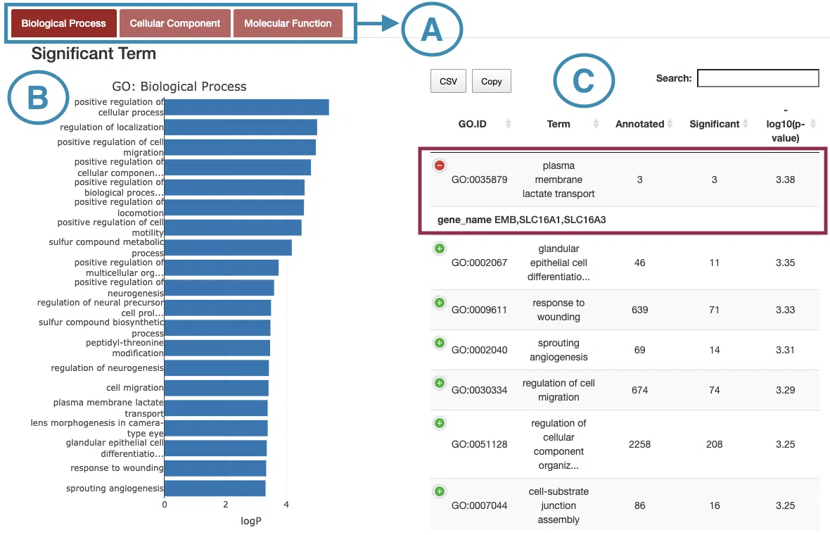
- Select the category to view.
- Move the mouse to the bar in the figure to view the -log10(p-value) of each significant term.
- The table lists the detailed information of the significant terms including GO.ID, GO term, annotated, significant, and -log10(p-value). Users can view the gene names by clicking on the “+” sign on the top-left of each row.
2.3.2 Pathway
The Pathwaysection includes collections of gene sets sourced from 4 public databases: KEGG, Reactome, PID, and BioCarta.
The manipulation explains as corresponding to the order in the below screenshot.
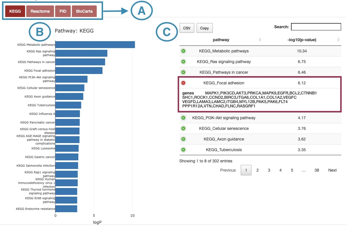
- Select the database to view.
- Move the mouse to the bar in the figure to view the -log10(p-value) of each pathway.
- The table lists the pathways and -log10(p-value). Users can view the genes in each pathway by clicking on the “+” sign on the top left of each row.
3. RNA
The RNA section provides visualizations to illustrate the survival-related genes based on RNA expression in a specific cancer type.
The screenshot below provides an overview of the entire section, with numbers assigned to each subsection. You can easily navigate through the corresponding tutorials in the following content.
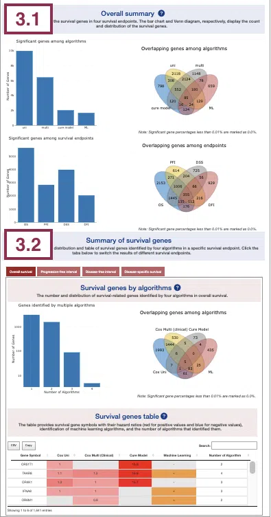
3.1 Overall summary
This section provides the number and distribution of survival-related genes identified by four algorithms in four survival endpoints.
The bar charts (A)(B) and Venn diagrams (C)(D) illustrate the number and distribution of survival-related genes with four survival endpoints, including overall survival (OS), progression-free interval (PFI), disease-specific survival (DSS), and disease-free interval (DFI), computing by four algorithms, univariate regression of RNA expression (cox uni), multivariate regression with clinical variables (cox multi (clinical)), cure model, and machine learning (ML).
For more information about the above algorithms, please refer to Help.
The explanation of each plot is listed below, corresponding to the order in the screenshot.
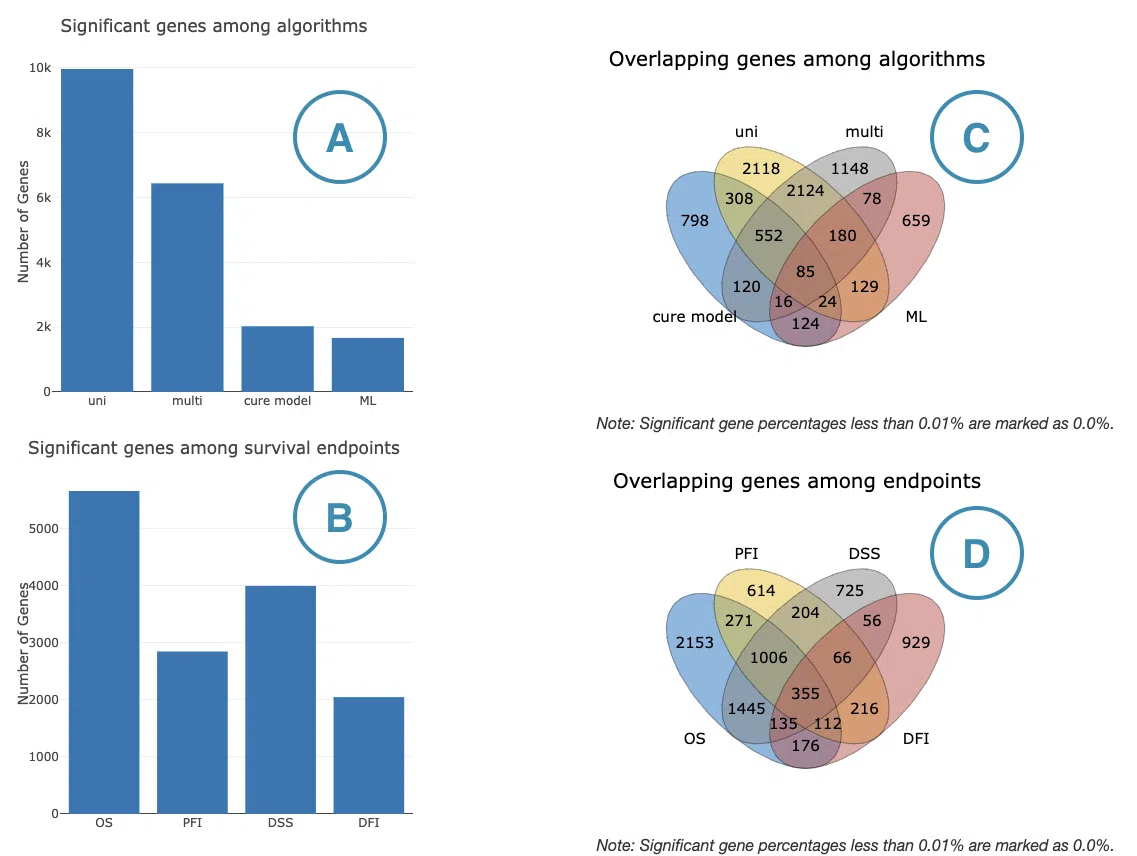
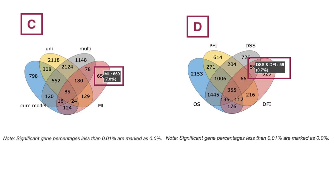
- The bar chart illustrates the number of survival-related genes computed by the four algorithms. The x-axis is the algorithm; the y-axis is the number of genes. As the mouse moves to the bar in the figure, the count of significant genes is provided.
- The bar chart illustrates the number of survival-related genes in four survival endpoints. The x-axis is survival endpoints; the y-axis is the number of genes. As the mouse moves to the bar in the figure, the count of significant genes is provided.
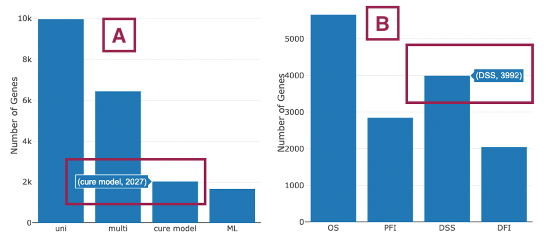
- The Venn diagram displays the distribution of survival-related genes of four algorithms. As the mouse moves to the number in each colored area, the numbers and percentages of significant genes are provided.
- The Venn diagram displays the distribution of survival-related genes of four survival endpoints. As the mouse moves to the number in each colored area, the numbers and percentages of significant genes are provided.
3.2 Summary of survival genes
This section provides the distribution and table of survival genes identified by four algorithms in four survival endpoints.
The screenshot provides an overview of the entire section, with assigned numbers indicating each part. The following description will correspond to the numbers marked in the screenshot.

Select a specific survival endpoint from the four tabs shown in the screenshot below. All subsequent results in the following section will be displayed based on the chosen survival endpoint.

3.2.1 Survival genes by algorithms
The bar charts (A) and Venn diagrams (B) illustrate the number and distribution of survival-related genes computing by four algorithms, univariate regression of RNA expression (cox uni), multivariate regression with clinical variables (cox multi (clinical)), cure model, and machine learning (ML). For more information about the above algorithms, please refer to Help.
The two plots are explained below according to the corresponding order marked in the screenshot.
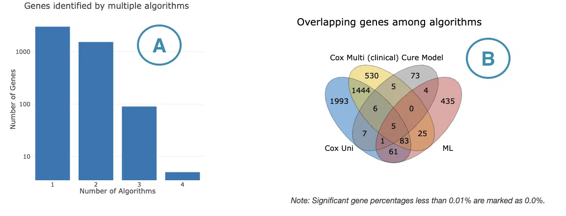
- The bar chart illustrates the number of survival-related genes computed by the four algorithms. The x-axis is the number of algorithms; the y-axis is the number of genes. As the mouse moves to the bar in the figure, the count of significant genes is provided.
- The Venn diagram displays the distribution of survival-related genes of four algorithms. As the mouse moves to the number in each colored area, the numbers and percentages of significant genes are provided.
3.2.2 Survival genes by algorithms
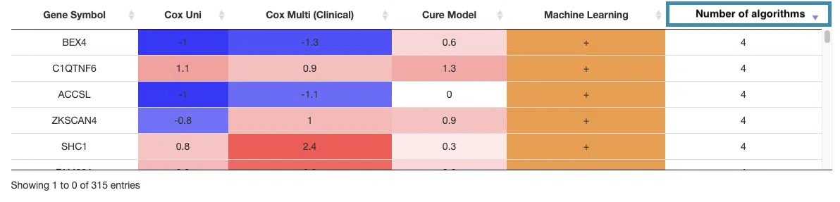
The table shows the symbol of survival-related genes and log2 hazard ratios, identified by three algorithms including univariate regression of RNA expression (cox uni), multivariate regression with clinical variables (cox multi (clinical)), and cure model. Positive values are marked red, and negative values are marked blue. In the “Machine Learning” column, survival genes identified by machine learning algorithms are marked as “+”. For more information about the above algorithms, please refer to Help. The “Number of algorithms” column summarizes the number of algorithms, which defines the significance of survival.
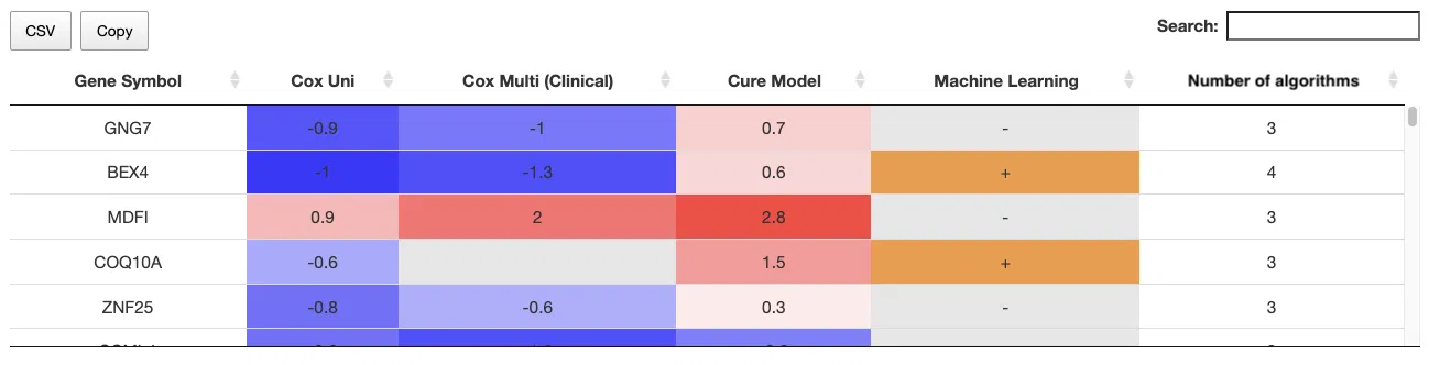
You can reorder each column in the table by clicking on the column name.
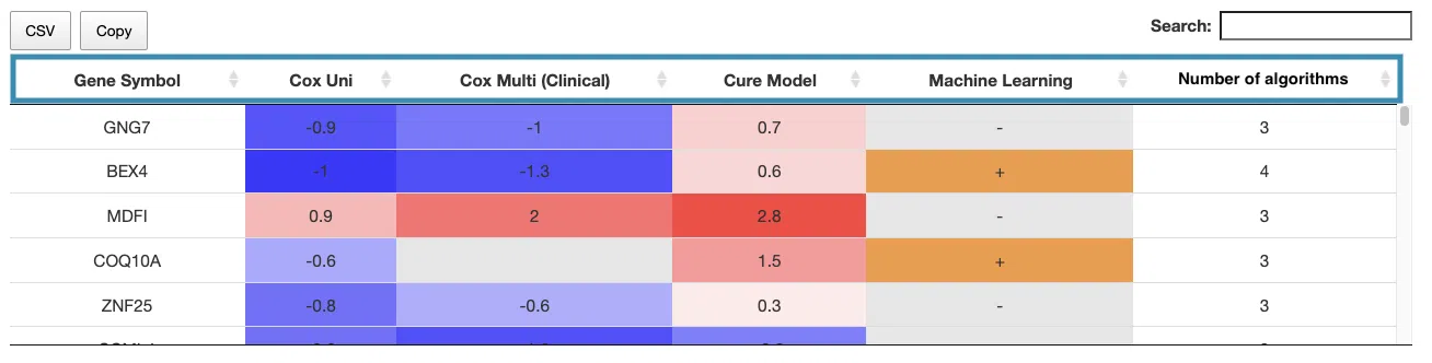
For example, after clicking on “Number of algorithms”, the numbers are displayed in decreasing order.
4. CNV
The CNV section provides visualizations illustrating the survival-related genes based on copy number variation (CNV) gain or loss of coding genes in a specific cancer type.
The screenshot below provides an overview of the entire section, with numbers assigned to each subsection. You can easily navigate through the corresponding tutorials in the following content.

4.1 Overall summary
This section provides the number and distribution of survival-related genes identified by four algorithms in four survival endpoints.
The bar charts (A)(B) and Venn diagrams (C)(D) illustrate the number and distribution of survival-related genes with four survival endpoints, including overall survival (OS), progression-free interval (PFI), disease-specific survival (DSS), and disease-free interval (DFI), computing by four algorithms, univariate regression of copy number variation (cox uni), multivariate regression with clinical variables (cox multi (clinical)), cure model, and machine learning (ML).
For more information about the above algorithms, please refer to Help.
The explanation of each plot is listed below, corresponding to the order in the screenshot.
- The bar chart illustrates the number of survival-related genes computed by the four algorithms. The x-axis is the algorithm; the y-axis is the number of genes. As the mouse moves to the bar in the figure, the count of significant genes is provided.
- The bar chart illustrates the number of survival-related genes in four survival endpoints. The x-axis is survival endpoints; the y-axis is the number of genes. As the mouse moves to the bar in the figure, the count of significant genes is provided.
- The Venn diagram displays the distribution of survival-related genes of four algorithms. As the mouse moves to the number in each colored area, the numbers and percentages of significant genes are provided.
- The Venn diagram displays the distribution of survival-related genes of four survival endpoints. As the mouse moves to the number in each colored area, the numbers and percentages of significant genes are provided.
4.2 Summary of survival genes
This section provides the distribution and table of survival genes identified by four algorithms in four survival endpoints.
The screenshot provides an overview of the entire section, with assigned numbers indicating each part. The following description will correspond to the numbers marked in the screenshot.

Select a specific survival endpoint from the four tabs shown in the screenshot below. All subsequent results in the following section will be displayed based on the chosen survival endpoint.
4.2.1 Survival genes by algorithms
The bar charts (A) and Venn diagrams (B) illustrate the number and distribution of survival-related genes computing by four algorithms, univariate regression of copy number variation (cox uni), multivariate regression with clinical variables (cox multi (clinical)), cure model, and machine learning (ML).
For more information about the above algorithms, please refer to Help.
- The bar chart illustrates the number of survival-related genes computed by the four algorithms. The x-axis is the number of algorithms; the y-axis is the number of genes. As the mouse moves to the bar in the figure, the count of significant genes is provided.
- The Venn diagram displays the distribution of survival-related genes of four algorithms. As the mouse moves to the number in each colored area, the numbers and percentages of significant genes are provided.
4.2.2 Survival genes by algorithms
The table shows the symbol of survival-related genes and log2 hazard ratios, identified by three algorithms including univariate regression of copy number variation (cox uni), multivariate regression with clinical variables (cox multi (clinical)), and cure model. Positive values are marked red, and negative values are marked blue. In the “Machine Learning” column, survival genes identified by machine learning algorithms are marked as “+”. For more information about the above algorithms, please refer to Help. The “Number of algorithms” column summarizes the number of algorithms, which defines the significance of survival.
You can reorder each column in the table by clicking on the column name.
For example, after clicking on “Number of algorithms”, the numbers are displayed in decreasing order.
5. Mutation
The Mutation section provides visualizations illustrating the survival-related genes based on mutation status in a specific cancer type.
The screenshot below provides an overview of the entire section, with numbers assigned to each subsection. You can easily navigate through the corresponding tutorials in the following content.

5.1 Overall summary
This section provides the number and distribution of survival-related genes identified by four algorithms in four survival endpoints.
The bar charts (A)(B) and Venn diagrams (C)(D) illustrate the number and distribution of survival-related genes with four survival endpoints, including overall survival (OS), progression-free interval (PFI), disease-specific survival (DSS), and disease-free interval (DFI), computing by four algorithms, univariate regression of mutation event (cox uni), multivariate regression with clinical variables (cox multi (clinical)), cure model, and machine learning (ML).
For more information about the above algorithms, please refer to Help.
The explanation of each plot is listed below, corresponding to the order in the screenshot.
- The bar chart illustrates the number of survival-related genes computed by the four algorithms. The x-axis is the algorithm; the y-axis is the number of genes. As the mouse moves to the bar in the figure, the count of significant genes is provided.
- The bar chart illustrates the number of survival-related genes in four survival endpoints. The x-axis is survival endpoints; the y-axis is the number of genes. As the mouse moves to the bar in the figure, the count of significant genes is provided.
- The Venn diagram displays the distribution of survival-related genes of four algorithms. As the mouse moves to the number in each colored area, the numbers and percentages of significant genes are provided.
- The Venn diagram displays the distribution of survival-related genes of four survival endpoints. As the mouse moves to the number in each colored area, the numbers and percentages of significant genes are provided.
5.2 Summary of survival genes
This section provides the distribution and table of survival genes identified by four algorithms in four survival endpoints.
The screenshot provides an overview of the entire section, with assigned numbers indicating each part. The following description will correspond to the numbers marked in the screenshot.
Select a specific survival endpoint from the four tabs shown in the screenshot below. All subsequent results in the following section will be displayed based on the chosen survival endpoint.
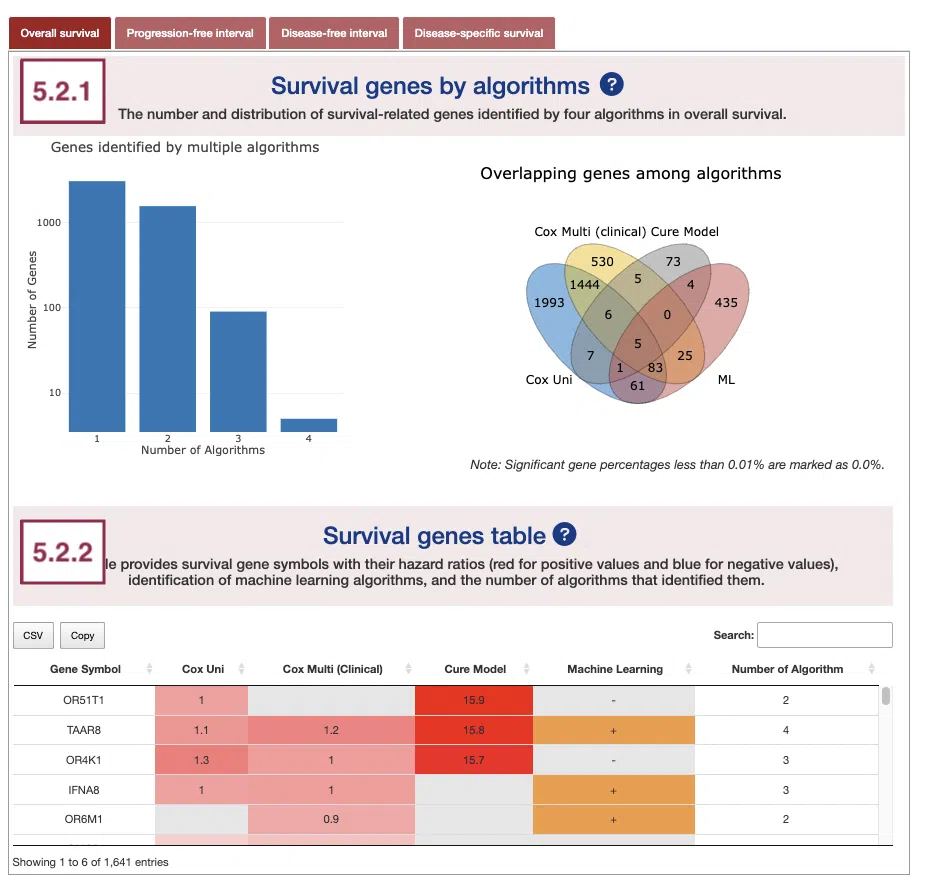
5.2.1 Survival genes by algorithms
The bar charts (A) and Venn diagrams (B) illustrate the number and distribution of survival-related genes computing by four algorithms, univariate regression of mutation event (cox uni), multivariate regression with clinical variables (cox multi (clinical)), cure model, and machine learning (ML).
For more information about the above algorithms, please refer to Help.
The two plots are explained below according to the corresponding order marked in the screenshot.
- The bar chart illustrates the number of survival-related genes computed by the four algorithms. The x-axis is the number of algorithms; the y-axis is the number of genes. As the mouse moves to the bar in the figure, the count of significant genes is provided.
- The Venn diagram displays the distribution of survival-related genes of four algorithms. As the mouse moves to the number in each colored area, the numbers and percentages of significant genes are provided.
5.2.2 Survival genes by algorithms
The table shows the symbol of survival-related genes and log2 hazard ratios, identified by three algorithms including univariate regression of mutation status (cox uni), multivariate regression with clinical variables (cox multi (clinical)), and cure model. Positive values are marked red, and negative values are marked blue. In the “Machine Learning” column, survival genes identified by machine learning algorithms are marked as “+”. For more information about the above algorithms, please refer to Help. The “Number of algorithms” column summarizes the number of algorithms, which defines the significance of survival.
You can reorder each column in the table by clicking on the column name.
For example, after clicking on “Number of algorithms”, the numbers are displayed in decreasing order.
6. Methylation
The Methylation section provides visualizations illustrating the survival-related genes based on their methylation level in a specific cancer type.
The screenshot below provides an overview of the entire section, with numbers assigned to each subsection. You can easily navigate through the corresponding tutorials in the following content.
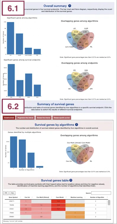
6.1 Overall summary
This section provides the number and distribution of survival-related genes identified by four algorithms in four survival endpoints.
The bar charts (A)(B) and Venn diagrams (C)(D) illustrate the number and distribution of survival-related genes with four survival endpoints, including overall survival (OS), progression-free interval (PFI), disease-specific survival (DSS), and disease-free interval (DFI), computing by four algorithms, univariate regression of methylation level (cox uni), multivariate regression with clinical variables (cox multi (clinical)), cure model, and machine learning (ML).
For more information about the above algorithms, please refer to Help.
The explanation of each plot is listed below, corresponding to the order in the screenshot.
- The bar chart illustrates the number of survival-related genes computed by the four algorithms. The x-axis is the algorithm; the y-axis is the number of genes. As the mouse moves to the bar in the figure, the count of significant genes is provided.
- The bar chart illustrates the number of survival-related genes in four survival endpoints. The x-axis is survival endpoints; the y-axis is the number of genes. As the mouse moves to the bar in the figure, the count of significant genes is provided.
- The Venn diagram displays the distribution of survival-related genes of four algorithms. As the mouse moves to the number in each colored area, the numbers and percentages of significant genes are provided.
- The Venn diagram displays the distribution of survival-related genes of four survival endpoints. As the mouse moves to the number in each colored area, the numbers and percentages of significant genes are provided.
6.2 Summary of survival genes
This section provides the distribution and table of survival genes identified by four algorithms in four survival endpoints.
The screenshot provides an overview of the entire section, with assigned numbers indicating each part. The following description will correspond to the numbers marked in the screenshot.

Select a specific survival endpoint from the four tabs shown in the screenshot below. All subsequent results in the following section will be displayed based on the chosen survival endpoint.
6.2.1 Survival genes by algorithms
The bar charts (A) and Venn diagrams (B) illustrate the number and distribution of survival-related genes computing by four algorithms, univariate regression of methylation level (cox uni), multivariate regression with clinical variables (cox multi (clinical)), cure model, and machine learning (ML).
For more information about the above algorithms, please refer to Help.
The two plots are explained below according to the corresponding order marked in the screenshot.
- The bar chart illustrates the number of survival-related genes computed by the four algorithms. The x-axis is the number of algorithms; the y-axis is the number of genes. As the mouse moves to the bar in the figure, the count of significant genes is provided.
- The Venn diagram displays the distribution of survival-related genes of four algorithms. As the mouse moves to the number in each colored area, the numbers and percentages of significant genes are provided.
6.2.2 Survival genes by algorithms
The table shows the symbol of survival-related genes and log2 hazard ratios, identified by three algorithms including univariate regression of methylation level (cox uni), multivariate regression with clinical variables (cox multi (clinical)), and cure model. Positive values are marked red, and negative values are marked blue. In the “Machine Learning” column, survival genes identified by machine learning algorithms are marked as “+”. For more information about the above algorithms, please refer to Help. The “Number of algorithms” column summarizes the number of algorithms, which defines the significance of survival.
You can reorder each column in the table by clicking on the column name.
For example, after clicking on “Number of algorithms”, the numbers are displayed in decreasing order.
7. Multi-Omics
The Multi-omics section provides the results of survival-related genes in all 4-omics levels (RNA, CNV, mutation, and methylation) identified by machine learning algorithms (Lasso, random forest, and I-Boost).
The screenshot below provides an overview of the entire section, with numbers assigned to each subsection. You can easily navigate through the corresponding tutorials in the following content.
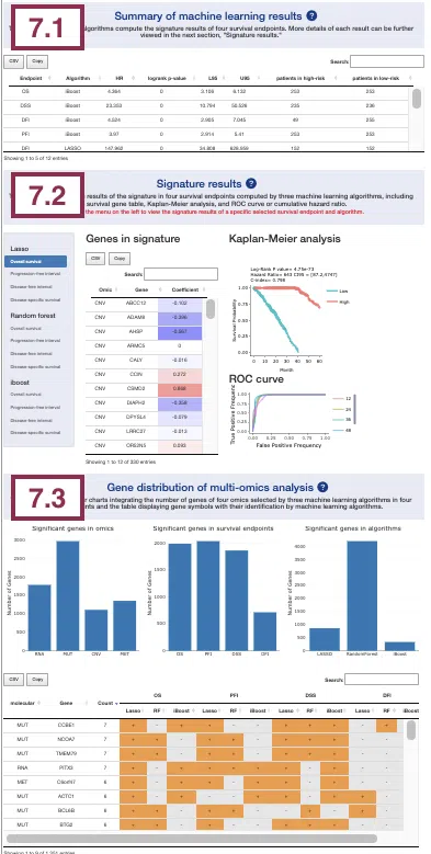
7.1 Summary of machine learning results
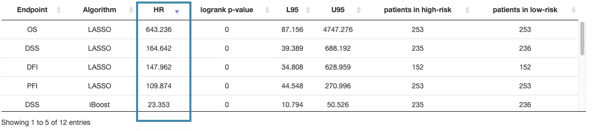
This section provides a table that summarizes the machine learning results of four survival endpoints, overall survival (OS), progression-free interval (PFI), disease-specific survival (DSS), and disease-free interval (DFI), respectively calculated by three machine learning algorithms, Lasso, random forest, and I-Boost. For more information about the above algorithms, please refer to Help.
The table lists the results of different survival endpoints computed by each machine learning algorithm, and in the next section, you can further view the corresponding survival gene table, Kaplan-Meier analysis, and ROC curve or cumulative hazard ratio.
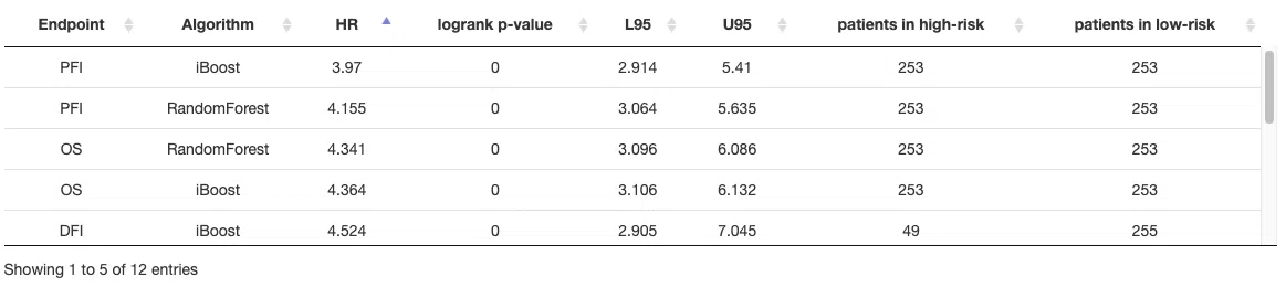
You can reorder each column in the table by clicking on the column name.
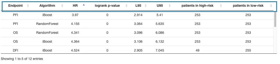
For example, after clicking on “HR,” the values are displayed in decreasing order.
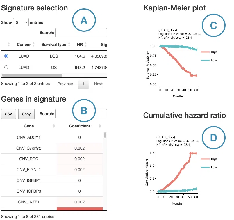
7.2 Signature results
This section provides a survival gene table, Kaplan-Meier analysis, and ROC curve or cumulative hazard ratio plot according to the user-selected machine learning algorithm and survival endpoint on the left menu.
First, select a survival endpoint and a machine learning algorithm to view, and all the results will be displayed according to the selection.
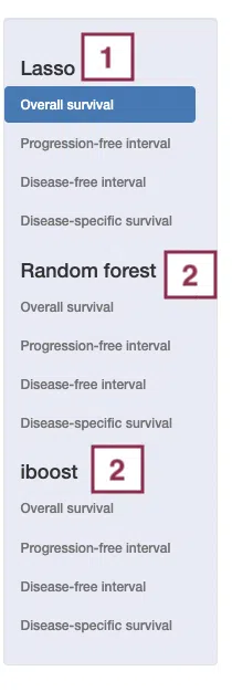
The following are the results of different algorithms, described according to the marked order in the screenshot.
-
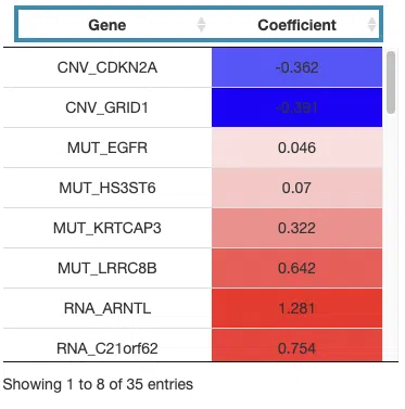
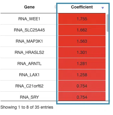
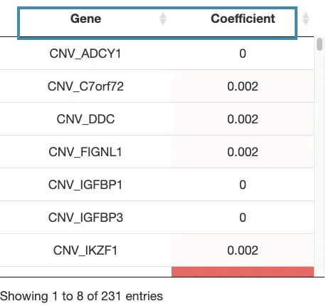
If you select results computed by the Lasso algorithm, a table with gene name and coefficient values, the KM plot, and ROC curves will be displayed.
The screenshot below provides an overview of this section, with each table and plot described in the following based on their corresponding marked order.
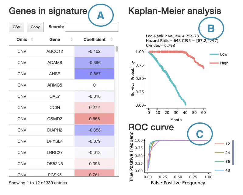
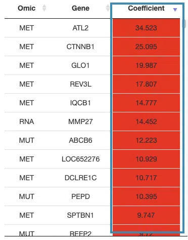
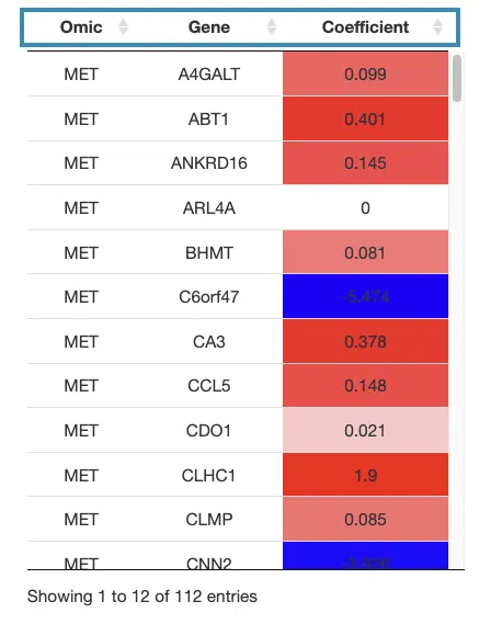
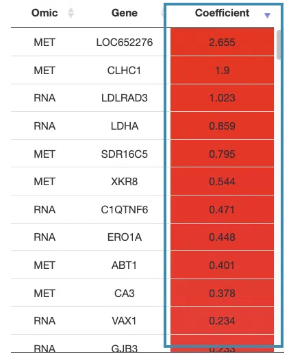
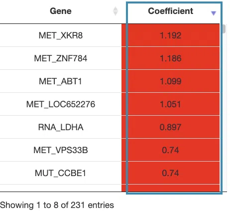
- The table lists the genes in the signature with the omic, gene name, and coefficient values (red for positive values and blue for negative values).
You can reorder each column in the table by clicking on the column name.
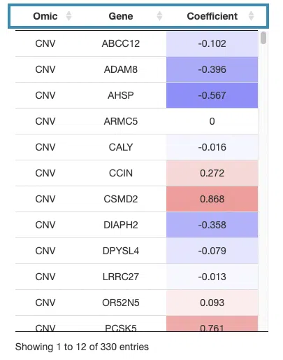
For example, after clicking on “Coefficient”, the values are displayed in decreasing order.
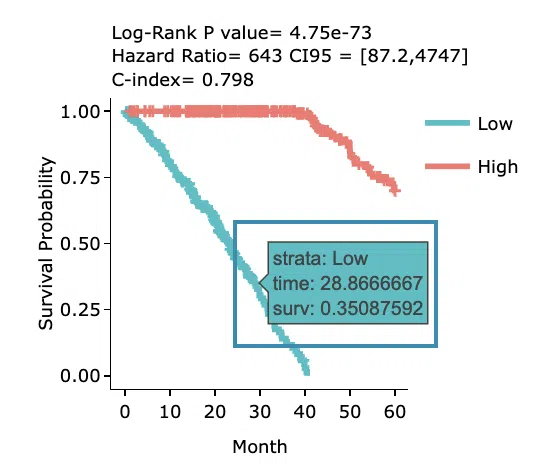
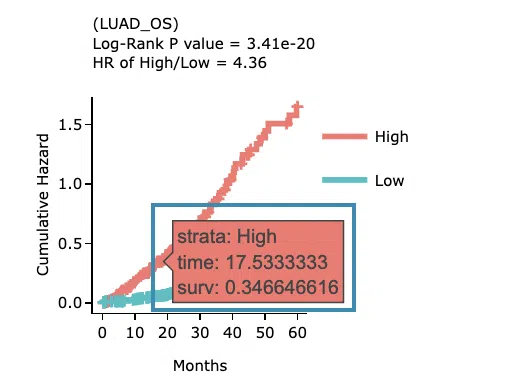
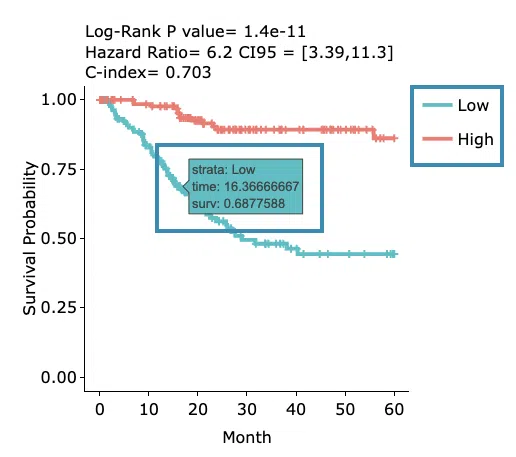
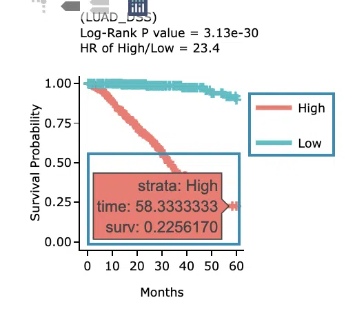
- The Kaplan-Meier plot of survival analysis.
The top of the plot lists the values calculated by survival analysis.
The plot's x-axis is the survival time starting from the initial cancer diagnosis, and the y-axis is the survival probability.
Hover the mouse on the curve to view the detailed information of strata, time, and survival probability.
You can click on the legend to hide or show the corresponding curve.
The explanation of the legend is as below.- Low = lower value in signature.
- High = higher value in signature.
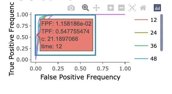
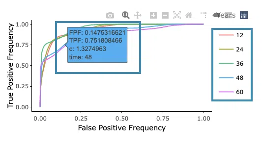
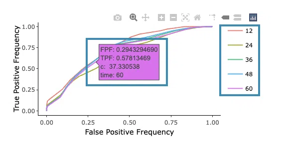
- ROC curves are used to evaluate the predictive power of signature in different survival times (month). The x-axis is the false-positive frequency, and the y-axis is the true-positive frequency. For the interpretation of the ROC curve, please refer to Help.
Hover the mouse on the curves to view the details of the false-positive frequency (FP), true-positive frequency (TP), and the unique marker values for the calculation of TP and FP (c value). You can show or hide a particular ROC curve by clicking on the corresponding legend beside the figure.
- The table lists the genes in the signature with the omic, gene name, and coefficient values (red for positive values and blue for negative values).
-
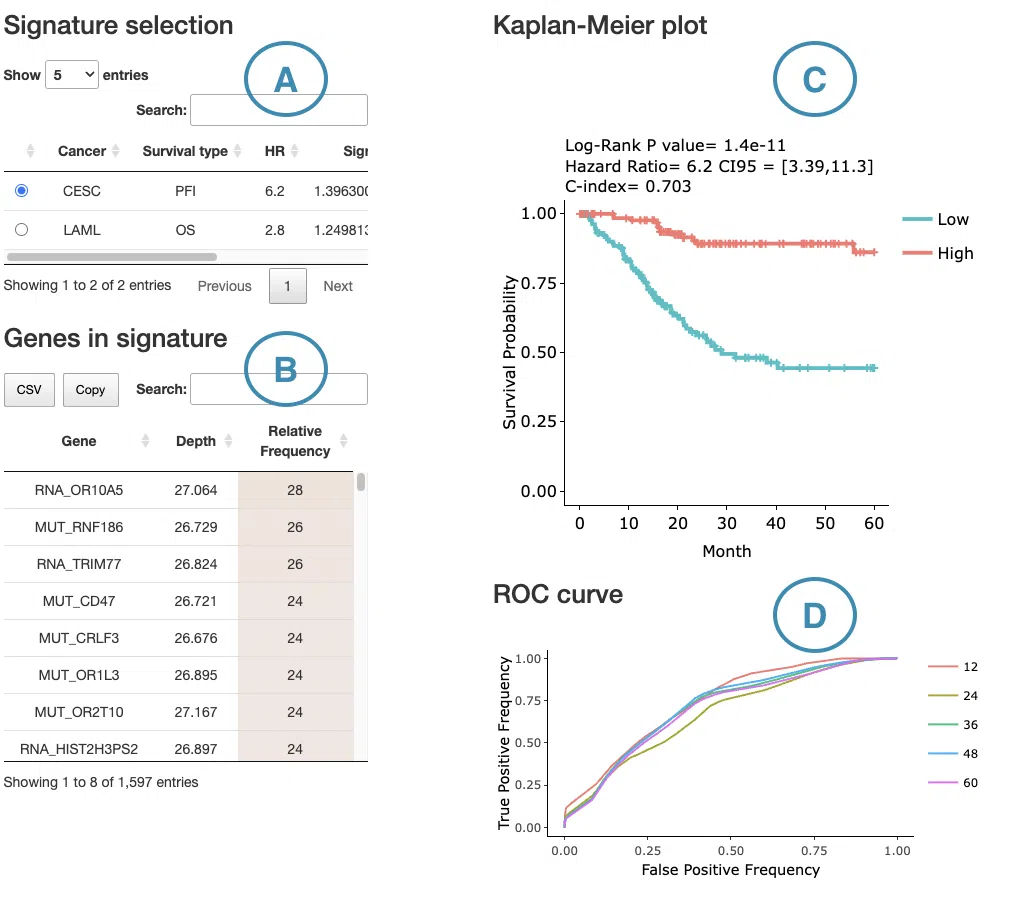
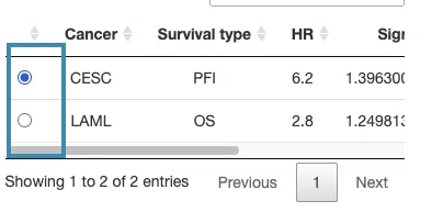
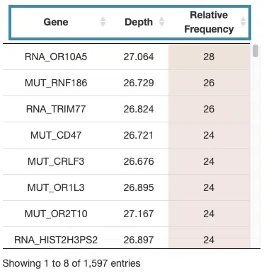
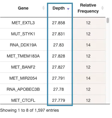
If you select results computed by the random forest algorithm, a table with gene name, depth and relative frequency, the KM plot, and ROC curves will be displayed.
The screenshot below provides an overview of this section, with each table and plot described in the following based on their corresponding marked order.
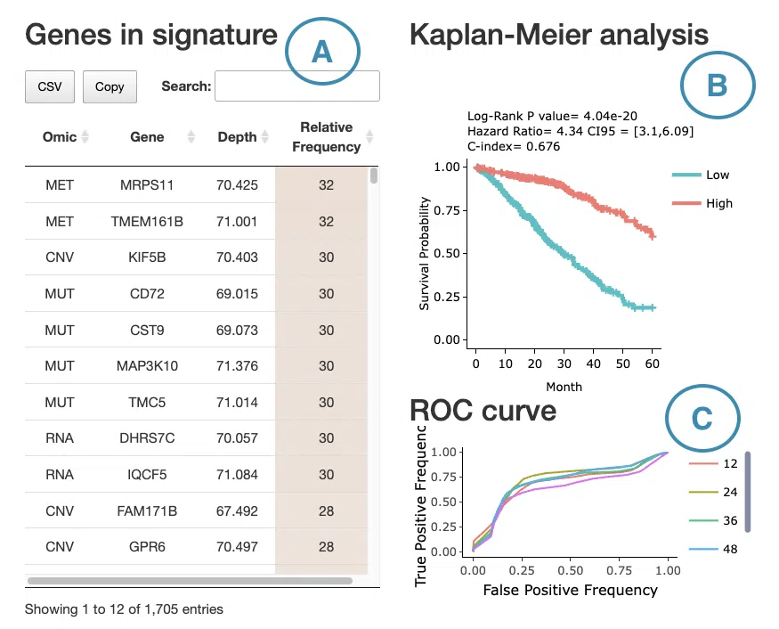
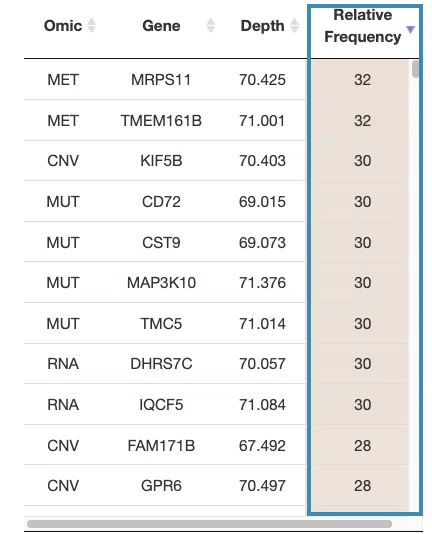
- The table lists the genes in the signature with the omic, gene name, depth, and relative frequency. The color of the relative frequency column is according to the value.
You can reorder each column in the table by clicking on the column name.
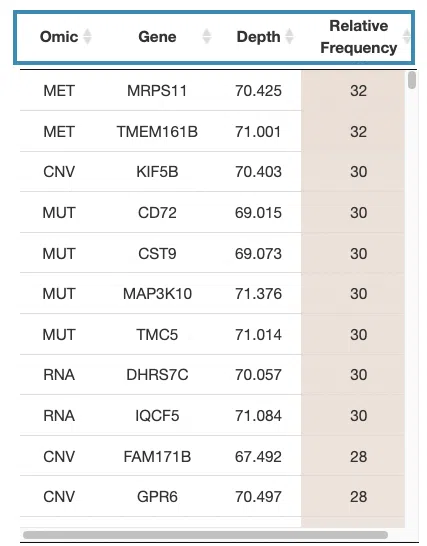
For example, after clicking on “relative frequency”, the values are displayed in decreasing order.
-
The Kaplan-Meier plot of survival analysis. The top of the plot lists the values calculated by survival analysis.
The plot's x-axis is the survival time starting from the initial cancer diagnosis, and the y-axis is the survival probability.
Hover the mouse on the curve to view the detailed information of strata, time, and survival probability. You can click on the legend to hide or show the corresponding curve.
The explanation of the legend is as below.- Low = lower value in signature.
- High = higher value in signature.
- ROC curves are used to evaluate the predictive power of signature in different survival times (month). The x-axis is the false-positive frequency, and the y-axis is the true-positive frequency. For the interpretation of the ROC curve, please refer to Help.
Hover the mouse on the curves to view the details of the false-positive frequency (FP), true-positive frequency (TP), and the unique marker values for the calculation of TP and FP (c value). You can show or hide a particular ROC curve by clicking on the corresponding legend beside the figure.
- The table lists the genes in the signature with the omic, gene name, depth, and relative frequency. The color of the relative frequency column is according to the value.
-
If you select results computed by the I-Boost algorithm, a table with gene name and coefficient values, the KM plot, and the cumulative hazard ratio plot will be displayed.
The screenshot below provides an overview of this section, with each table and plot described in the following based on their corresponding marked order.
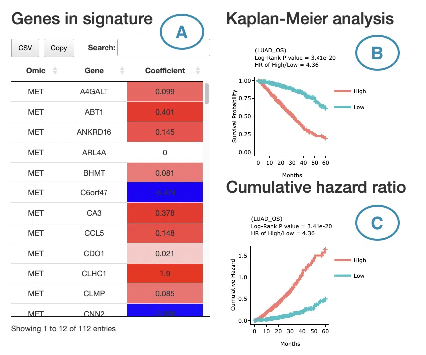
- The table lists the genes in the signature with the omic, gene name, and coefficient values (red for positive values and blue for negative values).
You can reorder each column in the table by clicking on the column name.
For example, after clicking on “Coefficient”, the values are displayed in decreasing order.
-
The Kaplan-Meier plot of survival analysis. The top of the plot lists the values calculated by survival analysis.
The plot's x-axis is the survival time starting from the initial cancer diagnosis, and the y-axis is the survival probability.
Hover the mouse on the curve to view the detailed information of strata, time, and survival probability.
You can click on the legend to hide or show the corresponding curve.
The explanation of the legend is as below.- Low = lower value in signature.
- High = higher value in signature.
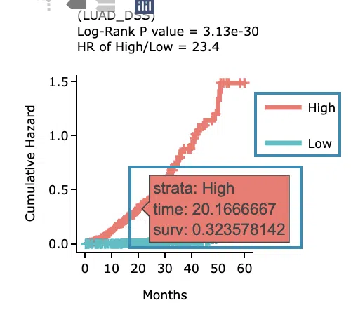
- The cumulative hazard ratio plot. The top of the plot lists the values calculated by survival analysis. The plot's x-axis is the survival time starting from the initial cancer diagnosis, and the y-axis is the cumulative hazard ratio. Hover the mouse on the curve to view the detailed information of strata, time, and survival probability. You can click on the legend to hide or show the corresponding curve. The explanation of the legend is as below.
- Low = lower value in signature.
- High = higher value in signature.
- The table lists the genes in the signature with the omic, gene name, and coefficient values (red for positive values and blue for negative values).
7.3 Gene distribution of multi-omics analysis
This section provides bar charts integrating the number of genes of four omics selected by three machine learning algorithms in four survival endpoints and the table displaying gene symbols with their identification by machine learning algorithms.
The screenshot below provides an overview of this section, with each plot and table described in the following based on their corresponding marked order.
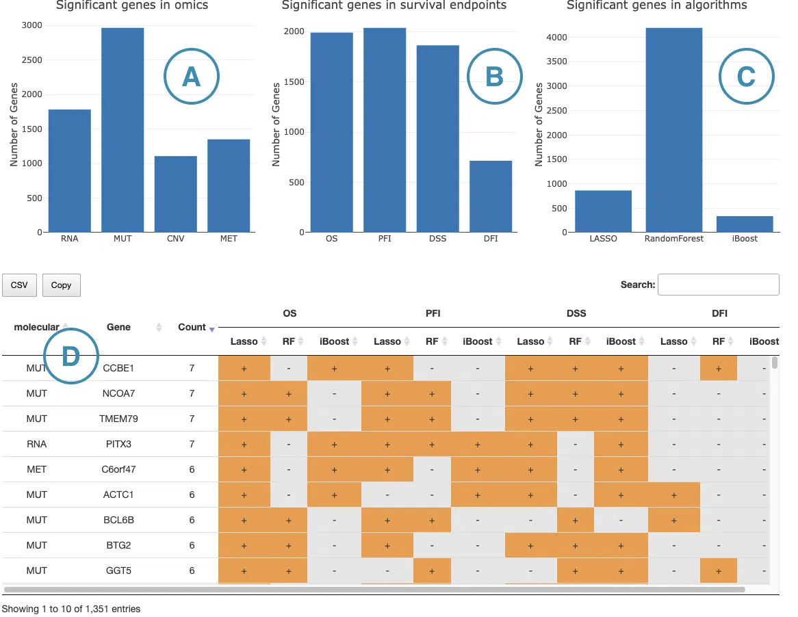
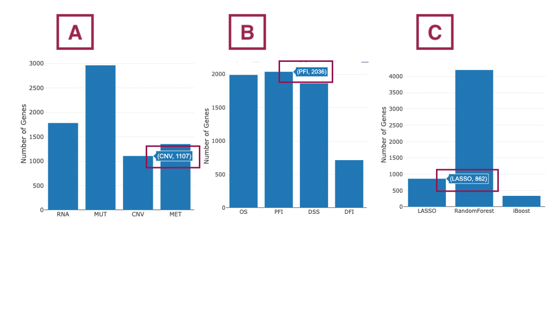
- The bar chart illustrates the number of significant genes identified by machine learning algorithms from 4 omics levels. The x-axis is the omic level; the y-axis is the count of genes identified by machine learning algorithms.
- The bar chart illustrates the number of significant genes in four survival endpoints, identified by machine learning algorithms from 4 omics levels. The x-axis is the survival endpoints; the y-axis is the count of genes identified by machine learning algorithms.
- The bar chart illustrates the number of significant genes identified by three machine learning algorithms. The x-axis is the machine learning algorithms; the y-axis is the count of genes.
Note: For all the above bar charts, you can view the count of significant genes by hovering the mouse on a particular bar.
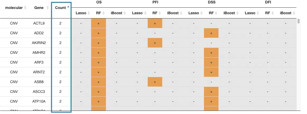
- The table lists the survival-related genes with omics in overall survival (OS), progression-free interval (PFI), disease-specific survival (DSS), and disease-free interval (DFI), identified respectively by Lasso, random forest, and I-Boost algorithm. The identified-survival genes are marked as "+."
You can reorder each column in the table by clicking on the column name.
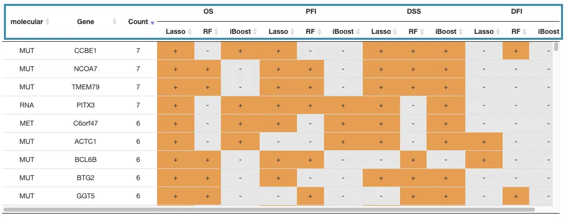
For example, after clicking on “Count,” the values are displayed in increasing order.
Gene
The 'Gene' function provides the multi-omics and multiple survival analyses of a user-selected gene within cancer types or datasets. Selected integrative multi-omics analyses are also presented.
In the following sections, you will figure out how to access each section on the Gene page. Each section, represented by a number in the screenshot below, has a corresponding page on the sidebar. You can access the desired tutorials by simply switching the sidebar.
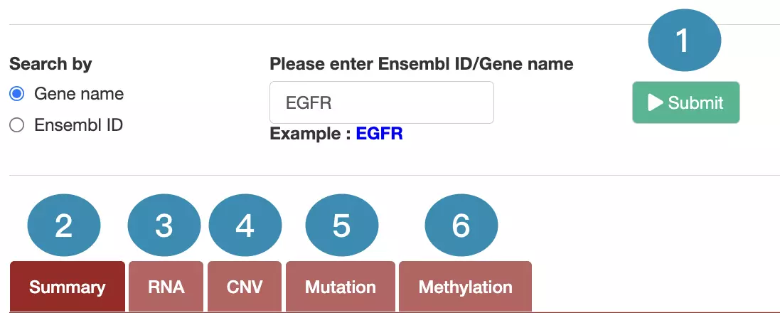
1. Data source and dataset
As you begin the analysis, the first step is inputting your data.
We have divided the process into three steps, marked in the below screenshot.

- Select to search by gene name or Ensembl ID.
- Enter the gene name or Ensembl ID.
- Press the ‘Submit’ button to view the analysis of the selected gene across multiple cancer types.
2. Summary
The Summary section provides visualizations to illustrate the survival probability and interaction of user-selected genes identified in multi-omics levels across multiple cancer types.
The screenshot below provides an overview of the entire section, with numbers assigned to each subsection. You can easily navigate through the corresponding tutorials in the following content.
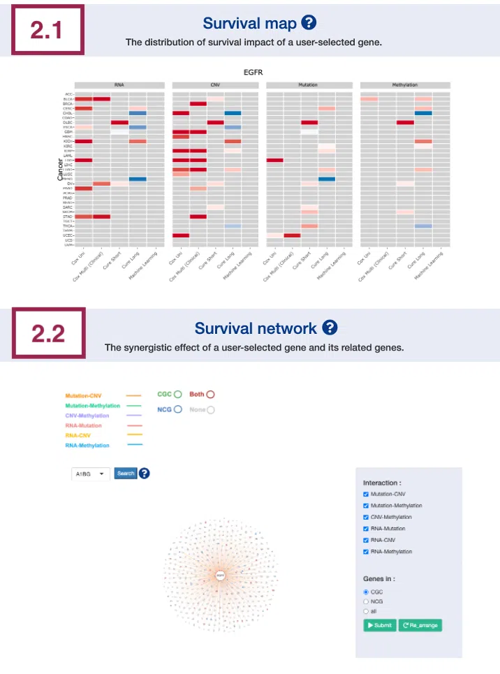
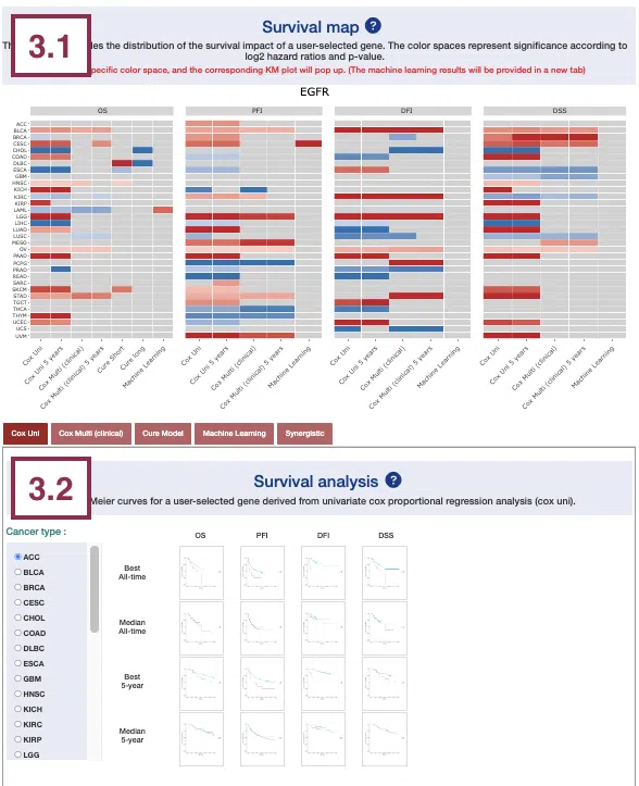
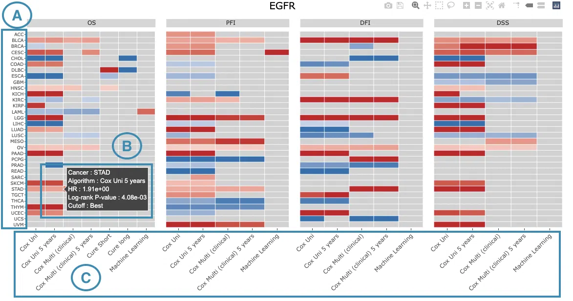
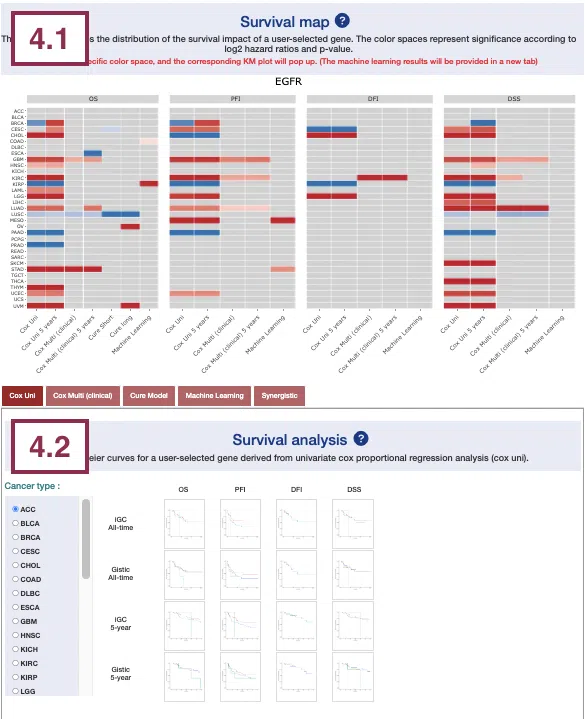
2.1 Survival map
This section provides four heatmaps to display the survival impact of the user-selected gene in 4-omics levels, including RNA expression, copy number variation (CNV), somatic mutation, and DNA methylation across multiple cancer types.
Each condition is analyzed by four survival algorithms, univariate (cox uni), multivariate regression with clinical variables (cox multi (clinical)), cure model, and machine learning (ML), including Lasso, random forest, and I-Boost.
The cure model can be described by short-term (cure_short) and long-term (cure_long) results. For more information about the above algorithms, please refer to Help.
The heatmap will be described based on its corresponding marked order in the screenshot provided below.
- The abbreviations of cancer types. For the full names, please refer to Help.
-
Color space in the plot represents that the user-selected gene is significant in specific cancer types according to log2 hazard ratios and p-value calculated by the survival algorithms.
Positive values are marked red, and negative values are marked blue.
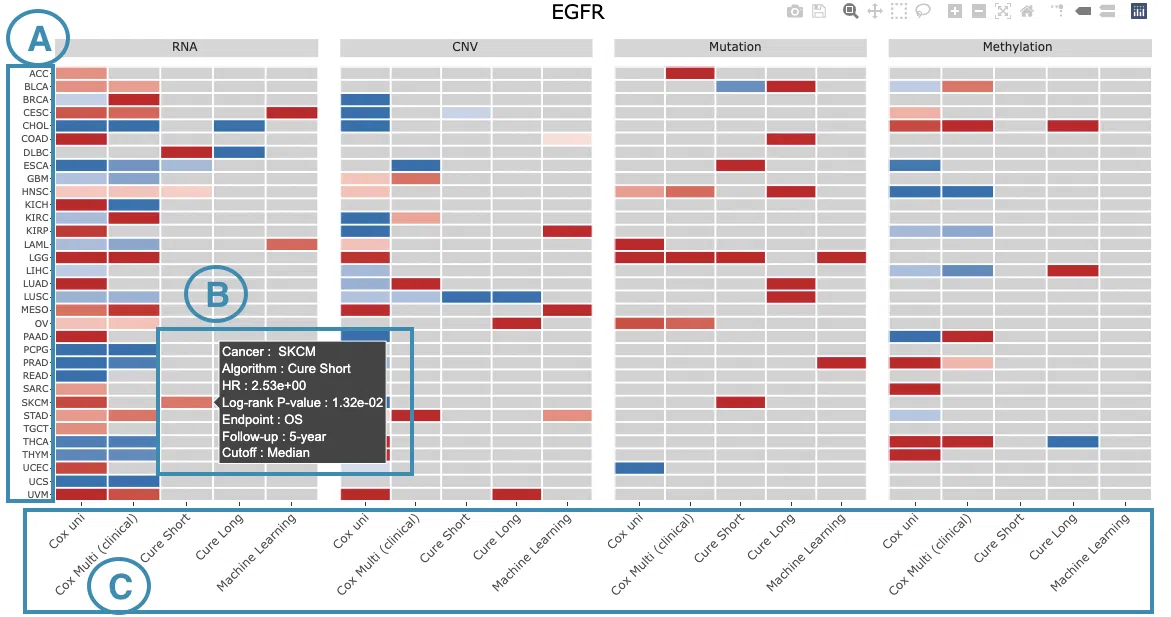
Hover the mouse on a particular color space for information on cancer type, algorithm, log2 hazard ratio (HR), p-value, endpoints, follow-up, and cut-off.
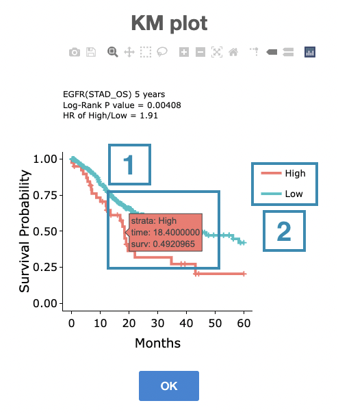
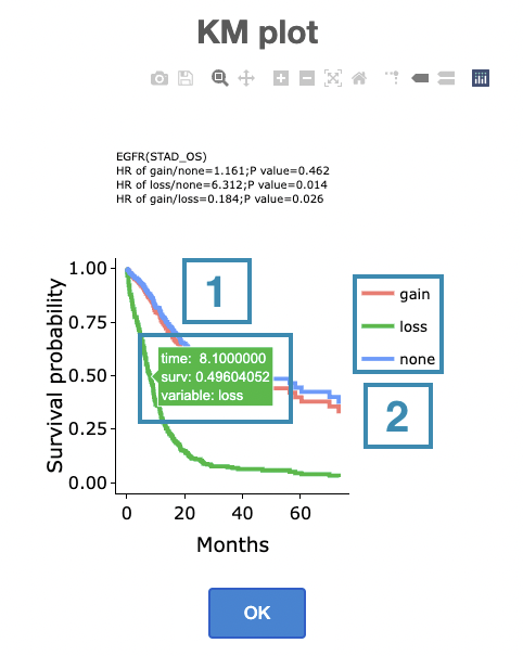
You can click on a specific color space, and the corresponding KM plot will pop up. (Note: The machine learning results will be provided in a new tab.)
The top of the Kaplan-Meier survival curves plot lists the values calculated by survival analysis. The plot's x-axis is the survival time starting from the initial cancer diagnosis, and the y-axis is the survival probability.
The manipulation of KM plot will be explained based on corresponding marked order in the screenshot provided below.
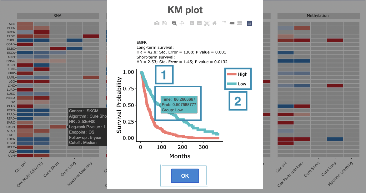
- Hover the mouse on the curve to view the detailed information on strata, time, and survival probability.
- You can hide or show a particular curve by clicking on the corresponding legend. High/low in the legend refers to a higher/lower gene expression value.
After viewing the plot, click the "OK" button to back to the heatmap.
- The survival algorithms. Detailed information is provided in Help.
2.2 Survival network
The survival network illustrates the synergistic effect of the user-selected gene and its related genes, defined by the log2 hazard ratio (HR) between them. The synergistic effect is defined by the hazard ratio (HR) of two survival-related genes in different omics, whose combine expression is > 1.5 fold of each omic with log-rank p-value <0.05.
The network can be zoomed in/out by rolling up/down the mouse and be moved by clicking and dragging on it.
Users are allowed to view a specific connection by clicking on the related gene or line.
Then, by clicking on the center node or clicking the "Re_arrange" and "Submit" buttons in turn, users can back to the overview of the network.
The manipulation is explained below as corresponding to the order in the screenshot.
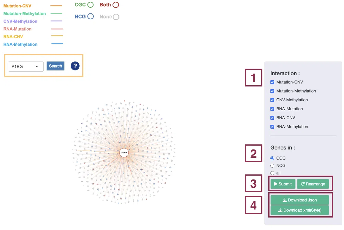
Note: Search. Browse by gene name and press “search” to view the synergistic effect of a specific gene. After searching, click the "Re_arrange" and "Submit" buttons, in turn, to back to the overview of the network.
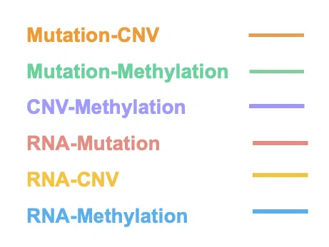
Step1. Select one or more interactions of synergistic effect to view.
- Mutation-CNV: synergistic effect between one gene in mutation level and another gene in CNV level.
- Mutation-Methylation: synergistic effect between one gene in mutation level and another gene in methylation level.
- CNV-Methylation: synergistic effect between one gene in CNV level and another gene in methylation level.
- RNA-Mutation: synergistic effect between the RNA expression of one gene and another gene in mutation level.
- RNA-CNV: synergistic effect between the RNA expression of one gene and another gene in CNV level.
- RNA-Methylation: synergistic effect between the RNA expression of one gene and another gene in methylation level.
Step2. Toggle CGC/NCG6.0/all for selecting dataset.
- All: show all coding genes.
- NCG: show genes in the Network of Cancer Genes (NCG6.0) dataset and the genes that are connected to them.
- CGC: show genes in the Cancer Gene Census (CGC) dataset and the genes that are connected to them.
Step3. Click the “Submit” button after setting the conditions. If you want to reset the arrangement to the original state click the “Re_arrange” button.
Step 4. Click the 'Download JSON' and 'Download XML (Style)' button to download the network results. The downloaded network results can be used as input for Cytoscape. For the manipulation of Cytoscape, please refer to Help.
After all the setting processes, the synergistic network will appear as below. The explanation of each legend is in the following sections, and a simple example is provided in the last section.
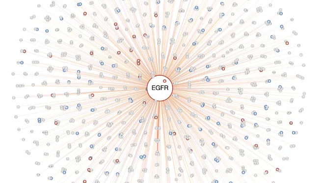
- The center node is the user-selected gene connected by lines to other related genes.
- The color of lines represents the type of interaction between mutation-copy number variation (CNV), mutation-methylation, CNV-methylation, RNA-mutation, RNA-CNV, and RNA-methylation.
- The frame color presents the datasets these genes belong to.

Example
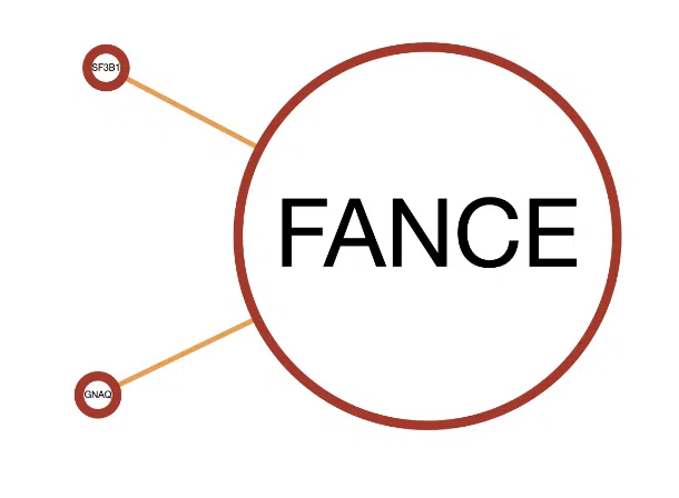
A simple example of the synergistic network of gene FANCE.
- The frame color of the node. FANCE and the two connected genes have red frames which represent that they are all in both the Cancer Gene Census (CGC) and the Network of Cancer Genes (NCG6.0) dataset.
- The color of connected lines. The lines between FANCE and the connected genes are orange, which refer that the synergistic effect between them is mutation-CNV.
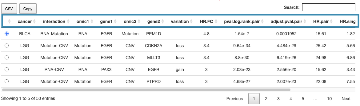
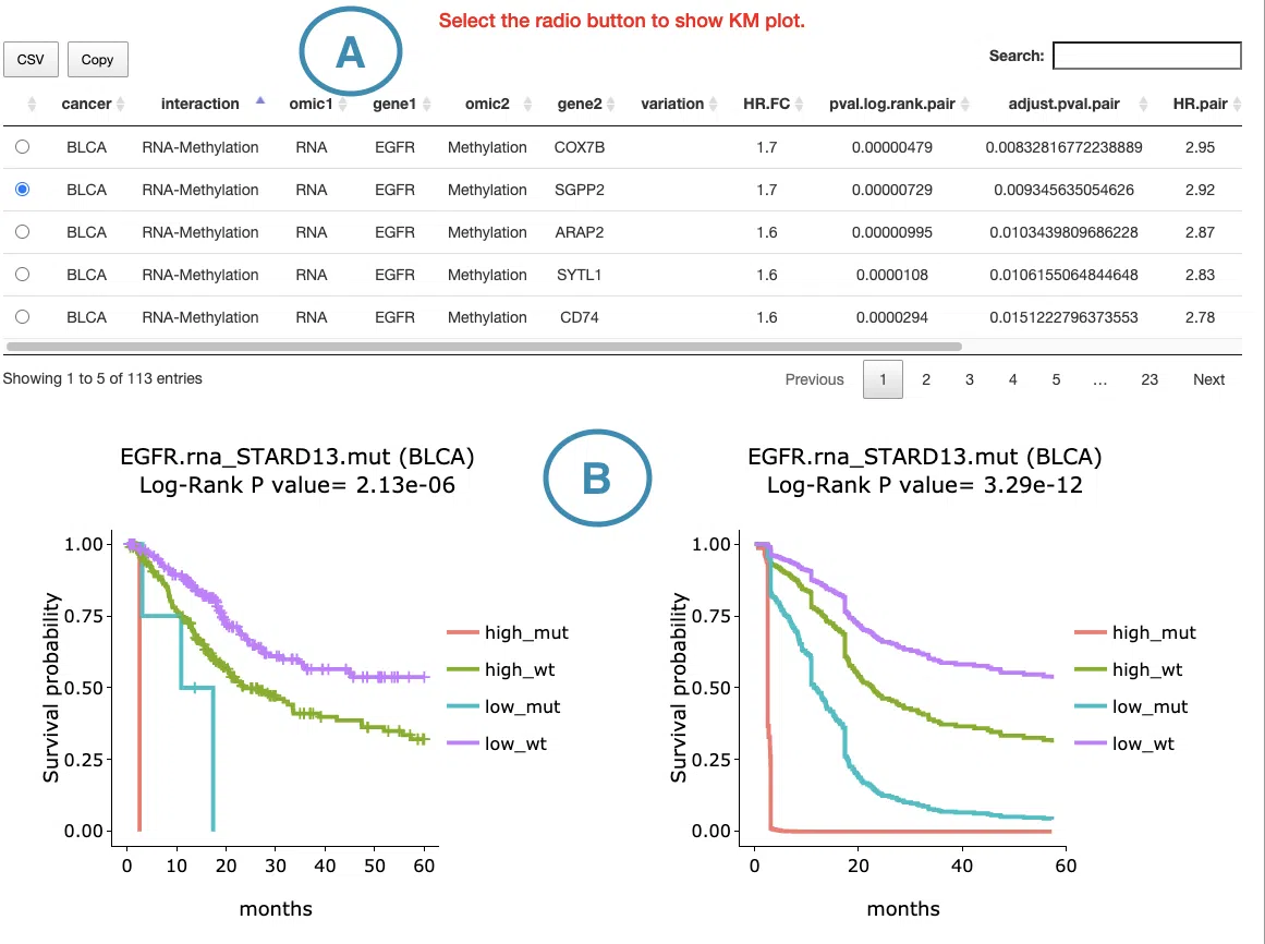
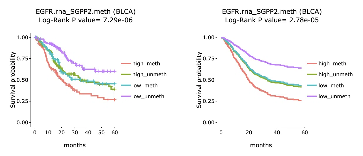
2.3 Synergistic survival analysis
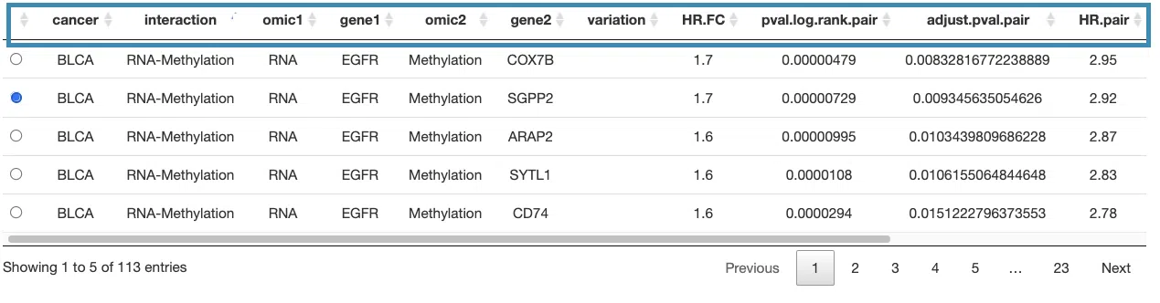
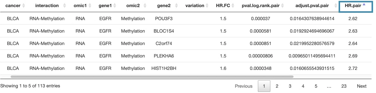
This section provides the synergistic effect between the user-selected gene and related genes in different omics. The interactions include RNA-mutation, RNA-CNV, RNA-methylation, CNV-mutation, CNV-methylation, and mutation-methylation.
The detailed information of synergistic effect including cancer type, gene symbol, omic level, hazard ratio, and p-value are shown in the table.
Toggling the desired gene-omic pairs on the table(A) generates corresponding survival plots below(B).
The synergistic effect is defined by the hazard ratio (HR) of two survival-related genes in different omics, whose combine expression is > 1.5 fold of each omic with log-rank p-value < 0.05.
The resources of the gene dataset include the Cancer Gene Census (CGC) and the Network of Cancer Genes (NCG6.0).
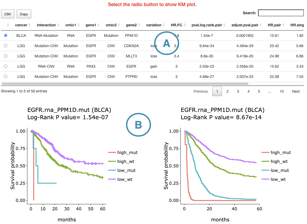
The table (A) lists cancer type, interaction, gene symbols, omic levels, hazard ratio, and p-value. Select the synergistic effect by the control panel and the corresponding KM plot will be displayed.
The explanations of the interactions are shown below.
- mut_meth: mutation occurs in gene1 and methylation occurs in gene2.
- mut_unmeth: mutation occurs in gene1 and methylation not occurs in gene2.
- wt_meth: wild-type in gene1 and methylation occurs in gene2.
- wt_unmeth: wild-type in gene1 and methylation does not occur in gene2.
- gain_meth: copy number gain occurs in gene1 and methylation occurs in gene2.
- gain_unmeth: copy number gain occurs in gene1 and methylation does not occur in gene2.
- none_meth: none of CNV in gene1 and methylation occurs in gene2.
- none_unmeth: none of CNV in gene1 and methylation not occurs in gene2.
- loss_meth: copy number loss occurs in gene1 and methylation occurs in gene2.
- loss_unmeth: copy number loss occurs in gene1 and methylation does not occur in gene2.
- mut_gain: mutation occurs in gene1 and copy number gain occurs in gene2.
- mut_none: mutation occurs in gene1 and none of CNV in gene2.
- mut_loss: mutation occurs in gene1 and copy number loss occurs in gene2.
- wt_gain: wild-type in gene1 and copy number gain occurs in gene2.
- wt_none: wild-type in gene1 and none of CNV in gene2.
- wt_loss: wild-type in gene1 and copy number loss occurs in gene2.
- high_mut: high RNA expression in gene1 and mutation occurs in gene2.
- high_wt: high RNA expression in gene1 and wild-type in gene2.
- low_mut: low RNA expression in gene1 and mutation occurs in gene2.
- low_wt: low RNA expression in gene1 and wild-type in gene2.
- high_gain: high RNA expression in gene1 and copy number gain occurs in gene2.
- high_loss: high RNA expression in gene1 and copy number loss occurs in gene2.
- high_none: high RNA expression in gene1 and none of CNV in gene2.
- low_gain: low RNA expression in gene1 and copy number gain occurs in gene2.
- low_loss: low RNA expression in gene1 and copy number loss occurs in gene2.
- low_none: low RNA expression in gene1 and none of CNV in gene2.
- high_meth: high RNA expression in gene1 and methylation occurs in gene2.
- high_unmeth: high RNA expression in gene1 and methylation not occurs in gene2.
- low_meth: low RNA expression in gene1 and methylation occurs in gene2.
- low_unmeth: low RNA expression in gene1 and methylation not occurs in gene2.
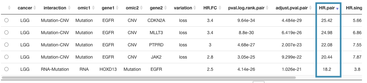
You can reorder each column in the table by clicking on the column name.
For example, after clicking on "HR.pair", and the values are displayed in decreasing order.
- mut_meth: mutation occurs in gene1 and methylation occurs in gene2.
- mut_unmeth: mutation occurs in gene1 and methylation not occurs in gene2.
- wt_meth: wild-type in gene1 and methylation occurs in gene2.
- wt_unmeth: wild-type in gene1 and methylation does not occur in gene2.
- gain_meth: copy number gain occurs in gene1 and methylation occurs in gene2.
- gain_unmeth: copy number gain occurs in gene1 and methylation does not occur in gene2.
- none_meth: none of CNV in gene1 and methylation occurs in gene2.
- none_unmeth: none of CNV in gene1 and methylation not occurs in gene2.
- loss_meth: copy number loss occurs in gene1 and methylation occurs in gene2.
- loss_unmeth: copy number loss occurs in gene1 and methylation does not occur in gene2.
- mut_gain: mutation occurs in gene1 and copy number gain occurs in gene2.
- mut_none: mutation occurs in gene1 and none of CNV in gene2.
- mut_loss: mutation occurs in gene1 and copy number loss occurs in gene2.
- wt_gain: wild-type in gene1 and copy number gain occurs in gene2.
- wt_none: wild-type in gene1 and none of CNV in gene2.
- wt_loss: wild-type in gene1 and copy number loss occurs in gene2.
- high_mut: high RNA expression in gene1 and mutation occurs in gene2.
- high_wt: high RNA expression in gene1 and wild-type in gene2.
- low_mut: low RNA expression in gene1 and mutation occurs in gene2.
- low_wt: low RNA expression in gene1 and wild-type in gene2.
- high_gain: high RNA expression in gene1 and copy number gain occurs in gene2.
- high_loss: high RNA expression in gene1 and copy number loss occurs in gene2.
- high_none: high RNA expression in gene1 and none of CNV in gene2.
- low_gain: low RNA expression in gene1 and copy number gain occurs in gene2.
- low_loss: low RNA expression in gene1 and copy number loss occurs in gene2.
- low_none: low RNA expression in gene1 and none of CNV in gene2.
- high_meth: high RNA expression in gene1 and methylation occurs in gene2.
- high_unmeth: high RNA expression in gene1 and methylation not occurs in gene2.
- low_meth: low RNA expression in gene1 and methylation occurs in gene2.
- low_unmeth: low RNA expression in gene1 and methylation not occurs in gene2.
The section (B) displays the Kaplan-Meier plots for survival analysis. The left plot is generated according to the selected panel in the above table. The right plot is the adjustive curve of the left one based on the Cox model results, presented by the R package, "survminer."
A more detailed description is provided in 'Adjusted Survival Curves' by Terry Therneau, Cynthia Crowson, and Elizabeth Atkinson (2015).
On the top of each plot lists gene symbols with omics and the value calculated by survival analysis. The x-axis of the plot is the survival time started from the initial cancer diagnosis and the y-axis is survival probability.
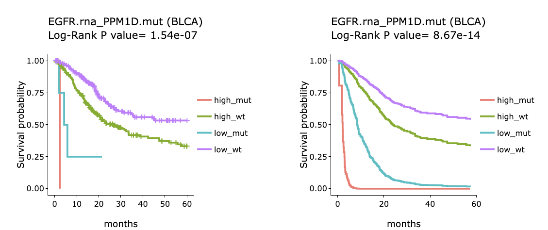
Below are the manipulations of the Kaplan-Meier plots, presented in the order corresponding to the mark in the screenshot.
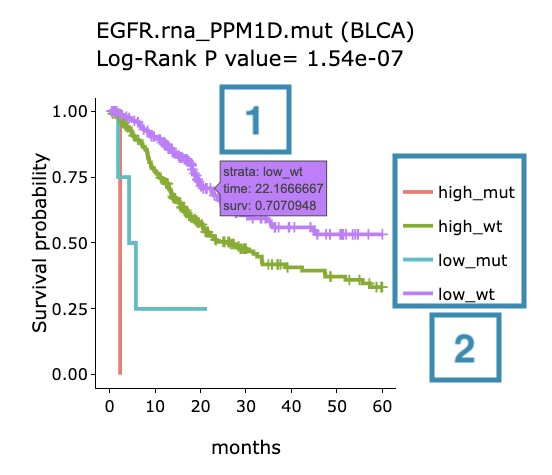
- Move the mouse to the curve to view the detailed information of strata, time, and survival probability.
- Users can view the curves respectively by clicking on the legend to hide or show the corresponding curve.
3. RNA
The RNA section provides visualizations to illustrate the survival probability of user-selected genes across multiple cancer types, based on RNA expression computed by multiple algorithms.
The screenshot below provides an overview of the entire section, with numbers assigned to each subsection. You can easily navigate through the corresponding tutorials in the following content.
3.1 Survival map
This section provides four heatmaps to display the survival impact of the user-selected gene in four survival types, including overall survival (OS), progression-free interval (PFI), disease-free interval (DFI), and disease-specific survival (DSS) across multiple cancer types.
Each condition is analyzed by four survival algorithms, univariate (cox uni), multivariate regression with clinical variables (cox multi (clinical)), cure model, and machine learning (ML) including Lasso, random forest, and I-Boost.
For more information about the above algorithms, please refer to Help.
The heatmap will be described based on its corresponding marked order in the screenshot provided below.
-
The abbreviations of cancer types. For the full names, please refer to Help.
- The color space in the plot represents that the user-selected gene is significant in the corresponding cancer type and algorithm. Each color space is marked according to log2 hazard ratios and p-value (red for positive values and blue for negative values). Hover the mouse on a particular color space for information on cancer type, algorithm, log2 hazard ratio (HR), p-value, and cut-off.
Note: The p-value of Cox uni, Cox uni (5 years), and ML are calculated by Log-Rank test; the p-value of Cox multi and Cox multi (5 years) are calculated by Cox-PH.
You can click on a specific color space, and the corresponding KM plot will pop up. (Note: The machine learning results will be provided in a new tab.)
The top of the Kaplan-Meier survival curves plot lists the values calculated by survival analysis. The plot's x-axis is the survival time starting from the initial cancer diagnosis, and the y-axis is the survival probability.
The manipulation of KM plot will be explained based on corresponding marked order in the screenshot provided below.
- Hover the mouse on the curve to view the detailed information on strata, time, and survival probability.
- You can hide or show a particular curve by clicking on the corresponding legend. High/low in the legend refers to a higher/lower gene expression value.
After viewing the plot, click the "OK" button to back to the heatmap.
-
The survival algorithms. Detailed information is provided in Help.
3.2 Survival analysis
The following sections respectively provide survival analysis of a user-selected gene derived from four algorithms, univariate cox proportional regression analysis (Cox Uni) (3.2.1), multiple cox proportional regression analysis with clinical variables (Cox Multi (Clinical)) (3.2.2), Cure model (3.2.3), machine learning (3.2.4), and Synergistic (3.2.5).
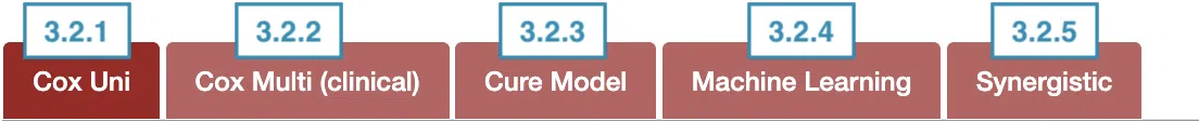
You can view a specific subsection by selecting from the tabs. Each subsection is described according to its marking in the screenshot.
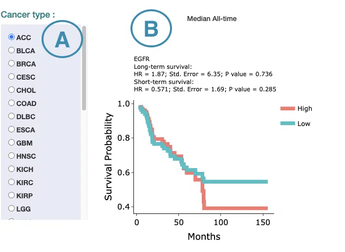
3.2.1 Cox Uni
This section provides the 5-year and all-time KM survival curves and cumulative hazard ratio of survival analysis.
For the survival analysis across multiple cancer types, univariate Cox proportional regression is adopted to calculate the gene expression of the user-selected gene.
The screenshot below provides an overview of this section. This section's manipulation and explanation will correspond to the marks in the screenshot.

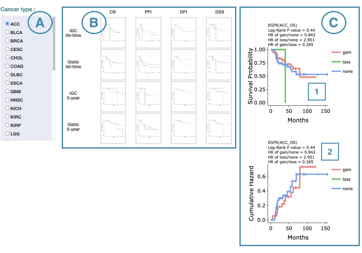
- Select the cancer type. Move the mouse to the abbreviation to view the full name of the cancer type.
- All-time and 5-year results of different survival types and stratify types. Click on the mini plot of a specific survival time, survival type, and stratify type, and the full-sized plots will be shown. The abbreviation is explained below.
Survival type:
- OS: overall survival
- PFI: progression-free interval
- DFI: disease-free interval
- DSS: disease-specific survival
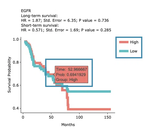
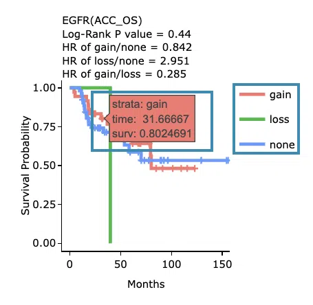
- The results of Kaplan-Meier survival curves plots and cumulative hazard ratio plots.
-
Kaplan-Meier survival curves plots
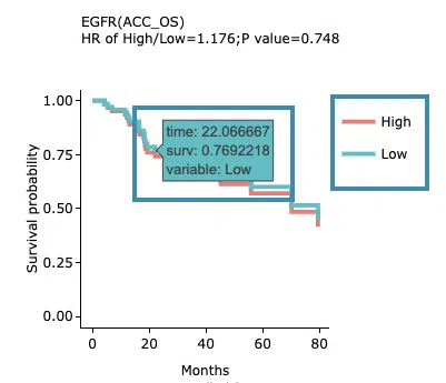
The top of the plot lists the values calculated by survival analysis. The plot's x-axis is the survival time starting from the initial cancer diagnosis, and the y-axis is the survival probability. Hover the mouse on the curve to view the detailed information on strata, time, and survival probability. You can hide or show a particular curve by clicking on the corresponding legend. High/low in the legend refers to a higher/lower gene expression value.
-
Cumulative hazard ratio plots
The top of the plot lists the values calculated by survival analysis. The plot's x-axis is the survival time starting from the initial cancer diagnosis, and the y-axis is the cumulative hazard ratio. Hover the mouse on the curve to view the detailed information on strata, time, and cumulative hazard ratio. You can hide or show a particular curve by clicking on the corresponding legend. High/low in the legend refers to a higher/lower gene expression value.
-
Kaplan-Meier survival curves plots
3.2.2 Cox Multi (Clinical)
This section provides 5-year and all-time adjustive survival curves and hazard ratio forest plots of survival analysis.
For the survival analysis across multiple cancer types, multiple cox proportional regression analysis is adopted along with clinical variables to calculate the gene expression of the user-selected gene.
The screenshot below provides an overview of this section. This section's manipulation and explanation will correspond to the marks in the screenshot.
- Select the cancer type. Move the mouse to the abbreviation to view the full name of the cancer type.
- All-time and 5-year results of different survival types and stratify types. Click on the mini plot of a specific survival time, survival type, and stratify type, and the full-sized plots will be shown. The abbreviation is explained below.
Survival type:
- OS: overall survival
- PFI: progression-free interval
- DFI: disease-free interval
- DSS: disease-specific survival
- The results of Kaplan-Meier adjustive survival curves plots and forest plots.
-
Adjustive survival curves plots
The top of the plot lists the values calculated by survival analysis. The plot's x-axis is the survival time starting from the initial cancer diagnosis, and the y-axis is the survival probability. Hover the mouse on the curve to view the detailed information on time, survival probability, and variable. You can hide or show a particular curve by clicking on the corresponding legend. High/low in the legend refers to a higher/lower gene expression value.
-
Covariate hazard ratio forest plots of clinical variables
Click on the plot to open and view the full-size one in a new tab.
-
Adjustive survival curves plots
3.2.3 Cure Model
This section provides predictive survival curves of survival analysis across multiple cancer types according to the gene expression of the user-selected gene calculated by the cure model.
Both short-term and long-term p-values derived from the cure model are provided.
For more information about the cure model, please refer to Help.
The screenshot below provides an overview of this section. This section's manipulation and explanation will correspond to the marks in the screenshot.
- Select the cancer type. Move the mouse to the abbreviation to view the full name of the cancer type.
-
The predictive survival curves
The top of the plot lists the values calculated by survival analysis. The plot's x-axis is the survival time starting from the initial cancer diagnosis, and the y-axis is the survival probability. Hover the mouse on the curve to view the detailed information on time, survival probability, and group. You can hide or show a particular curve by clicking on the corresponding legend. High/low in the legend refers to a higher/lower gene expression value.
3.2.4 Machine Learning
This section provides results of user-selected genes derived from three machine learning algorithms, Lasso, random forest, and I-Boost.

Select an algorithm and view its results.
For more information about Lasso, random forest, and I-Boost algorithm, please refer to Help.
The results of each algorithm are listed in the following subsections.
3.2.4.1 Lasso
The significant results of the user-selected gene derived from Lasso across 33 cancer types are displayed in the signature selection table(A). Select a specific result on the table, and the corresponding list of genes, a KM plot, and ROC curves will display.
Note: The most significant signature is calculated and combined from the gene expression of the significant survival genes selected by Lasso.
The screenshot below provides an overview of this section. This section's manipulation and explanation will correspond to the marks in the screenshot.
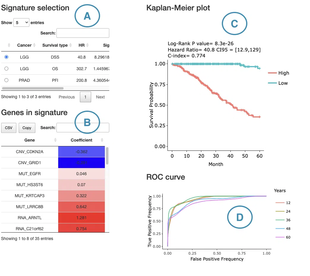
- The control panel with significant results derived from Lasso across 33 cancer types. The detailed information includes cancer type, survival type, significance, and the number of genes. Select a specific result to view, and the rest sections, including a list of genes (B), KM plot (C), and ROC curves (D), will be displayed according to your selection.
- The table lists the significant genes selected by Lasso and their coefficient. The color of the coefficient column is according to the value (red for positive values, blue for negative values). You can reorder each column in the table by clicking on the column name.
For example, after clicking on “Coefficient,” the values are displayed in decreasing order.
- The Kaplan-Meier plot of survival analysis. The top of the plot lists the values calculated by survival analysis. The plot's x-axis is the survival time starting from the initial cancer diagnosis, and the y-axis is the survival probability.
Hover the mouse on the curve to view the detailed information of strata, time, and survival probability. You can click on the legend to hide or show the corresponding curve.
The explanation of the legend is as below.
- Low = lower value in signature.
- High = higher value in signature.
- The ROC curves are used to evaluate the predictive power of the signature of different survival times (month). The x-axis is the false-positive frequency, and the y-axis is the true-positive frequency. For the interpretation of the ROC curve, please refer to Help.
Hover the mouse on the curves to view the details of the false-positive frequency (FP), true-positive frequency (TP), and the unique marker values for the calculation of TP and FP (c value). You can show or hide a particular ROC curve by clicking on the corresponding legend beside the figure.
3.2.4.2 Random Forest
The significant results of the user-selected gene derived from random forest across 33 cancer types are displayed in the signature selection table(A). Select a specific result on the table, and the corresponding list of genes, a KM plot, and ROC curves will display.
Note: The most significant signature is calculated and combined from the gene expression of the significant survival genes selected by random forest.
The screenshot below provides an overview of this section. This section's manipulation and explanation will correspond to the marks in the screenshot.
- The control panel with significant results derived from random forest across 33 cancer types. The detailed information includes cancer type, survival type, significance, and the number of genes. Select a specific result to view, and the rest sections, including a list of genes (B), KM plot (C), and ROC curves (D), will be displayed according to your selection.
- The table lists the significant genes selected by random forest and the depth and relative frequency. The color of the relative frequency column is according to the value.
You can reorder each column in the table by clicking on the column name.
For example, after clicking on “Depth”, the values are displayed in decreasing order.
- The Kaplan-Meier plot of survival analysis. The top of the plot lists the values calculated by survival analysis. The plot's x-axis is the survival time starting from the initial cancer diagnosis, and the y-axis is the survival probability.
Hover the mouse on the curve to view the detailed information of strata, time, and survival probability. You can click on the legend to hide or show the corresponding curve.
The explanation of the legend is as below.
- Low = lower value in signature.
- High = higher value in signature.
- The ROC curves are used to evaluate the predictive power of the signature of different survival times (month). The x-axis is the false-positive frequency, and the y-axis is the true-positive frequency. For the interpretation of the ROC curve, please refer to Help.
Hover the mouse on the curves to view the details of the false-positive frequency (FP), true-positive frequency (TP), and the unique marker values for the calculation of TP and FP (c value). You can show or hide a particular ROC curve by clicking on the corresponding legend beside the figure.
3.2.4.3 I-Boost
The significant results of the user-selected gene derived from I-Boost across 33 cancer types are displayed in the signature selection table(A). Select a specific result on the table, and the corresponding list of genes, a KM plot, and a cumulative hazard ratio plot will display.
Note: The most significant signature is calculated and combined from the gene expression of the significant survival genes selected by I-Boost.
The screenshot below provides an overview of this section. This section's manipulation and explanation will correspond to the marks in the screenshot.
- The control panel with significant results derived from I-Boost across 33 cancer types. The detailed information includes cancer type, survival type, significance, and the number of genes. Select a specific result to view, and the rest sections, including a list of genes (B), KM plot (C), and cumulative hazard ratio plot (D), will be displayed according to your selection.
- The table lists the significant genes selected by I-Boost and their coefficient values. The color of the coefficient column is according to the value (red for positive values and blue for negative values).
You can reorder each column in the table by clicking on the column name.
For example, after clicking on “Coefficient”, the values are displayed in decreasing order.
- The Kaplan-Meier plot of survival analysis. The top of the plot lists the values calculated by survival analysis. The plot's x-axis is the survival time starting from the initial cancer diagnosis, and the y-axis is the survival probability.
Hover the mouse on the curve to view the detailed information of strata, time, and survival probability. You can click on the legend to hide or show the corresponding curve.
The explanation of the legend is as below.
- Low = lower value in signature.
- High = higher value in signature.
- The cumulative hazard ratio plots. The top of the plot lists the values calculated by survival analysis. The plot's x-axis is the survival time starting from the initial cancer diagnosis, and the y-axis is the cumulative hazard ratio.
Hover the mouse on the curve to view the detailed information of strata, time, and survival probability. You can click on the legend to hide or show the corresponding curve. The explanation of the legend is as below.
- Low = lower value in signature.
- High = higher value in signature.
3.2.5 Synergistic
This section provides the synergistic effect between the user-selected gene and related genes in different omics. The interactions include RNA-mutation, RNA-CNV, and RNA-methylation. The detailed information of synergistic effect including cancer type, gene symbol, omic level, hazard ratio, and p-value are shown in the table. Toggling the desired gene-omic pairs on the table(A) generates corresponding survival plots below(B). The synergistic effect is defined by the hazard ratio (HR) of two survival-related genes in different omics, whose combine expression is > 1.5 fold of each omic with log-rank p-value <0.05 (the results are shown in “HR.FC” column). The resources of the gene dataset include the Cancer Gene Census (CGC) and the Network of Cancer Genes (NCG6.0).
The screenshot below provides an overview of this section. This section's manipulation and explanation will correspond to the marks in the screenshot.
3.2.5.1 Synergistic effect table
The table lists cancer type, interaction, gene symbols, omic levels, hazard ratio, and p-value. Select the synergistic effect by the control panel and the corresponding KM plot will be displayed.

You can reorder each column in the table by clicking on the column name.
For example, after clicking on “HR.pair”, the values are displayed in increasing order.
3.2.5.2 Kaplan-Meier plot
The Kaplan-Meier plots for survival analysis. The left plot is generated according to the selected panel in the above table. The right plot is the adjustive curve of the left one based on the Cox model results, presented by the R package, "survminer."
A more detailed description is provided in 'Adjusted Survival Curves' by Terry Therneau, Cynthia Crowson, and Elizabeth Atkinson (2015).
On the top of each plot lists gene symbols with omics and the value calculated by survival analysis. The x-axis of the plot is the survival time started from the initial cancer diagnosis and the y-axis is survival probability.
The explanations of the abbreviations are shown below.
- high_mut: high RNA expression in gene1 and mutation occurs in gene2.
- high_wt: high RNA expression in gene1 and wild-type in gene2.
- low_mut: low RNA expression in gene1 and mutation occurs in gene2.
- low_wt: low RNA expression in gene1 and wild-type in gene2.
- high_gain: high RNA expression in gene1 and copy number gain occurs in gene2.
- high_loss: high RNA expression in gene1 and copy number loss occurs in gene2.
- high_none: high RNA expression in gene1 and none of CNV in gene2.
- low_gain: low RNA expression in gene1 and copy number gain occurs in gene2.
- low_loss: low RNA expression in gene1 and copy number loss occurs in gene2.
- low_none: low RNA expression in gene1 and none of CNV in gene2.
- high_meth: high RNA expression in gene1 and methylation occurs in gene2.
- high_unmeth: high RNA expression in gene1 and methylation not occurs in gene2.
- low_meth: low RNA expression in gene1 and methylation occurs in gene2.
- low_unmeth: low RNA expression in gene1 and methylation not occurs in gene2.
Below are the manipulations of the Kaplan-Meier plots, presented in the order corresponding to the mark in the screenshot.

- Move the mouse to the curve to view the detailed information of strata, time, and survival probability.
- Users can view the curves respectively by clicking on the legend to hide or show the corresponding curve.
4. CNV
The CNV section provides visualizations to illustrate the survival probability of user-selected genes across multiple cancer types, based on copy number variation computed by multiple algorithms.
The screenshot below provides an overview of the entire section, with numbers assigned to each subsection. You can easily navigate through the corresponding tutorials in the following content.
4.1 Survival map
This section provides four heatmaps to display the survival impact of the user-selected gene in four survival types, including overall survival (OS), progression-free interval (PFI), disease-free interval (DFI), and disease-specific survival (DSS) across multiple cancer types.
Each condition is analyzed by four survival algorithms, univariate (cox uni), multivariate regression with clinical variables (cox multi (clinical)), cure model, and machine learning (ML) including Lasso, random forest, and I-Boost.
For more information about the above algorithms, please refer to Help.
The heatmap will be described based on its corresponding marked order in the screenshot provided below.
-
The abbreviations of cancer types. For the full names, please refer to Help.
- The color space in the plot represents that the user-selected gene is significant in the corresponding cancer type and algorithm. Each color space is marked according to log2 hazard ratios and p-value (red for positive values and blue for negative values). Hover the mouse on a particular color space for information on cancer type, algorithm, log2 hazard ratio (HR), p-value, and definition.
Note: The p-value of Cox uni, Cox uni (5 years), and ML are calculated by Log-Rank test; the p-value of Cox multi and Cox multi (5 years) are calculated by Cox-PH.
You can click on a specific color space, and the corresponding KM plot will pop up. (Note: The machine learning results will be provided in a new tab.)
The top of the Kaplan-Meier survival curves plot lists the values calculated by survival analysis. The plot's x-axis is the survival time starting from the initial cancer diagnosis, and the y-axis is the survival probability.
The manipulation of KM plot will be explained based on corresponding marked order in the screenshot provided below.
- Hover the mouse on the curve to view the detailed information on strata, time, and survival probability.
- You can hide or show a particular curve by clicking on the corresponding legend. Gain/loss in the legend refers to copy number gain/loss, and none refers to none of copy number variation.
After viewing the plot, click the "OK" button to back to the heatmap.
-
The survival algorithms. Detailed information is provided in Help.
4.2 Survival analysis
The following sections respectively provide survival analysis of a user-selected gene derived from four algorithms, univariate cox proportional regression analysis (Cox Uni) (4.2.1), multiple cox proportional regression analysis with clinical variables (Cox Multi (Clinical)) (4.2.2), Cure model (4.2.3), machine learning (4.2.4), and Synergistic (4.2.5).

You can view a specific subsection by selecting from the tabs. Each subsection is described according to its marking in the screenshot.
4.2.1 Cox Uni
This section provides the 5-year and all-time KM survival curves and cumulative hazard ratio of survival analysis.
For the survival analysis across multiple cancer types, univariate Cox proportional regression is adopted to calculate the gene copy number variation of the user-selected gene.
The screenshot below provides an overview of this section. This section's manipulation and explanation will correspond to the marks in the screenshot.
- Select the cancer type. Move the mouse to the abbreviation to view the full name of the cancer type.
- All-time and 5-year results of different survival types and definitions. Click on the mini plot of a specific survival time, survival type, and definition, and the full-sized plots will be shown. The abbreviation is explained below.
- Definition:
- iGC: identify CNV dysregulation events by iGC package.
- Gistic: identify CNV dysregulation events by Gistic software.
- Survival type:
- OS: overall survival
- PFI: progression-free interval
- DFI: disease-free interval
- DSS: disease-specific survival
- Definition:
- The results of Kaplan-Meier survival curves plots and cumulative hazard ratio plots.
-
Kaplan-Meier survival curves plots
The top of the plot lists the values calculated by survival analysis. The plot's x-axis is the survival time starting from the initial cancer diagnosis, and the y-axis is the survival probability. Hover the mouse on the curve to view the detailed information on time, survival probability, and variable. You can hide or show a particular curve by clicking on the corresponding legend. Gain/loss in the legend refers to copy number gain/loss, and none refers to none of copy number variation.
-
Cumulative hazard ratio plots
The top of the plot lists the values calculated by survival analysis. The plot's x-axis is the survival time starting from the initial cancer diagnosis, and the y-axis is the cumulative hazard ratio. Hover the mouse on the curve to view the detailed information on strata, time, and cumulative hazard ratio. You can hide or show a particular curve by clicking on the corresponding legend. Gain/loss in the legend refers to copy number gain/loss, and none refers to none of copy number variation.
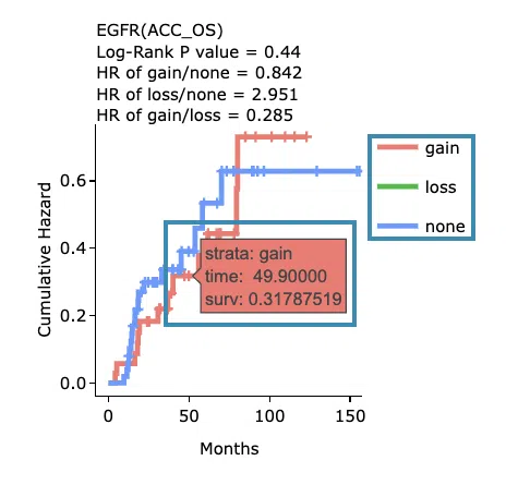
-
Kaplan-Meier survival curves plots
4.2.2 Cox Multi (clinical)
This section provides 5-year and all-time adjustive survival curves and hazard ratio forest plots of survival analysis.
For the survival analysis across multiple cancer types, multiple cox proportional regression analysis is adopted along with clinical variables to calculate the gene copy number variation of the user-selected gene.
The screenshot below provides an overview of this section. This section's manipulation and explanation will correspond to the marks in the screenshot.
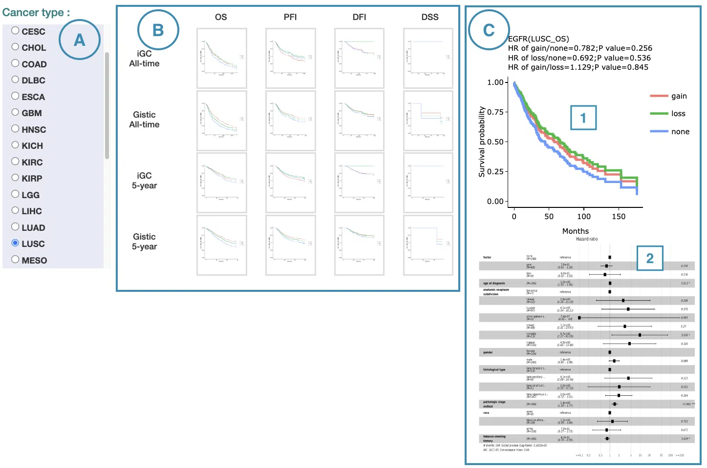
- Select the cancer type. Move the mouse to the abbreviation to view the full name of the cancer type.
- All-time and 5-year results of different survival types and definitions. Click on the mini plot of a specific survival time, survival type, and definition, and the full-sized plots will be shown. The abbreviation is explained below.
- Definition:
- iGC: identify CNV dysregulation events by iGC package.
- Gistic: identify CNV dysregulation events by Gistic software.
- Survival type:
- OS: overall survival
- PFI: progression-free interval
- DFI: disease-free interval
- DSS: disease-specific survival
- Definition:
- The results of Kaplan-Meier adjustive survival curves plots and forest plots.
-
Adjustive survival curves plots
The top of the plot lists the values calculated by survival analysis. The plot's x-axis is the survival time starting from the initial cancer diagnosis, and the y-axis is the survival probability. Hover the mouse on the curve to view the detailed information on time, survival probability, and variable. You can hide or show a particular curve by clicking on the corresponding legend. Gain/loss in the legend refers to copy number gain/loss, and none refers to none of copy number variation.
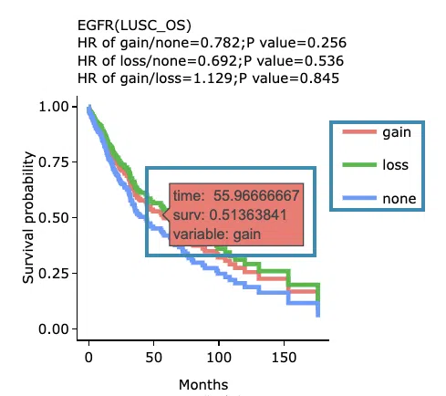
-
Covariate hazard ratio forest plots of clinical variables
Click on the plot to open and view the full-size one in a new tab.
-
Adjustive survival curves plots
4.2.3 Cure Model
This section provides predictive survival curves of survival analysis across multiple cancer types according to the gene copy number variation of the user-selected gene calculated by the cure model.
Both short-term and long-term p-values derived from the cure model are provided.
For more information about the cure model, please refer to Help.
The screenshot below provides an overview of this section. This section's manipulation and explanation will correspond to the marks in the screenshot.
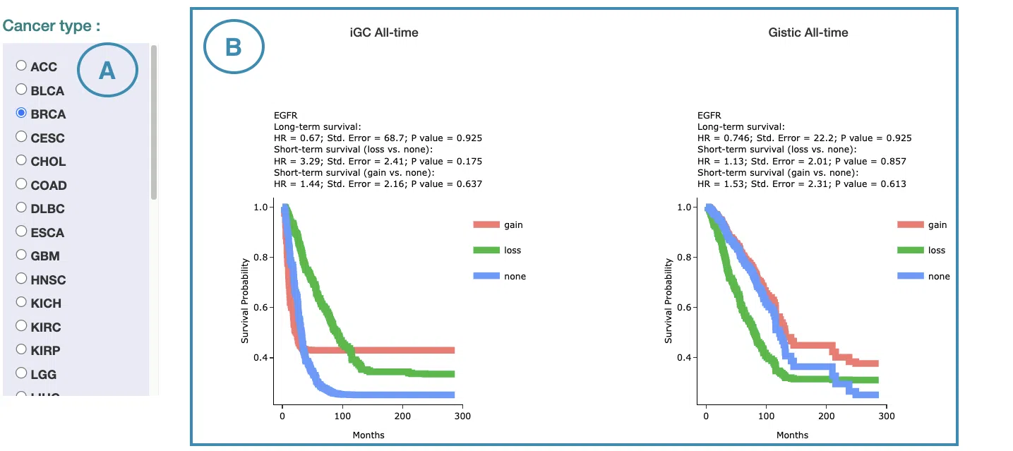
- Select the cancer type. Move the mouse to the abbreviation to view the full name of the cancer type.
- The predictive survival curves of different definitions. The abbreviation of definition is explained below.
- iGC: identify CNV dysregulation events by iGC package.
- Gistic: identify CNV dysregulation events by Gistic software.
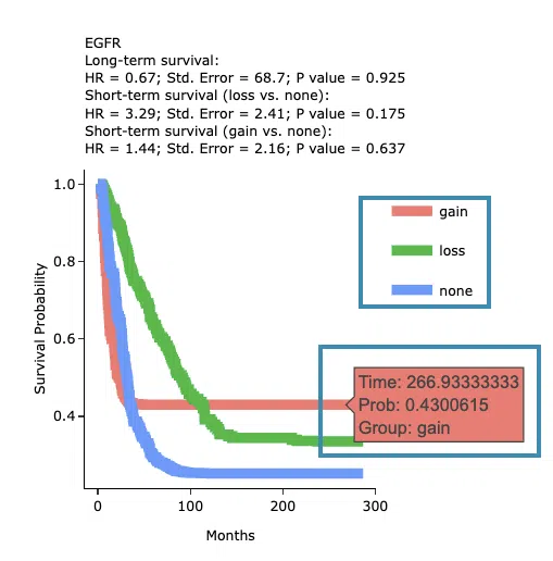
The top of the plot lists the values calculated by survival analysis. The plot's x-axis is the survival time starting from the initial cancer diagnosis, and the y-axis is the survival probability. Hover the mouse on the curve to view the detailed information on time, survival probability, and group. You can hide or show a particular curve by clicking on the corresponding legend. Gain/loss in the legend refers to copy number gain/loss, and none refers to none of copy number variation.
4.2.4 Machine Learning
This section provides results of user-selected genes derived from three machine learning algorithms, Lasso, random forest, and I-Boost.
Select an algorithm and view its results. For more information about Lasso, random forest, and I-Boost algorithm, please refer to Help.
The results of each algorithm are listed in the following subsections.
4.2.4.1 Lasso
The significant results of the user-selected gene derived from Lasso across 33 cancer types are displayed in the signature selection table(A). Select a specific result on the table, and the corresponding list of genes, a KM plot, and ROC curves will display.
Note: The most significant signature is calculated and combined from the gene copy number variation of the significant survival genes selected by Lasso.
The screenshot below provides an overview of this section. This section's manipulation and explanation will correspond to the marks in the screenshot.
- The control panel with significant results derived from Lasso across 33 cancer types. The detailed information includes cancer type, survival type, significance, and the number of genes. Select a specific result to view, and the rest sections, including a list of genes (B), KM plot (C), and ROC curves (D), will be displayed according to your selection.
- The table lists the significant genes selected by Lasso and their coefficient. The color of the coefficient column is according to the value (red for positive values, blue for negative values). You can reorder each column in the table by clicking on the column name.
For example, after clicking on “Coefficient,” the values are displayed in decreasing order.
- The Kaplan-Meier plot of survival analysis. The top of the plot lists the values calculated by survival analysis. The plot's x-axis is the survival time starting from the initial cancer diagnosis, and the y-axis is the survival probability.
Hover the mouse on the curve to view the detailed information of strata, time, and survival probability. You can click on the legend to hide or show the corresponding curve.
The explanation of the legend is as below.
- Low = lower value in signature.
- High = higher value in signature.
- The ROC curves are used to evaluate the predictive power of the signature of different survival times (month). The x-axis is the false-positive frequency, and the y-axis is the true-positive frequency. For the interpretation of the ROC curve, please refer to Help.
Hover the mouse on the curves to view the details of the false-positive frequency (FP), true-positive frequency (TP), and the unique marker values for the calculation of TP and FP (c value). You can show or hide a particular ROC curve by clicking on the corresponding legend beside the figure.
4.2.4.2 Random Forest
The significant results of the user-selected gene derived from random forest across 33 cancer types are displayed in the signature selection table(A). Select a specific result on the table, and the corresponding list of genes, a KM plot, and ROC curves will display.
Note: The most significant signature is calculated and combined from the gene copy number variation of the significant survival genes selected by random forest.
The screenshot below provides an overview of this section. This section's manipulation and explanation will correspond to the marks in the screenshot.
- The control panel with significant results derived from random forest across 33 cancer types. The detailed information includes cancer type, survival type, significance, and the number of genes. Select a specific result to view, and the rest sections, including a list of genes (B), KM plot (C), and ROC curves (D), will be displayed according to your selection.
- The table lists the significant genes selected by random forest and the depth and relative frequency. The color of the relative frequency column is according to the value.
You can reorder each column in the table by clicking on the column name.
For example, after clicking on “Depth”, the values are displayed in decreasing order.
- The Kaplan-Meier plot of survival analysis. The top of the plot lists the values calculated by survival analysis. The plot's x-axis is the survival time starting from the initial cancer diagnosis, and the y-axis is the survival probability.
Hover the mouse on the curve to view the detailed information of strata, time, and survival probability. You can click on the legend to hide or show the corresponding curve.
The explanation of the legend is as below.
- Low = lower value in signature.
- High = higher value in signature.
- The ROC curves are used to evaluate the predictive power of the signature of different survival times (month). The x-axis is the false-positive frequency, and the y-axis is the true-positive frequency. For the interpretation of the ROC curve, please refer to Help.
Hover the mouse on the curves to view the details of the false-positive frequency (FP), true-positive frequency (TP), and the unique marker values for the calculation of TP and FP (c value). You can show or hide a particular ROC curve by clicking on the corresponding legend beside the figure.
4.2.4.3 I-Boost
The significant results of the user-selected gene derived from I-Boost across 33 cancer types are displayed in the signature selection table(A). Select a specific result on the table, and the corresponding list of genes, a KM plot, and a cumulative hazard ratio plot will display.
Note: The most significant signature is calculated and combined from the gene copy number variation of the significant survival genes selected by I-Boost.
The screenshot below provides an overview of this section. This section's manipulation and explanation will correspond to the marks in the screenshot.
- The control panel with significant results derived from I-Boost across 33 cancer types. The detailed information includes cancer type, survival type, significance, and the number of genes. Select a specific result to view, and the rest sections, including a list of genes (B), KM plot (C), and cumulative hazard ratio plot (D), will be displayed according to your selection.
- The table lists the significant genes selected by I-Boost and their coefficient values. The color of the coefficient column is according to the value (red for positive values and blue for negative values).
You can reorder each column in the table by clicking on the column name.
For example, after clicking on “Coefficient”, the values are displayed in decreasing order.
- The Kaplan-Meier plot of survival analysis. The top of the plot lists the values calculated by survival analysis. The plot's x-axis is the survival time starting from the initial cancer diagnosis, and the y-axis is the survival probability.
Hover the mouse on the curve to view the detailed information of strata, time, and survival probability. You can click on the legend to hide or show the corresponding curve.
The explanation of the legend is as below.
- Low = lower value in signature.
- High = higher value in signature.
- The cumulative hazard ratio plots. The top of the plot lists the values calculated by survival analysis. The plot's x-axis is the survival time starting from the initial cancer diagnosis, and the y-axis is the cumulative hazard ratio.
Hover the mouse on the curve to view the detailed information of strata, time, and survival probability. You can click on the legend to hide or show the corresponding curve. The explanation of the legend is as below.
- Low = lower value in signature.
- High = higher value in signature.
4.2.5 Synergistic
This section provides the synergistic effect between the user-selected gene and related genes in different omics. The interactions include RNA-CNV, mutation-CNV and CNV-methylation. The detailed information of synergistic effect including cancer type, gene symbol, omic level, hazard ratio, and p-value are shown in the table. Toggling the desired gene-omic pairs on the table(A) generates corresponding survival plots below(B). The synergistic effect is defined by the hazard ratio (HR) of two survival-related genes in different omics, whose combine expression is > 1.5 fold of each omic with log-rank p-value <0.05 (the results are shown in “HR.FC” column). The resources of the gene dataset include the Cancer Gene Census (CGC) and the Network of Cancer Genes (NCG6.0).
The screenshot below provides an overview of this section. This section's manipulation and explanation will correspond to the marks in the screenshot.

4.2.5.1 Synergistic effect table
The table lists cancer type, interactions, gene symbols, omic levels, hazard ratio, and p-value. Select the synergistic effect by the control panel and the corresponding KM plot will be displayed.
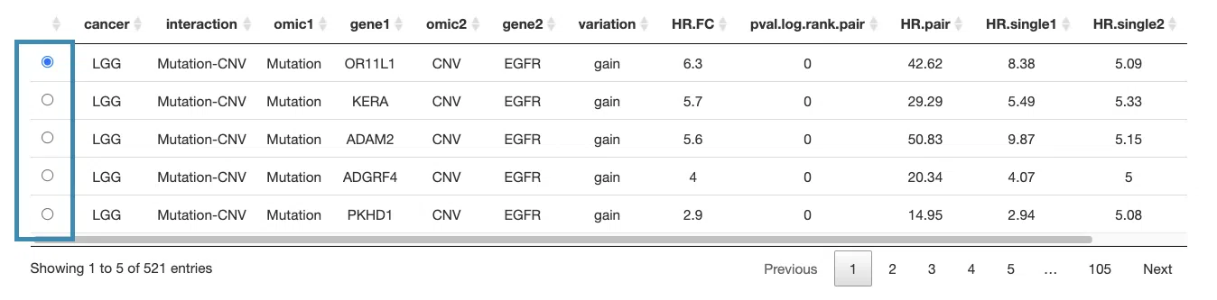
You can reorder each column in the table by clicking on the column name.

For example, after clicking on “HR.pair”, the values are displayed in decreasing order.

4.2.5.2 Kaplan-Meier plot
The Kaplan-Meier plots for survival analysis. The left plot is generated according to the selected panel in the above table. The right plot is the adjustive curve of the left one based on the Cox model results, presented by the R package, "survminer."
A more detailed description is provided in 'Adjusted Survival Curves' by Terry Therneau, Cynthia Crowson, and Elizabeth Atkinson (2015).
On the top of each plot lists gene symbols with omics and the value calculated by survival analysis. The x-axis of the plot is the survival time started from the initial cancer diagnosis and the y-axis is survival probability.
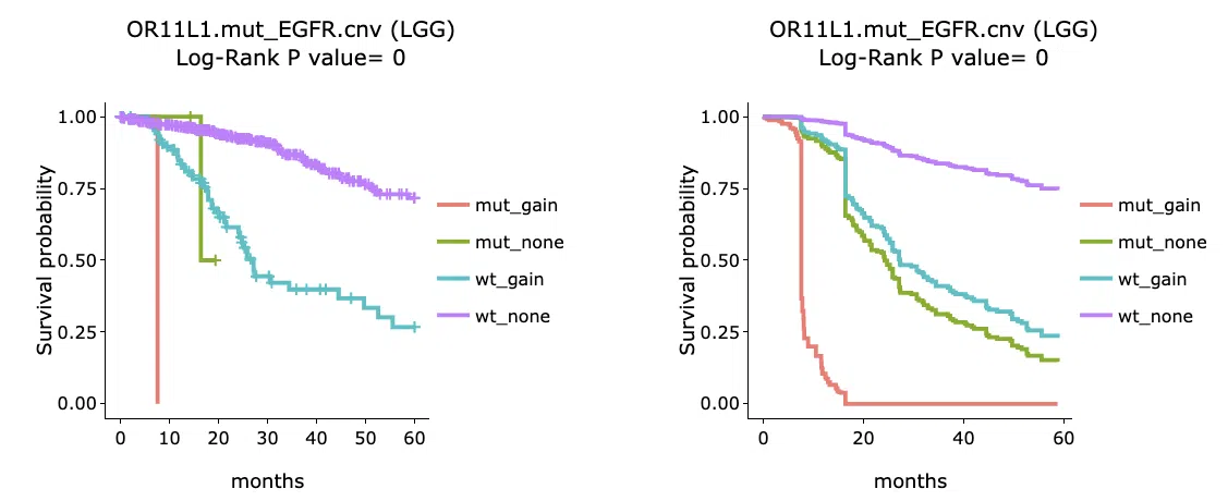
The explanations of the abbreviations are shown below.
- gain_meth: copy number gain occurs in gene1 and methylation occurs in gene2.
- gain_unmeth: copy number gain occurs in gene1 and methylation does not occur in gene2.
- none_meth: none of CNV in gene1 and methylation occurs in gene2.
- none_unmeth: none of CNV in gene1 and methylation not occurs in gene2.
- loss_meth: copy number loss occurs in gene1 and methylation occurs in gene2.
- loss_unmeth: copy number loss occurs in gene1 and methylation does not occur in gene2.
- mut_gain: mutation occurs in gene1 and copy number gain occurs in gene2.
- mut_none: mutation occurs in gene1 and none of CNV in gene2.
- mut_loss: mutation occurs in gene1 and copy number loss occurs in gene2.
- wt_gain: wild-type in gene1 and copy number gain occurs in gene2.
- wt_none: wild-type in gene1 and none of CNV in gene2.
- wt_loss: wild-type in gene1 and copy number loss occurs in gene2.
- high_gain: high RNA expression in gene1 and copy number gain occurs in gene2.
- high_loss: high RNA expression in gene1 and copy number loss occurs in gene2.
- high_none: high RNA expression in gene1 and none of CNV in gene2.
- low_gain: low RNA expression in gene1 and copy number gain occurs in gene2.
- low_loss: low RNA expression in gene1 and copy number loss occurs in gene2.
- low_none: low RNA expression in gene1 and none of CNV in gene2.
Below are the manipulations of the Kaplan-Meier plots, presented in the order corresponding to the mark in the screenshot.

- Move the mouse to the curve to view the detailed information of strata, time, and survival probability.
- Users can view the curves respectively by clicking on the legend to hide or show the corresponding curve.
5. Mutation
The Mutation section provides visualizations to illustrate the survival probability of user-selected genes across multiple cancer types, based on mutation computed by multiple algorithms.
The screenshot below provides an overview of the entire section, with numbers assigned to each subsection. You can easily navigate through the corresponding tutorials in the following content.
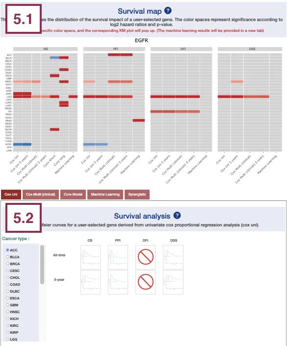
5.1 Survival map
This section provides four heatmaps to display the survival impact of the user-selected gene in four survival types, including overall survival (OS), progression-free interval (PFI), disease-free interval (DFI), and disease-specific survival (DSS) across multiple cancer types.
Each condition is analyzed by four survival algorithms, univariate (cox uni), multivariate regression with clinical variables (cox multi (clinical)), cure model, and machine learning (ML) including Lasso, random forest, and I-Boost.
For more information about the above algorithms, please refer to Help.
The heatmap will be described based on its corresponding marked order in the screenshot provided below.
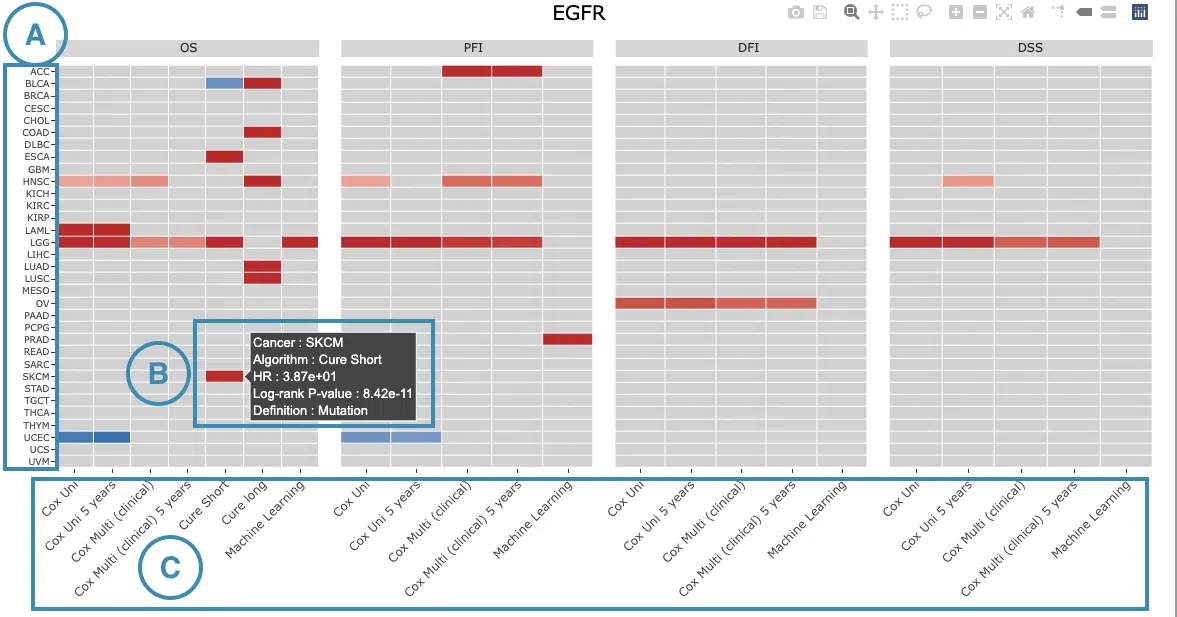
-
The abbreviations of cancer types. For the full names, please refer to Help.
- The color space in the plot represents that the user-selected gene is significant in the corresponding cancer type and algorithm. Each color space is marked according to log2 hazard ratios and p-value (red for positive values and blue for negative values). Hover the mouse on a particular color space for information on cancer type, algorithm, log2 hazard ratio (HR), p-value, and definition.
Note: The p-value of Cox uni, Cox uni (5 years), and ML are calculated by Log-Rank test; the p-value of Cox multi and Cox multi (5 years) are calculated by Cox-PH.
You can click on a specific color space, and the corresponding KM plot will pop up. (Note: The machine learning results will be provided in a new tab.)
The top of the Kaplan-Meier survival curves plot lists the values calculated by survival analysis. The plot's x-axis is the survival time starting from the initial cancer diagnosis, and the y-axis is the survival probability.
The manipulation of KM plot will be explained based on corresponding marked order in the screenshot provided below.
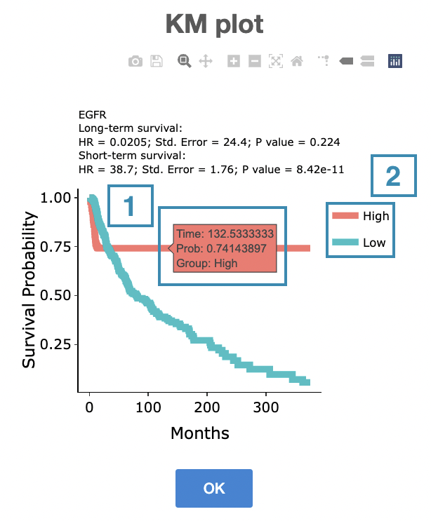
- Hover the mouse on the curve to view the detailed information on strata, time, and survival probability.
- You can hide or show a particular curve by clicking on the corresponding legend. Mut or high on the legend refers to carrying mutations, and WT or low refers to not carrying mutations.
After viewing the plot, click the "OK" button to back to the heatmap.
-
The survival algorithms. Detailed information is provided in Help.
5.2 Survival analysis
The following sections respectively provide survival analysis of a user-selected gene derived from four algorithms, univariate cox proportional regression analysis (Cox Uni) (5.2.1), multiple cox proportional regression analysis with clinical variables (Cox Multi (Clinical)) (5.2.2), Cure model (5.2.3), machine learning (5.2.4), and Synergistic (5.2.5).

You can view a specific subsection by selecting from the tabs. Each subsection is described according to its marking in the screenshot.
5.2.1 Cox Uni
This section provides the 5-year and all-time KM survival curves and cumulative hazard ratio of survival analysis.
For the survival analysis across multiple cancer types, univariate Cox proportional regression is adopted to calculate the gene mutation event of the user-selected gene.
The screenshot below provides an overview of this section. This section's manipulation and explanation will correspond to the marks in the screenshot.
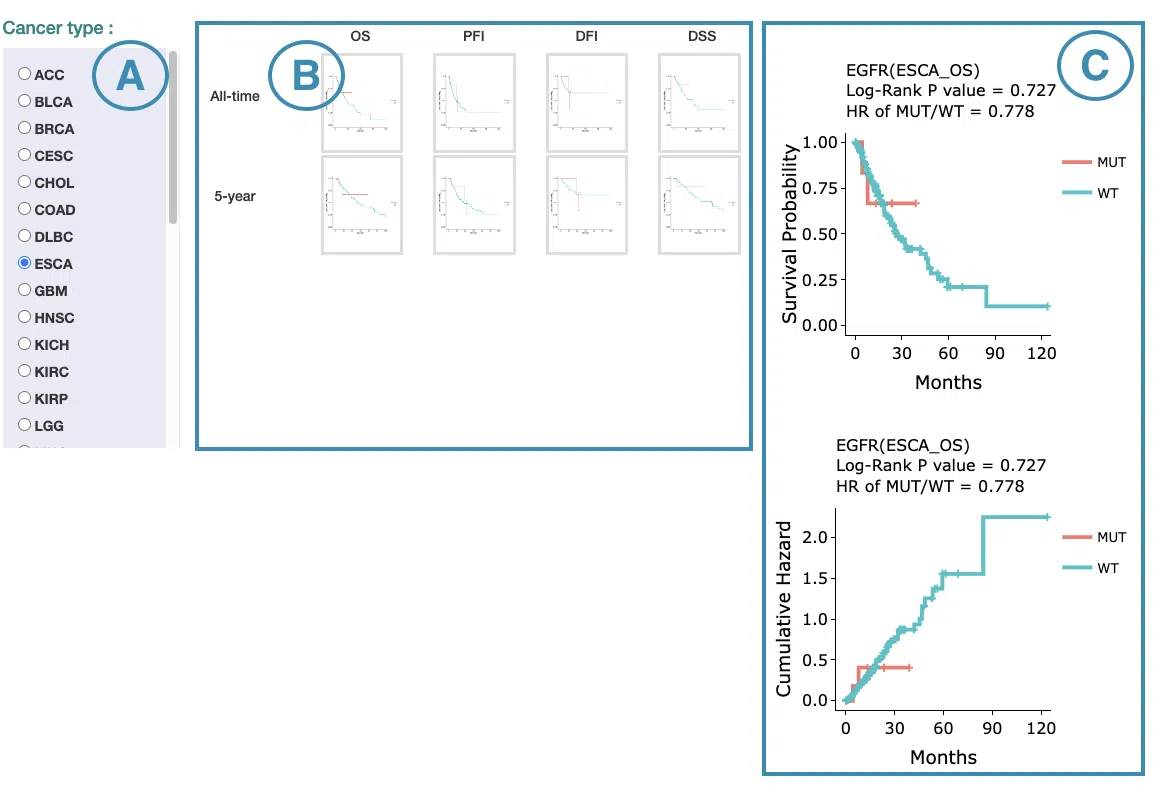
- Select the cancer type. Move the mouse to the abbreviation to view the full name of the cancer type.
- All-time and 5-year results of different survival types. Click on the mini plot of a specific survival time and survival type, and the full-sized plots will be shown. The abbreviation is explained below.
Survival type:
- OS: overall survival
- PFI: progression-free interval
- DFI: disease-free interval
- DSS: disease-specific survival
- The results of Kaplan-Meier survival curves plots and cumulative hazard ratio plots.
-
Kaplan-Meier survival curves plots
The top of the plot lists the values calculated by survival analysis. The plot's x-axis is the survival time starting from the initial cancer diagnosis, and the y-axis is the survival probability. Hover the mouse on the curve to view the detailed information on strata, time, and survival probability. You can hide or show a particular curve by clicking on the corresponding legend. Mut on the legend refers to mutation, and WT refers to wild-type.
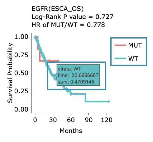
-
Cumulative hazard ratio plots
The top of the plot lists the values calculated by survival analysis. The plot's x-axis is the survival time starting from the initial cancer diagnosis, and the y-axis is the cumulative hazard ratio. Hover the mouse on the curve to view the detailed information on strata, time, and cumulative hazard ratio. You can hide or show a particular curve by clicking on the corresponding legend. Mut on the legend refers to mutation, and WT refers to wild-type.
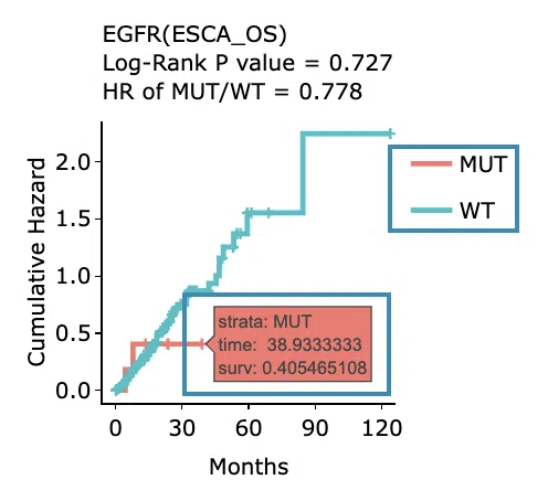
-
Kaplan-Meier survival curves plots
5.2.2 Cox Multi (clinical)
This section provides 5-year and all-time adjustive survival curves and hazard ratio forest plots of survival analysis.
For the survival analysis across multiple cancer types, multiple cox proportional regression analysis is adopted along with clinical variables to calculate the gene mutation event of the user-selected gene.
The screenshot below provides an overview of this section. This section's manipulation and explanation will correspond to the marks in the screenshot.
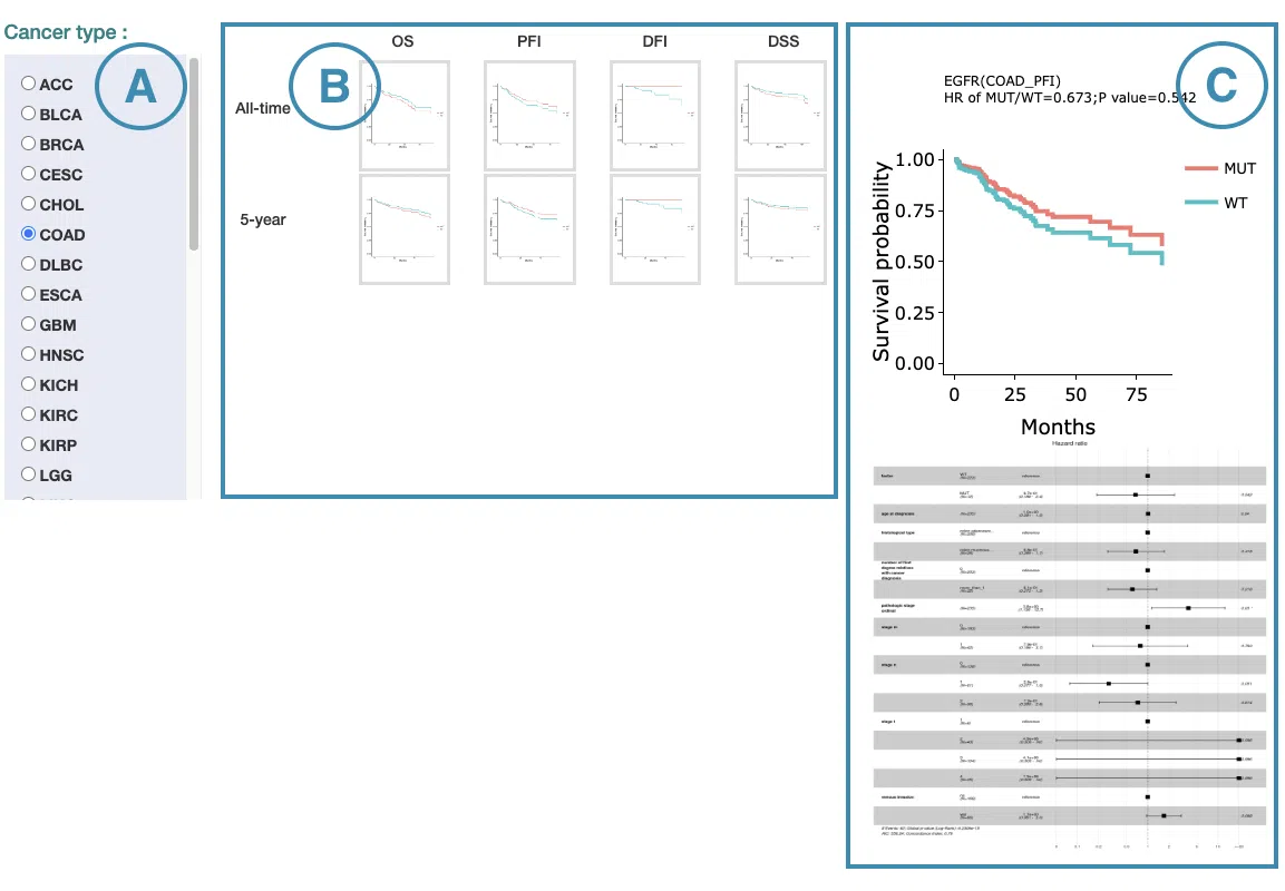
- Select the cancer type. Move the mouse to the abbreviation to view the full name of the cancer type.
- All-time and 5-year results of different survival types. Click on the mini plot of a specific survival time and survival type, and the full-sized plots will be shown. The abbreviation is explained below.
Survival type:
- OS: overall survival
- PFI: progression-free interval
- DFI: disease-free interval
- DSS: disease-specific survival
- The results of Kaplan-Meier adjustive survival curves plots and forest plots.
-
Adjustive survival curves plots
The top of the plot lists the values calculated by survival analysis. The plot's x-axis is the survival time starting from the initial cancer diagnosis, and the y-axis is the survival probability. Hover the mouse on the curve to view the detailed information on time, survival probability, and variable. You can hide or show a particular curve by clicking on the corresponding legend. Mut on the legend refers to mutation, and WT refers to wild-type.
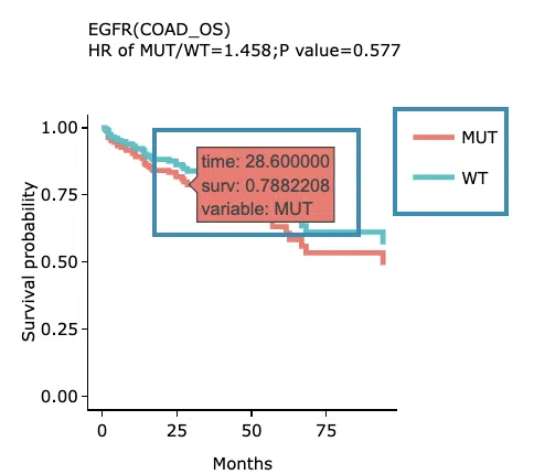
-
Covariate hazard ratio forest plots of clinical variables
Click on the plot to open and view the full-size one in a new tab.
-
Adjustive survival curves plots
5.2.3 Cure Model
This section provides predictive survival curves of survival analysis across multiple cancer types according to the gene mutation event of the user-selected gene calculated by the cure model.
Both short-term and long-term p-values derived from the cure model are provided. For more information about the cure model, please refer to Help.
The screenshot below provides an overview of this section. This section's manipulation and explanation will correspond to the marks in the screenshot.
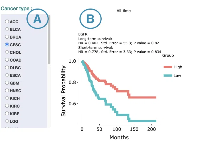
- Select the cancer type. Move the mouse to the abbreviation to view the full name of the cancer type.
-
The predictive survival curves
The top of the plot lists the values calculated by survival analysis. The plot's x-axis is the survival time starting from the initial cancer diagnosis, and the y-axis is the survival probability. Hover the mouse on the curve to view the detailed information on time, survival probability, and group. You can hide or show a particular curve by clicking on the corresponding legend. High in the legend refers to carrying mutations, and low refers to not carrying mutations.
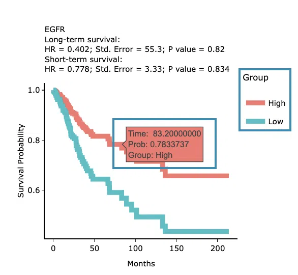
5.2.4 Machine Learning
This section provides results of user-selected genes derived from three machine learning algorithms, Lasso, random forest, and I-Boost.
Select an algorithm and view its results. For more information about Lasso, random forest, and I-Boost algorithm, please refer to Help.
The results of each algorithm are listed in the following subsections.
5.2.4.1 Lasso
The significant results of the user-selected gene derived from Lasso across 33 cancer types are displayed in the signature selection table(A). Select a specific result on the table, and the corresponding list of genes, a KM plot, and ROC curves will display.
Note: The most significant signature is calculated and combined from the gene mutation event of the significant survival genes selected by Lasso.
The screenshot below provides an overview of this section. This section's manipulation and explanation will correspond to the marks in the screenshot.
- The control panel with significant results derived from Lasso across 33 cancer types. The detailed information includes cancer type, survival type, significance, and the number of genes. Select a specific result to view, and the rest sections, including a list of genes (B), KM plot (C), and ROC curves (D), will be displayed according to your selection.
- The table lists the significant genes selected by Lasso and their coefficient. The color of the coefficient column is according to the value (red for positive values, blue for negative values). You can reorder each column in the table by clicking on the column name.
For example, after clicking on “Coefficient,” the values are displayed in decreasing order.
- The Kaplan-Meier plot of survival analysis. The top of the plot lists the values calculated by survival analysis. The plot's x-axis is the survival time starting from the initial cancer diagnosis, and the y-axis is the survival probability.
Hover the mouse on the curve to view the detailed information of strata, time, and survival probability. You can click on the legend to hide or show the corresponding curve.
The explanation of the legend is as below.
- Low = lower value in signature.
- High = higher value in signature.
- The ROC curves are used to evaluate the predictive power of the signature of different survival times (month). The x-axis is the false-positive frequency, and the y-axis is the true-positive frequency. For the interpretation of the ROC curve, please refer to Help.
Hover the mouse on the curves to view the details of the false-positive frequency (FP), true-positive frequency (TP), and the unique marker values for the calculation of TP and FP (c value). You can show or hide a particular ROC curve by clicking on the corresponding legend beside the figure.
5.2.4.2 Random Forest
The significant results of the user-selected gene derived from random forest across 33 cancer types are displayed in the signature selection table(A). Select a specific result on the table, and the corresponding list of genes, a KM plot, and ROC curves will display.
Note: The most significant signature is calculated and combined from the gene mutation event of the significant survival genes selected by random forest.
The screenshot below provides an overview of this section. This section's manipulation and explanation will correspond to the marks in the screenshot.
- The control panel with significant results derived from random forest across 33 cancer types. The detailed information includes cancer type, survival type, significance, and the number of genes. Select a specific result to view, and the rest sections, including a list of genes (B), KM plot (C), and ROC curves (D), will be displayed according to your selection.
- The table lists the significant genes selected by random forest and the depth and relative frequency. The color of the relative frequency column is according to the value.
You can reorder each column in the table by clicking on the column name.
For example, after clicking on “Depth”, the values are displayed in decreasing order.
- The Kaplan-Meier plot of survival analysis. The top of the plot lists the values calculated by survival analysis. The plot's x-axis is the survival time starting from the initial cancer diagnosis, and the y-axis is the survival probability.
Hover the mouse on the curve to view the detailed information of strata, time, and survival probability. You can click on the legend to hide or show the corresponding curve.
The explanation of the legend is as below.
- Low = lower value in signature.
- High = higher value in signature.
- The ROC curves are used to evaluate the predictive power of the signature of different survival times (month). The x-axis is the false-positive frequency, and the y-axis is the true-positive frequency. For the interpretation of the ROC curve, please refer to Help.
Hover the mouse on the curves to view the details of the false-positive frequency (FP), true-positive frequency (TP), and the unique marker values for the calculation of TP and FP (c value). You can show or hide a particular ROC curve by clicking on the corresponding legend beside the figure.
5.2.4.3 I-Boost
The significant results of the user-selected gene derived from I-Boost across 33 cancer types are displayed in the signature selection table(A). Select a specific result on the table, and the corresponding list of genes, a KM plot, and a cumulative hazard ratio plot will display.
Note: The most significant signature is calculated and combined from the gene mutation event of the significant survival genes selected by I-Boost.
The screenshot below provides an overview of this section. This section's manipulation and explanation will correspond to the marks in the screenshot.
- The control panel with significant results derived from I-Boost across 33 cancer types. The detailed information includes cancer type, survival type, significance, and the number of genes. Select a specific result to view, and the rest sections, including a list of genes (B), KM plot (C), and cumulative hazard ratio plot (D), will be displayed according to your selection.
- The table lists the significant genes selected by I-Boost and their coefficient values. The color of the coefficient column is according to the value (red for positive values and blue for negative values).
You can reorder each column in the table by clicking on the column name.
For example, after clicking on “Coefficient”, the values are displayed in decreasing order.
- The Kaplan-Meier plot of survival analysis. The top of the plot lists the values calculated by survival analysis. The plot's x-axis is the survival time starting from the initial cancer diagnosis, and the y-axis is the survival probability.
Hover the mouse on the curve to view the detailed information of strata, time, and survival probability. You can click on the legend to hide or show the corresponding curve.
The explanation of the legend is as below.
- Low = lower value in signature.
- High = higher value in signature.
- The cumulative hazard ratio plots. The top of the plot lists the values calculated by survival analysis. The plot's x-axis is the survival time starting from the initial cancer diagnosis, and the y-axis is the cumulative hazard ratio.
Hover the mouse on the curve to view the detailed information of strata, time, and survival probability. You can click on the legend to hide or show the corresponding curve. The explanation of the legend is as below.
- Low = lower value in signature.
- High = higher value in signature.
5.2.5 Synergistic
This section provides the synergistic effect between the user-selected gene and related genes in different omics. The interactions include RNA-mutation, mutation-methylation, and mutation-CNV. The detailed information of synergistic effect including cancer type, gene symbol, omic level, hazard ratio, and p-value are shown in the table. Toggling the desired gene-omic pairs on the table(A) generates corresponding survival plots below(B). The synergistic effect is defined by the hazard ratio (HR) of two survival-related genes in different omics, whose combine expression is > 1.5 fold of each omic with log-rank p-value <0.05 (the results are shown in “HR.FC” column). The resources of the gene dataset include the Cancer Gene Census (CGC) and the Network of Cancer Genes (NCG6.0).
The screenshot below provides an overview of this section. This section's manipulation and explanation will correspond to the marks in the screenshot.
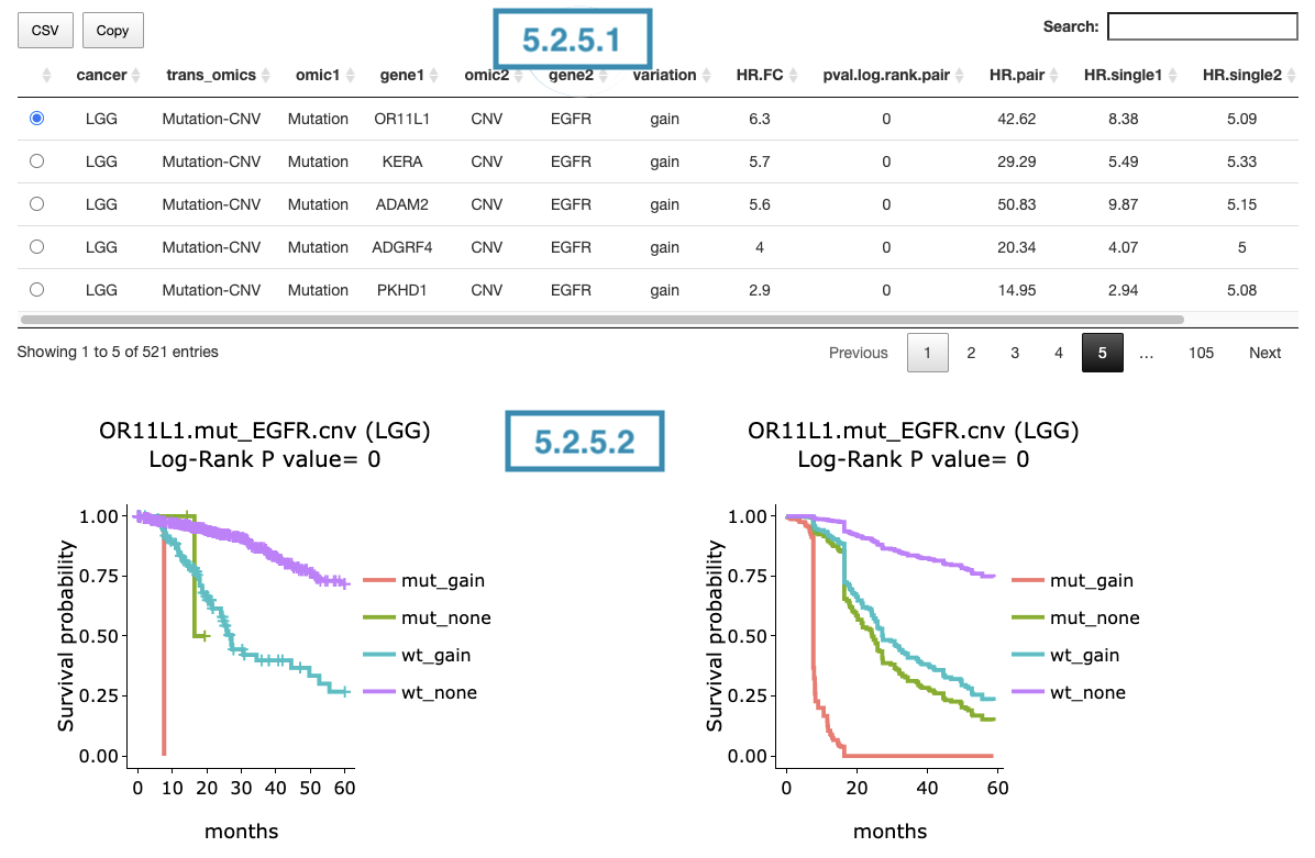
5.2.5.1 Synergistic effect table
The table lists cancer type, interactions, gene symbols, omic levels, hazard ratio, and p-value. Select the synergistic effect by the control panel and the corresponding KM plot will be displayed.

You can reorder each column in the table by clicking on the column name.
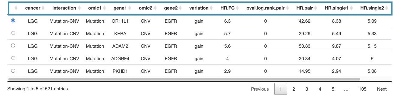
For example, after clicking on “HR.pair”, the values are displayed in decreasing order.
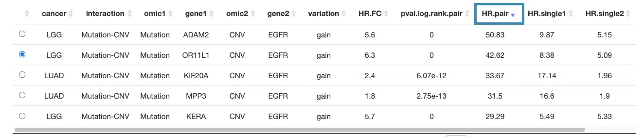
5.2.5.2 Kaplan-Meier plot
The Kaplan-Meier plots for survival analysis. The left plot is generated according to the selected panel in the above table. The right plot is the adjustive curve of the left one based on the Cox model results, presented by the R package, "survminer."
A more detailed description is provided in 'Adjusted Survival Curves' by Terry Therneau, Cynthia Crowson, and Elizabeth Atkinson (2015).
On the top of each plot lists gene symbols with omics and the value calculated by survival analysis. The x-axis of the plot is the survival time started from the initial cancer diagnosis and the y-axis is survival probability.

The explanations of the abbreviations are shown below.
- mut_meth: mutation occurs in gene1 and methylation occurs in gene2.
- mut_unmeth: mutation occurs in gene1 and methylation not occurs in gene2.
- wt_meth: wild-type in gene1 and methylation occurs in gene2.
- wt_unmeth: wild-type in gene1 and methylation does not occur in gene2.
- mut_gain: mutation occurs in gene1 and copy number gain occurs in gene2.
- mut_none: mutation occurs in gene1 and none of CNV in gene2.
- mut_loss: mutation occurs in gene1 and copy number loss occurs in gene2.
- wt_gain: wild-type in gene1 and copy number gain occurs in gene2.
- wt_none: wild-type in gene1 and none of CNV in gene2.
- wt_loss: wild-type in gene1 and copy number loss occurs in gene2.
- high_mut: high RNA expression in gene1 and mutation occurs in gene2.
- high_wt: high RNA expression in gene1 and wild-type in gene2.
- low_mut: low RNA expression in gene1 and mutation occurs in gene2.
- low_wt: low RNA expression in gene1 and wild-type in gene2.
Below are the manipulations of the Kaplan-Meier plots, presented in the order corresponding to the mark in the screenshot.
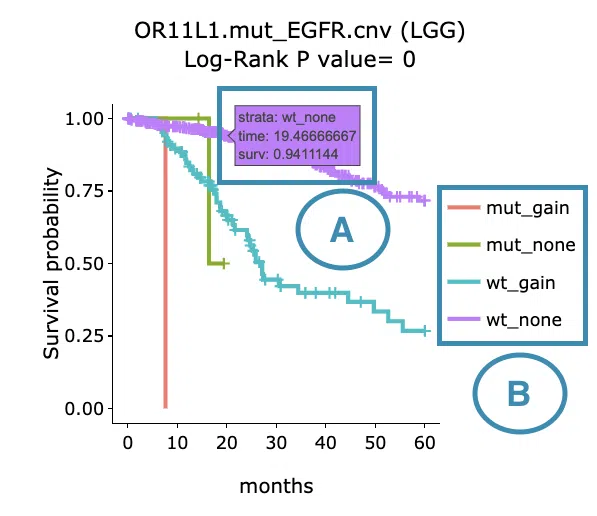
- Move the mouse to the curve to view the detailed information of strata, time, and survival probability.
- Users can view the curves respectively by clicking on the legend to hide or show the corresponding curve.
6. Methylation
The Methylation section provides visualizations to illustrate the survival probability of user-selected genes across multiple cancer types, based on DNA methylation computed by multiple algorithms.
The screenshot below provides an overview of the entire section, with numbers assigned to each subsection. You can easily navigate through the corresponding tutorials in the following content.
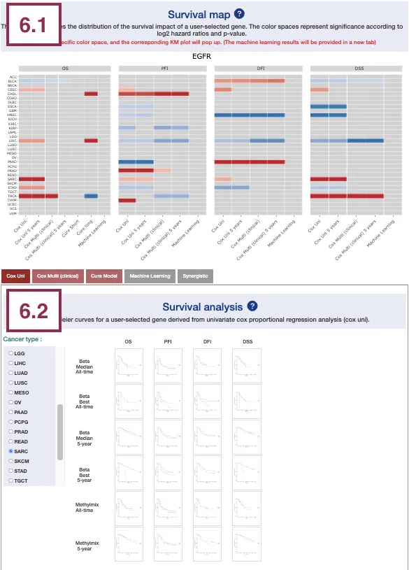
6.1 Survival map
This section provides four heatmaps to display the survival impact of the user-selected gene in four survival types, including overall survival (OS), progression-free interval (PFI), disease-free interval (DFI), and disease-specific survival (DSS) across multiple cancer types.
Each condition is analyzed by four survival algorithms, univariate (cox uni), multivariate regression with clinical variables (cox multi (clinical)), cure model, and machine learning (ML) including Lasso, random forest, and I-Boost.
For more information about the above algorithms, please refer to Help.
The heatmap will be described based on its corresponding marked order in the screenshot provided below.
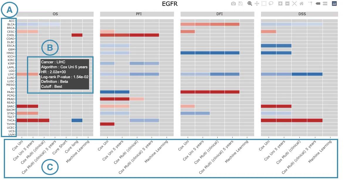
-
The abbreviations of cancer types. For the full names, please refer to Help.
-
The color space in the plot represents that the user-selected gene is significant in the corresponding cancer type and algorithm.
Each color space is marked according to log2 hazard ratios and p-value (red for positive values and blue for negative values).
Hover the mouse on a particular color space for information on cancer type, algorithm, log2 hazard ratio (HR), p-value, definition, and cut-off.
Note: The p-value of Cox uni, Cox uni (5 years), and ML are calculated by Log-Rank test; the p-value of Cox multi and Cox multi (5 years) are calculated by Cox-PH.
You can click on a specific color space, and the corresponding KM plot will pop up. (Note: The machine learning results will be provided in a new tab.)
The top of the Kaplan-Meier survival curves plot lists the values calculated by survival analysis. The plot's x-axis is the survival time starting from the initial cancer diagnosis, and the y-axis is the survival probability.
The manipulation of KM plot will be explained based on corresponding marked order in the screenshot provided below.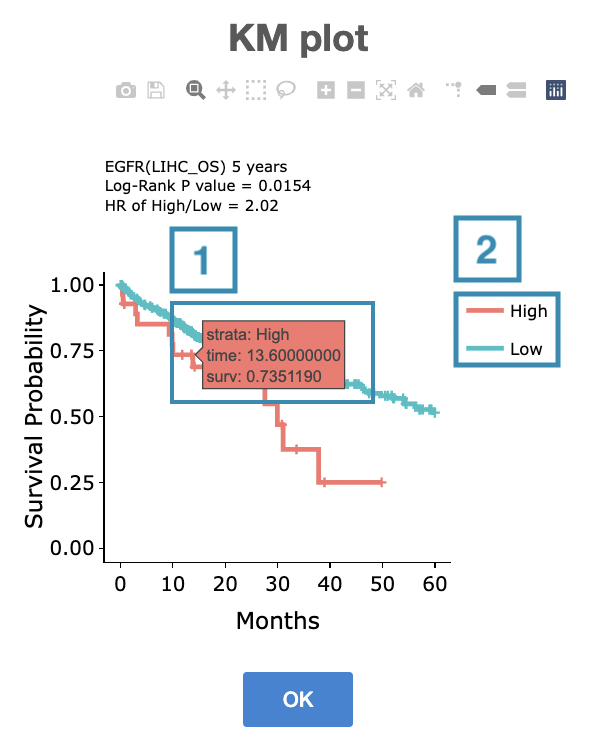
- Hover the mouse on the curve to view the detailed information on strata, time, and survival probability.
- You can hide or show a particular curve by clicking on the corresponding legend. Hypo or high in the legend refers to methylation, and none or low refers to none methylation.
After viewing the plot, click the "OK" button to back to the heatmap.
-
The survival algorithms. Detailed information is provided in Help.
6.2 Survival analysis
The following sections respectively provide survival analysis of a user-selected gene derived from four algorithms, univariate cox proportional regression analysis (Cox Uni) (6.2.1), multiple cox proportional regression analysis with clinical variables (Cox Multi (Clinical)) (6.2.2), Cure model (6.2.3), machine learning (6.2.4), and Synergistic (6.2.5).

You can view a specific subsection by selecting from the tabs. Each subsection is described according to its marking in the screenshot.
6.2.1 Cox Uni
This section provides the 5-year and all-time KM survival curves and cumulative hazard ratio of survival analysis.
For the survival analysis across multiple cancer types, univariate Cox proportional regression is adopted to calculate the gene methylation level of the user-selected gene.
The screenshot below provides an overview of this section. This section's manipulation and explanation will correspond to the marks in the screenshot.
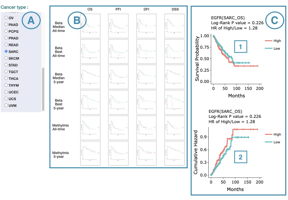
- Select the cancer type. Move the mouse to the abbreviation to view the full name of the cancer type.
- All-time and 5-year results of different survival types and definitions. Click on the mini plot of a specific survival time, survival type, and definition, and the full-sized plots will be shown. The abbreviation is explained below.
- Definition:
- MethylMix: identify DNA methylation events by MethyMix package.
- beta value: beta(β) value at CpG site based on TCGA Level 3 data, stratified by mean or median.
- Survival type:
- OS: overall survival
- PFI: progression-free interval
- DFI: disease-free interval
- DSS: disease-specific survival
- Definition:
- The results of Kaplan-Meier survival curves plots and cumulative hazard ratio plots.
-
Kaplan-Meier survival curves plots
The top of the plot lists the values calculated by survival analysis. The plot's x-axis is the survival time starting from the initial cancer diagnosis, and the y-axis is the survival probability. Hover the mouse on the curve to view the detailed information on strata, time, and survival probability. You can hide or show a particular curve by clicking on the corresponding legend. High or hypo in the legend refers to methylation, and low or none refers to none methylation.
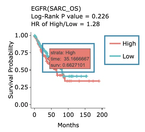
-
Cumulative hazard ratio plots
The top of the plot lists the values calculated by survival analysis. The plot's x-axis is the survival time starting from the initial cancer diagnosis, and the y-axis is the cumulative hazard ratio. Hover the mouse on the curve to view the detailed information on strata, time, and cumulative hazard ratio. You can hide or show a particular curve by clicking on the corresponding legend. High or hypo in the legend refers to methylation, and low or none refers to none methylation.
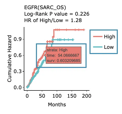
-
Kaplan-Meier survival curves plots
6.2.2 Cox Multi (clinical)
This section provides 5-year and all-time adjustive survival curves and hazard ratio forest plots of survival analysis.
For the survival analysis across multiple cancer types, multiple cox proportional regression analysis is adopted along with clinical variables to calculate the gene methylation level of the user-selected gene.
The screenshot below provides an overview of this section. This section's manipulation and explanation will correspond to the marks in the screenshot.
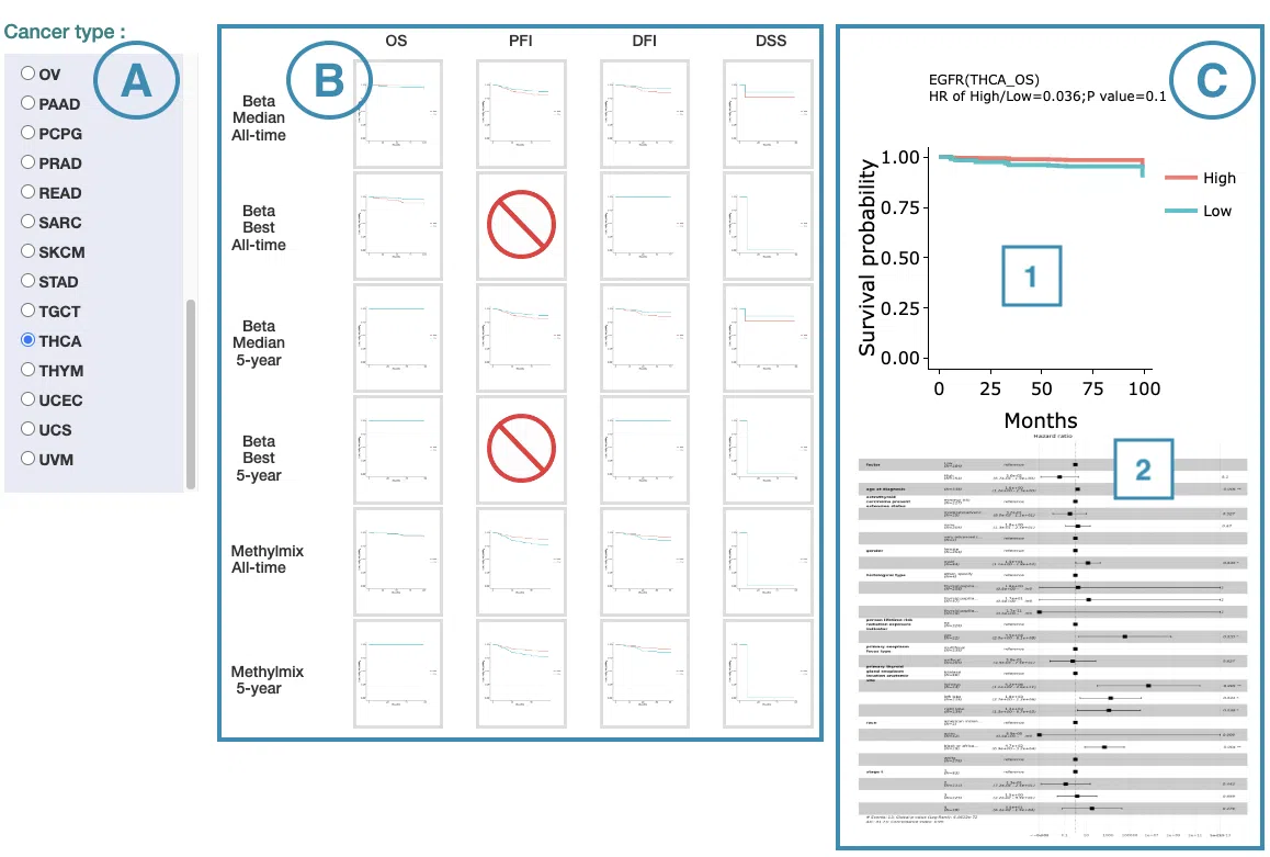
- Select the cancer type. Move the mouse to the abbreviation to view the full name of the cancer type.
- All-time and 5-year results of different survival types and definitions. Click on the mini plot of a specific survival time, survival type, and definition, and the full-sized plots will be shown. The abbreviation is explained below.
- Definition:
- MethylMix: identify DNA methylation events by MethyMix package.
- beta value: beta(β) value at CpG site based on TCGA Level 3 data, stratified by mean or median.
- Survival type:
- OS: overall survival
- PFI: progression-free interval
- DFI: disease-free interval
- DSS: disease-specific survival
- Definition:
- The results of Kaplan-Meier adjustive survival curves plots and forest plots.
-
Adjustive survival curves plots
The top of the plot lists the values calculated by survival analysis. The plot's x-axis is the survival time starting from the initial cancer diagnosis, and the y-axis is the survival probability. Hover the mouse on the curve to view the detailed information on time, survival probability, and variable. You can hide or show a particular curve by clicking on the corresponding legend. High or hypo in the legend refers to methylation, and low or none refers to none methylation.
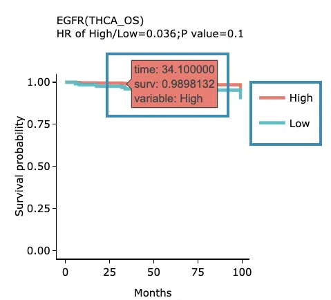
-
Covariate hazard ratio forest plots of clinical variables
Click on the plot to open and view the full-size one in a new tab.
-
Adjustive survival curves plots
6.2.3 Cure Model
This section provides predictive survival curves of survival analysis across multiple cancer types according to the gene methylation level of the user-selected gene calculated by the cure model.
Both short-term and long-term p-values derived from the cure model are provided. For more information about the cure model, please refer to Help.
The screenshot below provides an overview of this section. This section's manipulation and explanation will correspond to the marks in the screenshot.
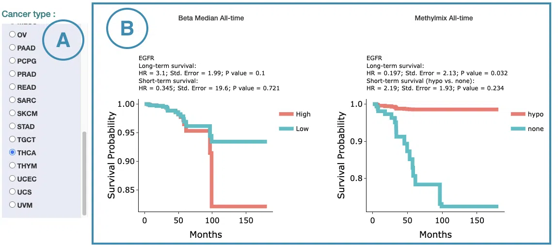
- Select the cancer type. Move the mouse to the abbreviation to view the full name of the cancer type.
- The predictive survival curves of different definitions. The abbreviation of definition is explained below.
- MethylMix: identify DNA methylation events by MethyMix package.
- beta value: beta(β) value at CpG site based on TCGA Level 3 data, stratified by mean or median.
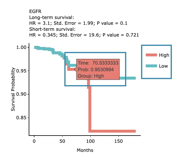
The top of the plot lists the values calculated by survival analysis. The plot's x-axis is the survival time starting from the initial cancer diagnosis, and the y-axis is the survival probability. Hover the mouse on the curve to view the detailed information on time, survival probability, and group. You can hide or show a particular curve by clicking on the corresponding legend. High or hypo in the legend refers to methylation, and low or none refers to none methylation.
6.2.4 Machine Learning
This section provides results of user-selected genes derived from three machine learning algorithms, Lasso, random forest, and I-Boost.
Select an algorithm and view its results. For more information about Lasso, random forest, and I-Boost algorithm, please refer to Help.
The results of each algorithm are listed in the following subsections.
6.2.4.1 Lasso
The significant results of the user-selected gene derived from Lasso across 33 cancer types are displayed in the signature selection table(A). Select a specific result on the table, and the corresponding list of genes, a KM plot, and ROC curves will display.
Note: The most significant signature is calculated and combined from the gene methylation level of the significant survival genes selected by Lasso.
The screenshot below provides an overview of this section. This section's manipulation and explanation will correspond to the marks in the screenshot.
- The control panel with significant results derived from Lasso across 33 cancer types. The detailed information includes cancer type, survival type, significance, and the number of genes. Select a specific result to view, and the rest sections, including a list of genes (B), KM plot (C), and ROC curves (D), will be displayed according to your selection.
- The table lists the significant genes selected by Lasso and their coefficient. The color of the coefficient column is according to the value (red for positive values, blue for negative values). You can reorder each column in the table by clicking on the column name.
For example, after clicking on “Coefficient,” the values are displayed in decreasing order.
- The Kaplan-Meier plot of survival analysis. The top of the plot lists the values calculated by survival analysis. The plot's x-axis is the survival time starting from the initial cancer diagnosis, and the y-axis is the survival probability.
Hover the mouse on the curve to view the detailed information of strata, time, and survival probability. You can click on the legend to hide or show the corresponding curve.
The explanation of the legend is as below.
- Low = lower value in signature.
- High = higher value in signature.
- The ROC curves are used to evaluate the predictive power of the signature of different survival times (month). The x-axis is the false-positive frequency, and the y-axis is the true-positive frequency. For the interpretation of the ROC curve, please refer to Help.
Hover the mouse on the curves to view the details of the false-positive frequency (FP), true-positive frequency (TP), and the unique marker values for the calculation of TP and FP (c value). You can show or hide a particular ROC curve by clicking on the corresponding legend beside the figure.
6.2.4.2 Random Forest
The significant results of the user-selected gene derived from random forest across 33 cancer types are displayed in the signature selection table(A). Select a specific result on the table, and the corresponding list of genes, a KM plot, and ROC curves will display.
Note: The most significant signature is calculated and combined from the gene methylation level of the significant survival genes selected by random forest.
The screenshot below provides an overview of this section. This section's manipulation and explanation will correspond to the marks in the screenshot.
- The control panel with significant results derived from random forest across 33 cancer types. The detailed information includes cancer type, survival type, significance, and the number of genes. Select a specific result to view, and the rest sections, including a list of genes (B), KM plot (C), and ROC curves (D), will be displayed according to your selection.
- The table lists the significant genes selected by random forest and the depth and relative frequency. The color of the relative frequency column is according to the value.
You can reorder each column in the table by clicking on the column name.
For example, after clicking on “Depth”, the values are displayed in decreasing order.
- The Kaplan-Meier plot of survival analysis. The top of the plot lists the values calculated by survival analysis. The plot's x-axis is the survival time starting from the initial cancer diagnosis, and the y-axis is the survival probability.
Hover the mouse on the curve to view the detailed information of strata, time, and survival probability. You can click on the legend to hide or show the corresponding curve.
The explanation of the legend is as below.
- Low = lower value in signature.
- High = higher value in signature.
- The ROC curves are used to evaluate the predictive power of the signature of different survival times (month). The x-axis is the false-positive frequency, and the y-axis is the true-positive frequency. For the interpretation of the ROC curve, please refer to Help.
Hover the mouse on the curves to view the details of the false-positive frequency (FP), true-positive frequency (TP), and the unique marker values for the calculation of TP and FP (c value). You can show or hide a particular ROC curve by clicking on the corresponding legend beside the figure.
6.2.4.3 I-Boost
The significant results of the user-selected gene derived from I-Boost across 33 cancer types are displayed in the signature selection table(A). Select a specific result on the table, and the corresponding list of genes, a KM plot, and a cumulative hazard ratio plot will display.
Note: The most significant signature is calculated and combined from the gene methylation level of the significant survival genes selected by I-Boost.
The screenshot below provides an overview of this section. This section's manipulation and explanation will correspond to the marks in the screenshot.
- The control panel with significant results derived from I-Boost across 33 cancer types. The detailed information includes cancer type, survival type, significance, and the number of genes. Select a specific result to view, and the rest sections, including a list of genes (B), KM plot (C), and cumulative hazard ratio plot (D), will be displayed according to your selection.
- The table lists the significant genes selected by I-Boost and their coefficient values. The color of the coefficient column is according to the value (red for positive values and blue for negative values).
You can reorder each column in the table by clicking on the column name.
For example, after clicking on “Coefficient”, the values are displayed in decreasing order.
- The Kaplan-Meier plot of survival analysis. The top of the plot lists the values calculated by survival analysis. The plot's x-axis is the survival time starting from the initial cancer diagnosis, and the y-axis is the survival probability.
Hover the mouse on the curve to view the detailed information of strata, time, and survival probability. You can click on the legend to hide or show the corresponding curve.
The explanation of the legend is as below.
- Low = lower value in signature.
- High = higher value in signature.
- The cumulative hazard ratio plots. The top of the plot lists the values calculated by survival analysis. The plot's x-axis is the survival time starting from the initial cancer diagnosis, and the y-axis is the cumulative hazard ratio.
Hover the mouse on the curve to view the detailed information of strata, time, and survival probability. You can click on the legend to hide or show the corresponding curve. The explanation of the legend is as below.
- Low = lower value in signature.
- High = higher value in signature.
6.2.5 Synergistic
This section provides the synergistic effect between the user-selected gene and related genes in different omics. The interactions include RNA- methylation, mutation-methylation, and CNV-methylation. The detailed information of synergistic effect including cancer type, gene symbol, omic level, hazard ratio, and p-value are shown in the table. Toggling the desired gene-omic pairs on table(A) generates corresponding survival plots below(B). The synergistic effect is defined by the hazard ratio (HR) of two survival-related genes in different omics, whose combine expression is > 1.5 fold of each omic with log-rank p-value <0.05 (the results are shown in “HR.FC” column). The resources of the gene dataset include the Cancer Gene Census (CGC) and the Network of Cancer Genes (NCG6.0).
The screenshot below provides an overview of this section. This section's manipulation and explanation will correspond to the marks in the screenshot.
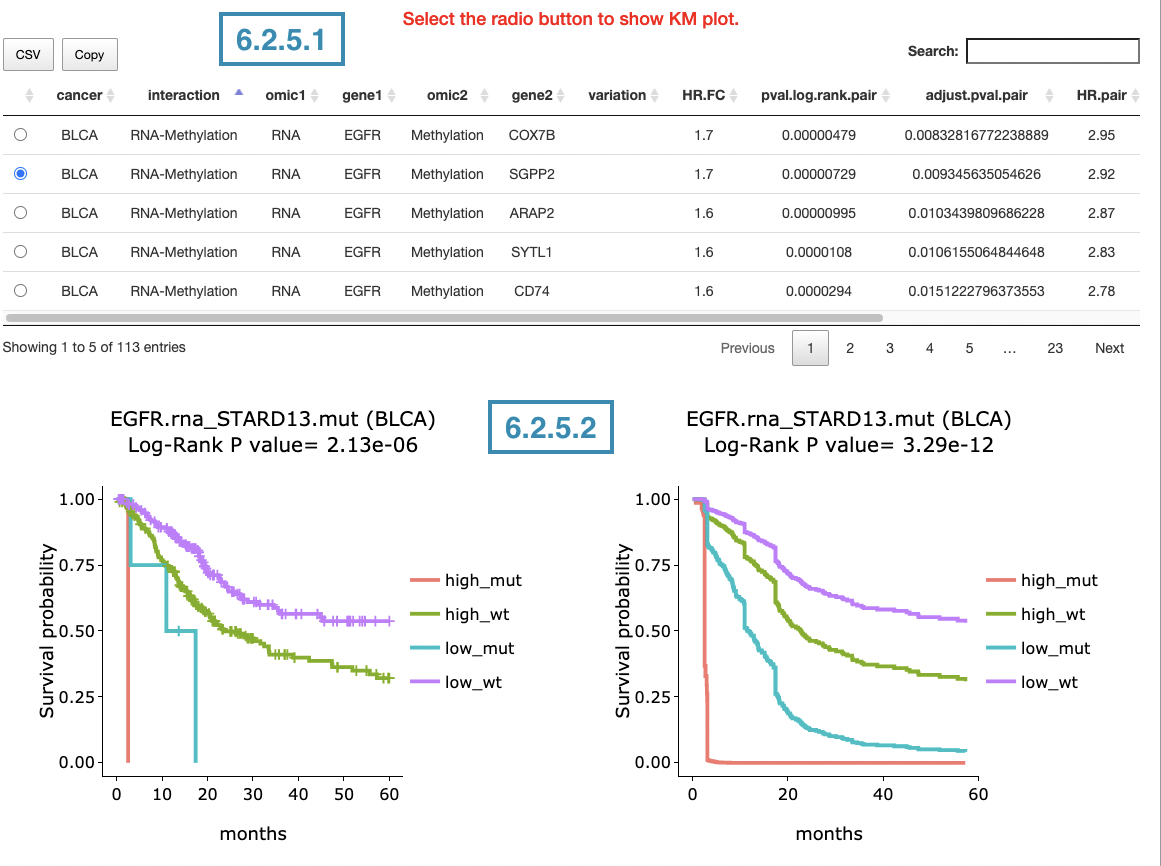
6.2.5.1 Synergistic effect table
The table lists cancer type, interactions, gene symbols, omic levels, hazard ratio, and p-value. Select the synergistic effect by the control panel and the corresponding KM plot will be displayed.
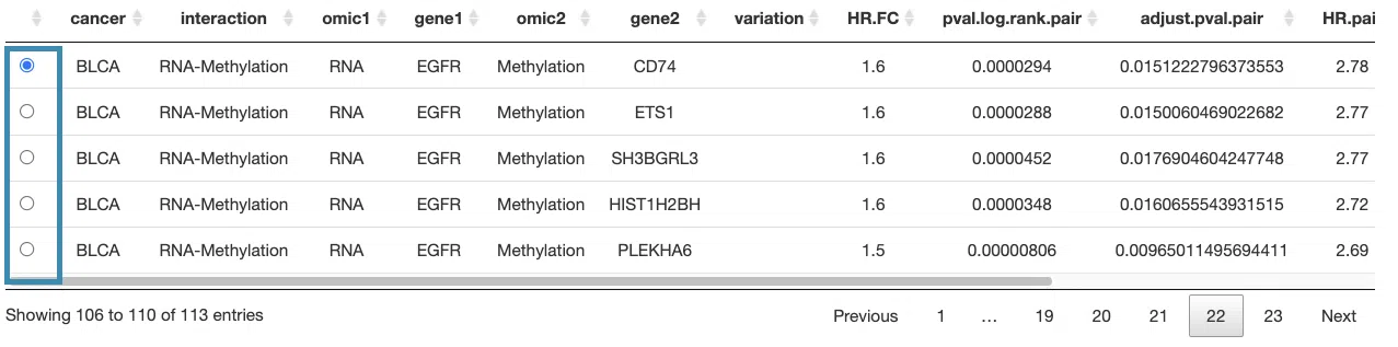
You can reorder each column in the table by clicking on the column name.

For example, after clicking on “HR.pair”, the values are displayed in increasing order.

6.2.5.2 Kaplan-Meier plot
The Kaplan-Meier plots for survival analysis. The left plot is generated according to the selected panel in the above table. The right plot is the adjustive curve of the left one based on the Cox model results, presented by the R package, "survminer."
A more detailed description is provided in 'Adjusted Survival Curves' by Terry Therneau, Cynthia Crowson, and Elizabeth Atkinson (2015).
On the top of each plot lists gene symbols with omics and the value calculated by survival analysis. The x-axis of the plot is the survival time started from the initial cancer diagnosis and the y-axis is survival probability.

The explanations of the abbreviations are shown below.
- mut_meth: mutation occurs in gene1 and methylation occurs in gene2.
- mut_unmeth: mutation occurs in gene1 and methylation not occurs in gene2.
- wt_meth: wild-type in gene1 and methylation occurs in gene2.
- wt_unmeth: wild-type in gene1 and methylation does not occur in gene2.
- gain_meth: copy number gain occurs in gene1 and methylation occurs in gene2.
- gain_unmeth: copy number gain occurs in gene1 and methylation does not occur in gene2.
- none_meth: none of CNV in gene1 and methylation occurs in gene2.
- none_unmeth: none of CNV in gene1 and methylation not occurs in gene2.
- loss_meth: copy number loss occurs in gene1 and methylation occurs in gene2.
- loss_unmeth: copy number loss occurs in gene1 and methylation does not occur in gene2.
- high_meth: high RNA expression in gene1 and methylation occurs in gene2.
- high_unmeth: high RNA expression in gene1 and methylation not occurs in gene2.
- low_meth: low RNA expression in gene1 and methylation occurs in gene2.
- low_unmeth: low RNA expression in gene1 and methylation not occurs in gene2.
Below are the manipulations of the Kaplan-Meier plots, presented in the order corresponding to the mark in the screenshot.
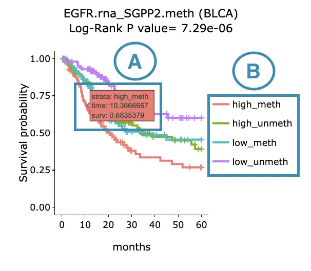
- Move the mouse to the curve to view the detailed information of strata, time, and survival probability.
- Users can view the curves respectively by clicking on the legend to hide or show the corresponding curve.
Customized analysis
Step 1. Begin your analysis.
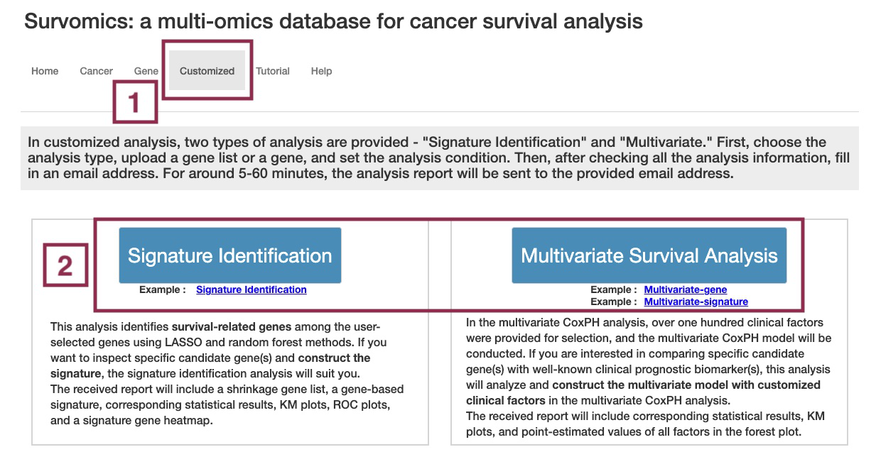
The manipulation of this step follows the marked order in the screenshot.
- Go to the Customized analysis page.
- Choose the analysis type.
- Signature identification analysis identifies survival-related genes among the user-selected genes using LASSO and random forest methods. Select feature selection analysis if you want to inspect specific candidate gene(s) and construct the signature.
- Multivariate survival analysis analyzes and constructs the multivariate model with customized clinical factors; over one hundred clinical factors were provided for selection. Select Multivariate analysis to compare specific candidate gene(s) with well-known clinical prognostic biomarker(s).
Step 2. Upload a gene list.
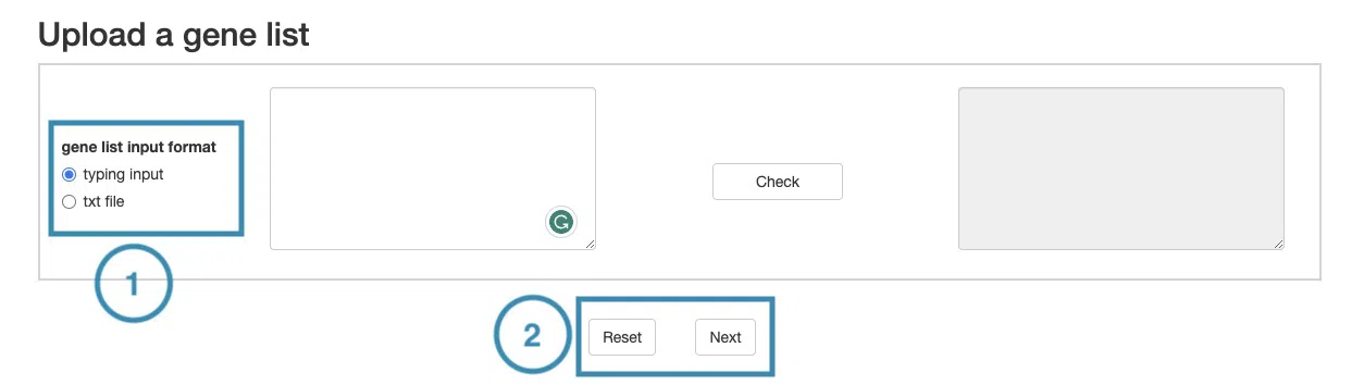
The manipulation of this step follows the marked order in the screenshot.
-
Upload the gene list by typing the gene symbols or submitting a txt file.
If you submit in a txt file, please ensure that the file follows the specified format:
- Each line of the text file should contain only one gene symbol.
- Gene symbols should be listed one after the other, each symbol on a separate line.
Here is an example of a correctly formatted input file.
- After the file is ready, click the “Next” button to move on to the next step. (If you want to reset your setting, click the “Reset” button.)
If you submit in a txt file, please ensure that the file follows the specified format:
- Each line of the text file should contain only one gene symbol.
- Gene symbols should be listed one after the other, each symbol on a separate line.
Here is an example of a correctly formatted input file.